
Tehran · Iran
Why Disney Made the Genie Blue
The long material and colonial history behind the most recognizable blue body in popular culture.
Early in 1991, just before the Gulf War broke out, a layout artist named Rasoul Azadani flew home to Isfahan and started photographing his own city. The domes off Naqsh-e Jahan Square. The way afternoon light moved across tilework. The patterns in a doorway nobody would think to notice. He came back to Burbank with somewhere around 1,800 photographs — a few tellings say closer to two thousand — and out of them Disney's artists built Agrabah, the city where Aladdin takes place. A city that is nowhere. A real man photographed his real hometown so that a studio could assemble a place that exists only as a set of suggestions.
So: the genie is blue. Almost everyone remembers that much. Fewer people ask why, and the answer turns out to run backward through five thousand years of a color that was rarely, in this part of the world, quite what it claimed to be.
The color script
Start with the studio, because the studio is unusually honest about what it did.
The blue was a decision, made on paper, before a frame was animated. The production designer, Richard Vander Wende, built what animators call a color script — a plan that assigns emotional weight to hue across the whole film. In Aladdin the plan is close to a moral diagram. Protagonists carry light colors, blues especially; the villain Jafar and his world run to red and black; and Agrabah itself, the city, sits in a neutral sandy yellow — neither good nor evil, just the ground the story happens on. Blue is good. Red is danger. The city is beige.
The whole thing was engineered with a precision the finished film hides under its jokes. Shapes were coded as carefully as hue: the rounded Sultan is built, in art director Bill Perkins's own description, so that his basic form "is like an egg," his throne room's curves echoing his own — softness becoming part of the film's visual shorthand for harmlessness, the way the palette becomes shorthand for morality. And all of it sat on the architecture Azadani had carried back from Isfahan, the domes and arches of a real city holding up an invented one. The look is meticulous. The meaning is what got thinned.
You can almost watch the diagram do its work in the Cave of Wonders. Aladdin is warned to touch nothing but the lamp, and the lamp sits in a chamber of cool blue light while a forbidden ruby glows red across the cavern. The scene reads, if you let it, as a choice between two colors made before a single word is spoken. Reach for the red and you are lost. Reach for the blue and you are saved.
Eric Goldberg, the animator most associated with bringing the genie to life, is careful to say the blue wasn't his idea. He didn't make the genie blue; Vander Wende's palette did, and Goldberg animated inside it. And Vander Wende, asked years later why blue, gave an answer that is worth reading slowly, because it quietly names the whole lineage this article is about. He wrote that certain blues in Persian miniatures and tiled mosques stand out brilliantly against the sun-bleached desert, and that the color suggested water and sky, life, freedom, and hope.
Persian miniatures and tiled mosques. That is not a vague gesture at "the East." That is a specific body of blue objects, made with specific materials, in specific cities, over several specific centuries. The art director on the film, Bill Perkins, said the same thing more plainly: the team took the limited palette of Persian miniatures and adapted it. Disney reached back, deliberately, to the manuscript-and-tile tradition — and extracted the color from a much denser material and symbolic system, giving it a simpler, cleaner job of its own. Vander Wende kept some of the old associations: water, sky, freedom, hope are all in his note, and all of them are genuinely part of what blue has carried. What thinned was everything else around those associations — the cost, the labor, the protection, the cosmology, the centuries of exchange that made the color mean anything in the first place. The film kept the halo and let go of the weight.
To understand what got left behind, you have to understand why some of the blues humans prized most were so difficult to make.
The last color
Here is something strange, and I will only say it once, because the tradition of saying here is what is strange every few paragraphs is itself a kind of tic.
For much of recorded history, in a great many languages, there was no basic word for blue — and the story of how scholars noticed that, and then argued about what it meant, is more interesting than the tidy version usually told.
It starts as an observation, and a real one. In 1858 the British statesman William Gladstone — the same Gladstone who was four times prime minister — spent his spare hours counting color words in Homer and noticed that a poet alert to every other texture of the world seems never to reach for blue. The sea is "wine-dark." Iron is "violet." The sky is bronze, or nothing. In the 1860s the philologist Lazarus Geiger widened the search into the Vedic hymns, the Icelandic sagas, older Chinese texts, the Hebrew Bible, and reported the same near-silence around blue. A century later the anthropologist Brent Berlin and the linguist Paul Kay turned it into a model in Basic Color Terms (1969): across the languages they surveyed, basic color words seemed to enter in a broadly recurring order — dark and light first, then red, then green and yellow, and blue characteristically late.
Then the model got complicated, which is the part worth keeping. Gladstone's own guess — that the Greeks were physically unable to see blue — has been set aside: there is no evidence the ancient eye was any different from ours, and a language can lack a basic term for a color its speakers distinguish perfectly well. Berlin and Kay's broad sequence has held up better than Gladstone's biology, but later work has complicated it — showing that languages carve the spectrum in genuinely different ways and that the "stages" are looser than first proposed. So I'll put it carefully, because the careful version is the true one: blue is unusual in how often it appears relatively late as a distinct basic color category, not because anyone was blind to the color, but for reasons linguists still weigh — perceptual salience, the structure of a given language, the material culture around its speakers.
And there is a separate peculiarity of blue that belongs to the material history rather than the linguistic one. Its strongest natural appearances — the sky, the sea, the blue of distance — are things you cannot pick up and set on a table as a sample. A deep, saturated blue on an object, a dye, a painted surface had, for most of history, to be made. You could see blue everywhere and still not possess a piece of it.
Which is the quiet joke underneath Vander Wende's color script — offered as a reading, not a proof. A film that sorts its moral world into blue good, dark dangerous has, without meaning to, leaned on one of the oldest and simplest color contrasts there is: light against dark. The genie is painted in one of the colors languages reach for last, and set to work in the service of a distinction they draw first.
And the making of blue — the actual, physical manufacture of it — is where this stops being a story about a cartoon and becomes a story about stone.
The blue that stood in for other blues
The oldest manufactured blue we know of was a stand-in for something rarer.
Around the third millennium BCE, Egyptian workshops began producing a pigment we now call Egyptian blue — calcium copper silicate, cuprorivaite, generally reckoned the first synthetic pigment anyone made. What it was for is clearer than exactly why it was first devised, and the honest version keeps that line. The blue stones people prized, turquoise and lapis lazuli, were rare and costly; lapis in particular came, for the trade we can trace, overwhelmingly from a single distant region, the mountains of what is now Afghanistan, and everything else was trade and distance. So Egyptian blue got used, again and again, in place of those stones — cheaper, closer, endlessly reproducible. Whether the artisans set out to imitate lapis or simply arrived at a durable blue that then did lapis's job is a reconstruction, not a documented intention; the materials scholars who reproduced the recipe describe it as an alternative reached for when the stones proved too costly, and I'll take it that far and no further. Either way, the effect is the same: one of the earliest engineered blues in the region could already perform the visual work of a more expensive material.
It went into protection. The Egyptians worked blue — Egyptian blue among other blue and green materials — into wedjat amulets, the Eye of Horus, the restored eye, worn by the living and laid on the dead, the faience favored in blue and green for their association with life and regeneration. You can hold the specific objects in specific collections: a polychrome faience wedjat from Tell el-Amarna, its pupil and cosmetic lines picked out in blue, catalogued as 2031 D at the Johns Hopkins Archaeological Museum; an Egyptian-blue eye-amulet seal in the Petrie Museum in London, inventory LDUCE-UC60589. A manufactured blue, pressed into the shape of an eye, set against the harm a look could do.
The first blue anyone made stood in for a rarer blue, and was pressed into the shape of an eye, set to guard the wearer against the gaze of others. Much of what follows is a variation on that sentence — offered as a pattern I keep noticing, not a law I can prove.
Because the stone it stood in for came from far away, and getting color out of it was closer to mining than to painting. True ultramarine is ground lapis lazuli, and the lapis worth grinding came, for the ancient trade networks we can actually trace, overwhelmingly from one place: the valley of Sar-e-Sang in Badakhshan, in what is now northeastern Afghanistan. Other possible sources existed, but this is the one securely documented across the long history of the trade. The Latin name records the distance — ultramarinus, "beyond the sea." And turning the stone into color was punishing, precise work, because lapis is a mixture of minerals: grind it carelessly and you get a greyish tint, not blue. So you crush the stone, knead the powder into a paste of wax and resin, and work it under a mild lye solution again and again until the blue lazurite sinks and the grey calcite and gold pyrite wash away. The labor was the cost. By the fifteenth and sixteenth centuries the finest grades of ultramarine could be worth more than gold, and patrons commissioning a painting would sometimes pay for the exact quantity of the pigment they wanted used — buying the blue by contract, like a precious metal.
A Renaissance master saved his ultramarine for the Virgin's robe and used cheaper blues for the sky. The dearest color on the panel went to its holiest garment, because blue was not a hue you selected. It was a sum you spent.
This is worth holding against the ease of the color script. When Vander Wende assigned blue to good and red to evil, blue was a swatch — free, infinite, one choice among a palette. For the makers whose miniatures he was adapting, blue was a decision with a price attached, a material rationed across a page, its very abundance in a manuscript a quiet statement about who could afford it. The screen inherited the look of that abundance and none of its weight.
The word for it carries its own long journey, and the journey ends in an accident that will sound familiar by the end of this piece. The Persian lazhward — lapis, and by extension the blue itself — traveled into Arabic as lazaward, into medieval Latin as lazulum and azurium, and from there into the English azure and the lazuli of lapis lazuli. Somewhere along the medieval route into French, the initial l was lost through what linguists call deglutination — the word arriving as azur rather than lazur, as though the l had been mistaken for a stray article and shed. It is a small thing, a word losing a consonant to a misread article — but hold onto the shape of it, because a strikingly similar accident will produce the word genie a little later in this story. The blue and the being it would eventually color both reach us through a European mishearing of an Eastern word.
Takht-e Soleyman
There is a ruined palace in northwestern Iran where several of these threads knot together, and it happens to sit on top of a fire.
Takht-e Soleyman — the name means "the Throne of Solomon" — is a walled oval around a deep spring-fed lake, and for centuries before Islam it held one of the great Zoroastrian fire temples. In the 1270s the Ilkhanid ruler Abaqa Khan, a great-grandson of Genghis, built a summer palace over the older sanctuary, deliberately borrowing the prestige of the ancient Persian kings whose site he was occupying. He faced it in tile. And the tile he faced it in was blue.
What is now called lajvardina takes its name, once again, from lazhward, from lapis — though the term is a later one, applied by scholars and collectors to the ware rather than used at the time. And once again the name outruns the material: the blue of these tiles was generally produced with cobalt rather than ground lapis. Cobalt was no cheap substance either — Iranica counts cobalt blue among the costlier colorants the potters worked with — so this is not a story of a poor imitation of a rich thing, but of one prized blue evoking the look of another. Some scholars think the style may even have been invented for this palace — a suggestion, not a settled fact, resting partly on a large frieze tile with a dragon-and-phoenix border, now in the British Museum as 1896,0314.32, almost certainly from the site.
Look closely at those tiles and the fantasy of a pure origin dissolves. The blue surfaces of Takht-e Soleyman carry Persian verses and scenes from the Shahnama alongside Chinese dragons and phoenixes — Iranian and Chinese motifs circulating together through the Mongol imperial world, where images moved across Asia with everything else. The blue that Disney's designers would later reach for as the essence of an authentic Orient was, at one of its celebrated sources, already a composite: Persian structure, cobalt for lapis, Chinese beasts, built over the remains of a Zoroastrian fire temple, under a name that means the Throne of Solomon.
You can see the ware up close without going to Iran. In Gallery 455 of the Metropolitan Museum in New York there is a small lajvardina bowl, late thirteenth or early fourteenth century, catalogued as accession 34.151: a deep cobalt ground worked over with white, red, and cut gold leaf, the whole surface the color of a stone that never went into it. It is the size of something you would eat from. It has outlived the palace, the dynasty, the fire, and the empire, and it still carries, beautifully, the look of lapis it was never made of. Hold that image, because the film at the other end of this story is doing a version of the same thing at a distance of six centuries and five thousand miles — reaching for the look of a blue whose making it never had to learn.
A cheaper mineral standing in for a precious stone, named after the stone it stands in for, carrying imagery from the far side of Asia, over the ruins of an older faith. This is the "traditional" blue one reaches back to. Reach far enough and the pure origin keeps receding.
That the site is called the Throne of Solomon is not incidental to a story about genies, though I will leave the Solomon thread mostly alone here — it has its own essay in this series. It is enough to notice that the name attached itself to the ruins long after the fact, the way these names do, and that blue tile and the memory of a king who commanded spirits ended up in the same place by the ordinary accidents of history.
The demon who was not the color of his name
The manuscripts that carried this blue also carried demons, and the demons were painted in colors that carried meaning — which is a thing Disney's color script faintly echoes and then flattens.
In the great illustrated Shahnama made for Shah Tahmasp in Tabriz in the sixteenth century — a manuscript praised in its own day, the museums note, for its brilliant coloring — the hero Rustam fights a series of divs, monstrous beings of Iranian legend. One folio, now in the Cleveland Museum of Art as accession 1988.96 and attributed to Mir Musavvir — with Abd al-Vahhab associated with it in earlier scholarship — shows Rustam killing the Div-e Sepid — the White Div. He is called the White Div. He is not painted white. In the miniatures his body is rendered in dark, spotted, horned form, the skin in grey-blue tones. The name and the painted body do not neatly coincide — why a given painter rendered him this way is its own iconographic question — but the gap is worth pausing on, because it is a reminder that here, at least, a color-word attached to a being is not simply a description of its surface.
I want to be precise about what the div is and isn't, because this series has already spent real care on the theology and I don't want to blur it. A div is not a jinn. The div belongs to the Iranian daeva tradition, a pre-Islamic Iranian category of supernatural beings; the jinn belong to a different, Arabic and Islamic conceptual world, the fire-born spirits of the Qur'an. The two get braided together in later folklore, but they start apart. What they share is a habit worth noticing: color used as a system of meaning rather than plain description. The fourteenth-century compendium of the marvelous, the Kitab al-Bulhan — the Book of Surprises, in Oxford's Bodleian Library (MS. Bodl. Or. 133) — sorts the kings of the jinn by color and, as Stefano Carboni's study of the manuscript describes, ties each of the seven to a day of the week, an angel, a planet and a metal: a Red King, a Black King, and so on across the week. Color, there, is closer to a coordinate than a costume. It carried information about which being you were dealing with and how to approach it.
Now set that beside the color script. Disney also sorted its supernatural world by color — blue for the helper, red for the threat. But where the manuscript tradition used color as a rich address system, a way of locating a being inside a working cosmology, the film collapsed it into a single axis with two poles. Good and evil. Friend and enemy. It isn't that Disney simplified the enemy. It's that it dissolved the coordinate grid the colors used to plot, and kept only the two brightest points on it.
The eye that looks back
Go into many homes from Istanbul to Cairo and there is a good chance a small blue disc is watching a doorway — dark cobalt around a ring of turquoise around a white ring around a black pupil, glass, cheap, hung by the entrance or pinned to a baby's clothes. The nazar — the blue glass eye against the evil eye — is among the most recognisable protective objects across the Middle East and the Mediterranean. The belief behind it is genuinely ancient and genuinely widespread: the folklorist Alan Dundes, in the standard scholarly casebook on the subject, documents the idea of a harmful, envious gaze across Mesopotamia, Egypt, Greece, Rome, the Islamic world and beyond, and the classicist John H. Elliott traces the belief in written and material evidence from roughly 3000 BCE onward. In Islamic tradition the harmful gaze, al-'ayn, is acknowledged in the hadith, and protection against it is sought through prayer and Qur'anic recitation. The blue glass eye is something else — a folk charm, widespread across the region and often worn alongside that faith rather than derived from it, not an article of doctrine. In the popular practice that surrounds it, the blue eye is the thing that meets or deflects the harmful gaze aimed at you.
I want to be careful here, because this is exactly the kind of history that invites a too-clean genealogy. It is tempting to draw a straight line — Egyptian wedjat, to Phoenician glass eye-bead, to Ottoman nazar — and some popular accounts do. The honest position is looser. The blue-green faience wedjat was, scholars think, itself partly a stand-in for coveted stones of the same color; eye-shaped protective amulets recur for millennia across the region; the modern nazar shares with the ancient eye its single staring form and its blue. But, as one careful summary of the scholarship puts it, there is little firm evidence that the Eye of Horus became the modern charm; they are connected by a recurring idea and a recurring color, not by a documented unbroken line. That is enough. A recurring solution to a recurring fear, reached for again and again over five thousand years, and reached for in blue — you meet the dangerous gaze with an image of the gaze.
Sit with the direction of that for a second. In the region, this blue is worn to look back — to guard the wearer against being seen with envy, to turn a dangerous gaze around. It faces outward, on your behalf.
The genie's blue faces the other way. He is not the eye that protects you from being watched. He is the thing that is watched, and summoned, and owned — a blue body that appears when you rub the lamp and vanishes when you are done with it. In the bazaar, blue looks out to defend you. On the screen, blue is what you possess.
Same color. Opposite relationship to power. One is a shield you hold up against the world's attention; the other is a servant conjured by attention and dismissed by it.
How the West drew the genie
The blue of the screen genie did not fall from the sky in 1992. It arrived at the end of a long European habit of drawing these beings, and that habit has a documented history — one it would be dishonest to make prettier than it is.
Antoine Galland recorded the Aladdin story after hearing it from the Syrian Maronite storyteller Hanna Diyab of Aleppo, in Paris in 1709, and folded it into his French Mille et Une Nuits — a story with no place in the older Arabic Nights corpus, whose route into Europe scholars including Paulo Lemos Horta and Arafat Razzaque have reconstructed through Diyab. From there it entered the European tradition, and European illustrators had to construct a visual vocabulary for a being whose appearance was not fixed by a single canonical image. The earliest, in the Galland editions, drew the spirit as a very large man in a torn robe. Over the next two centuries, in the illustrated English and French Nights, the being drifted and darkened. The scholar Anne E. Duggan, who has traced this visual evolution, reads it as a story about alterity — about the West drawing the jinn increasingly as a racial Other. In Edward Lane's influential edition of the 1830s and 40s, and in the lavish illustrations that followed, the more menacing, more sexualized spirits tend to be rendered darker; the tamer ones lighter. Duggan reads this as the pattern; it is an interpretation of the images, and a persuasive one, and worth naming as hers rather than treating as simply given.
The screen inherited that lineage. One of the clearest genie ancestors on film before Disney's is in Alexander Korda's 1940 The Thief of Bagdad — a film whose plot Disney's Aladdin echoes closely, down to the treacherous grand vizier and the toy-obsessed sultan; Disney's Jafar even takes his name from Korda's Jaffar, who took his in turn from the historical Abbasid vizier Ja'far ibn Yahya. Here the facts and the reading should be kept apart. The facts: Korda's djinn is an enormous, booming spirit, freed from a bottle after centuries of imprisonment, who submits to grant three wishes only after the boy Abu tricks him — and abandons the boy the moment the third wish is spent. He was played by Rex Ingram, a Black American actor, dark-skinned on screen. The reading — mine, and not only mine — is that this is a racialized image of a bound and grudging servant, and that Disney's blue genie descends from it by inverting the color while keeping the servitude. The imprisonment and the wish-granting are in the plot. The racialization is an interpretation of the image. I want to hold the second more lightly than the first.
And here the technical history turns into something close to metaphor, which I promise not to overwork. The Thief of Bagdad is usually credited with the first proper blue-screen work — Lawrence Butler's travelling-matte process, which won that year's special-effects Oscar; the fuller history of the technique is messier than any single "first," but the film is where the blue-background method arrived at scale. Butler photographed his figures against a blue field so the travelling-matte process could separate them from the background — which is how the djinn is made to tower over the human world. The color that makes screen magic possible, the color you stand in front of to be conjured somewhere else, is blue.
To put the 1940 djinn on screen, they set a Black actor against a field of blue and lifted him out of it. To put the 1992 genie on screen, they painted the blue onto him. In half a century the color moved from the background that erases you to the skin that defines you — and the being it conjured stayed, either way, a servant in a bottle.
Half a century later Disney would take that same conjuring color and paint it directly onto the wish-granter's skin. The genie came out of the blue, and then became it.
The scholar Mark Allen Peterson has a useful way of describing this whole passage. The free-willed, genuinely dangerous jinn of the tradition became, through wave after wave of retelling and re-illustration — what he calls entextualization, each version copying and altering the last — the enslaved, wish-granting genie of global folklore. The global genie was not conjured in a single moment. It was elaborated, over centuries, by many hands, until the being that could kill you had been sanded into the being that serves you. The blue is the last coat of paint on a very long process.
Blue skin, elsewhere
Step outside the region for a moment, because Disney's choice sits inside a much older and wider human intuition, and the comparison cuts in an unexpected direction.
Across several traditions, blue skin marks the more-than-human. In Hindu iconography, Vishnu and his avatars Rama and Krishna are shown blue; the color is read, in the religious and art-historical literature, as the infinite, the cosmos, the depth of sky and ocean — a rich field of meaning with many explanations, none of which reduces to any single cause. One strand of that literature notes, alongside the theology, that blue pigments were rare and precious, and that such rarity can shade into sacredness; I raise it only as one thread among several, not as the mechanism behind the others. Shiva's throat is blue from the poison he swallowed to save the world. The intuition recurs, loosely, across cultures that never met: blue is often the color reached for when an image needs to signal a being from beyond the human.
Notice what Disney does with that inheritance. In the Hindu image, blue is the boundless — the divine as something larger than form, older than the world. Disney keeps the blue and inverts the meaning. Its blue being is not vast and unknowable. He is friendly, funny, and for sale — a cosmic power reduced to a valet with a punchline. The color that elsewhere signals the infinite is used, on the screen, to signal the safe. I offer that as a comparison, not a claim of shared origin; the div is not the jinn is not Vishnu, and the traditions should not be melted into one. But the reversal is real, and it tells you what the film is for.
The blue that entered the skin
And then there is a blue that no one painted on and no one summoned — a blue people wore until it became them.
The Tuareg of the Sahara — many of whom use self-designations such as Imuhaɣ, a term often translated as "the free people," and Kel Tagelmust, "the people of the veil" — dye their robes and their long face-wraps, the tagelmust, with indigo. In an environment where water is scarce, the deep-dyed cloth is often worked and burnished rather than repeatedly washed, and with heavy wear some of the pigment rubs off onto the face and hands, leaving a bluish cast on the skin. Outsiders — Europeans, largely — named them the "Blue People" for it, an exonym worth flagging as theirs rather than the Tuareg's own. But it points at something real. Indigo is a vat dye: worked into the cloth in solution and then fixed by exposure to air, it settles into the fiber in repeated layers rather than truly bonding to it, and off the surface of heavily dyed cloth it transfers, so that the color the wearer lives inside ends up faintly on the wearer. The dye, as one account nicely puts it, does not so much stain as inhabit.
Here the indigo carries a rhyme with everything else. Natural indigo, the plant dye, was itself transformed after BASF commercialized a synthetic version in the late 1890s — chemically the same molecule, industrially produced, and over the following decades it reshaped global dye markets, though natural indigo persisted in different places on different timelines. And here is where I should be plain that what I am about to draw is a pattern I notice, not a law the historians have handed me. Egyptian blue could do the visual work of lapis. Cobalt gave the look of lapis on a glazed tile. Synthetic ultramarine deliberately replaced natural ultramarine on the palette. Synthetic indigo industrialized what a plant used to make. These are four separate technological histories, and I am the one threading them together — but threaded together they rhyme: in this part of the world a scarce, dear, laborious blue keeps being reproduced, substituted, or manufactured into something more available, without the visual language attached to it falling away. The affordable version shadowing the costly one is not a modern betrayal of an ancient purity. It may be close to the oldest thing about blue here.
And the direction of the Tuareg blue is what makes it land against the genie. This is blue that is worn, and often worn by choice, carried on the body as part of a living social identity rather than assigned to it from outside. I don't want to flatten a complex people into a slogan, so I'll keep it modest: set this blue beside the blue in the lamp, and the contrast almost draws itself. One is a color worn out into the world as part of who a person is. The other is a color painted onto a being who lives in a bottle and appears when he is summoned. In the Sahara the blue has soaked into the wearer over a life. On the screen it is applied to the servant.
Who works with this now
None of this stays in the past tense, which is the part I find myself most interested in.
The clearest way to see it is in an artist who works the manuscript medium itself, not just its subject matter. Shahzia Sikander — Pakistani, trained under the master miniaturist Bashir Ahmad at the National College of Arts in Lahore before she broke the form open into what got called neo-miniature — kept the physical apparatus of the old workshop. The hand-prepared wasli paper, the dry pigment and vegetable color, the squirrel-hair brush: the material discipline of the tradition, turned toward work that, in her own framing, speaks back to the European narratives of art history. That matters for this story in a specific way. Her medium keeps visible the material labor that a digital palette makes invisible — the preparing, the grinding, the sheer physical cost that color used to carry. She holds onto exactly the knowledge the color script had no use for: that a color was once inseparable from the labor of making it. To work in that tradition now is to keep the weight attached to the look.
She is not alone in turning the old grammar against its old uses. Hayv Kahraman was born in Baghdad in 1981 and left Iraq as a child during the 1991 Gulf War, moving with her family to Sweden and eventually settling in Los Angeles. She and Azadani, in a sense, entered the visual history of that war from opposite directions — one photographing his city for the machine, one carried out of hers and later turning its aesthetic language back on itself. Kahraman paints in a visual vocabulary drawn from Persian miniatures and then fractures the fetishized, passive female figures the Orientalist eye preferred. Her work sits in Gulf collections that are themselves rewriting whose art gets kept: the Barjeel Art Foundation in Sharjah, alongside the British Museum and LACMA. Lalla Essaydi, Moroccan, restages nineteenth-century Orientalist paintings with women from her own cultural world and buries every surface in henna calligraphy, taking back the frame — and the male-coded art of the pen — from the painters who built it. Neither works in blue as such — I don't want to pretend otherwise — but both are doing to the Orientalist image what Sikander does to the Orientalist medium: repossessing it from the inside.
And the oldest form of the color is still being worn rather than looked at. In the indigo markets that still run from West Africa up into the Maghreb, the deep-dyed cloth keeps moving, keeps transferring its blue onto the hands that handle it — a color kept alive not in a vitrine but in use, on bodies. The plant dye competes now with the synthetic version out of a German factory, the two chemically identical and culturally not, which is the latest verse of the song this essay keeps humming. When an elder's face carries a bluish cast from a lifetime of the veil, the color has done something no color script can arrange: it has stopped being a choice and become a fact about a person.
And somewhere in the middle of all of it, still, is Rasoul Azadani in early 1991, walking his own city with a camera, photographing Isfahan so precisely that the animators back in Burbank could build a place out of it. They named the captain of the palace guard Razoul after him, a small tribute folded into the film; by some accounts an early version even used his full name as the password to open the Cave of Wonders, before the line was cut. There is no fault in what he did — he gave a beautiful film the texture of a real place. But the process he fed, the long machinery of turning a dense region into a legible elsewhere, does what it does regardless of any one contributor's care: it took his exact Isfahan and made from it a city that is nowhere. The blue belonged to the visual world his photographs had helped Disney reconstruct. The system that blue once belonged to did not make the trip. It was still back in Isfahan, where he found it, holding up the light.
Galleries mentioned

Related reading
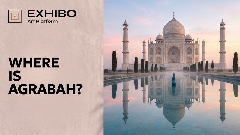
Where Is Agrabah? The City Disney Assembled From Real Places
Agrabah was going to be Baghdad. A war made it fictional — and then Disney built it back out of real places, from a tomb in Agra to a valley in Jordan that usually plays Mars.
The Sultan's palace where Princess Jasmine feels trapped has the silhouette of the Taj Mahal — which is not a palace at all, but a tomb. That is how Agrabah works. Disney's fairy-tale city was going to be Baghdad, until the Gulf War made the name impossible; the studio invented a place that could not be found on a map, then quietly rebuilt it out of real ones — Isfahan and Agra, Marrakesh and Mandalay, a Jordanian desert that has played both Arabia and Mars.
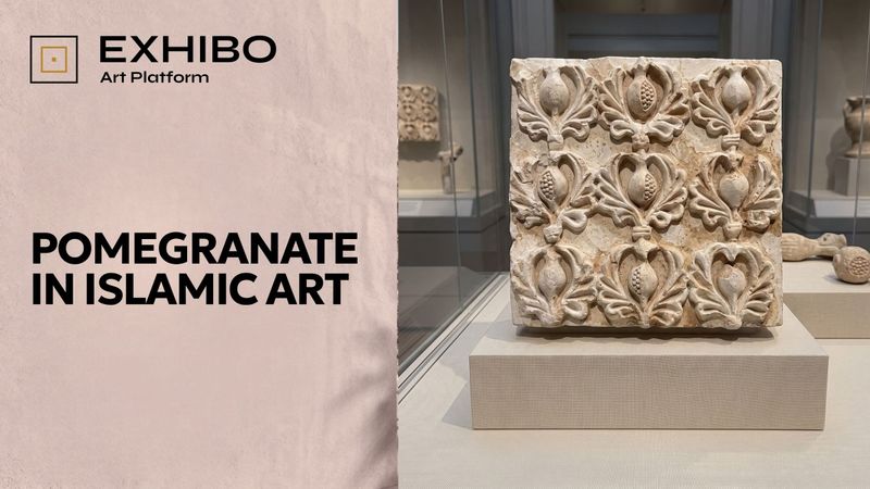
The Fruit We Are Sure We Recognize
How the pomegranate became one of the most confidently named motifs in Islamic ornament — and one of the least confidently identified — across a thousand years of tile, silk and stucco, with meanings we mostly attached later.
A slab of sixth-century plaster in the Met shows a fruit you recognise at a glance: a pomegranate, and surely it means paradise. Hold that certainty up to the light and it dissolves. Across a thousand years of tile, silk and stucco, the pomegranate is the shape we name most confidently and identify least — blurring into the artichoke and the palmette, its meanings attached by later viewers, its very name partly a nineteenth-century invention
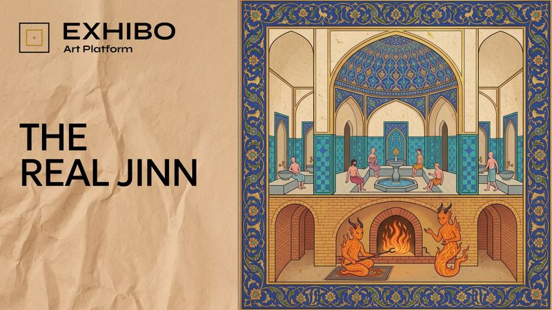
The Real Jinn: How the Middle East Imagined Them Before Disney
Seven kings, one for each day of the week. A portrait of Fever. Two spirits keeping a bathhouse warm. What the manuscripts actually show — and what the lamp replaced.
Folio 35v of a manuscript in Oxford shows the public baths at Tiberias in cutaway. Upstairs, people washing. Downstairs, two jinn tending the furnace, mid-conversation. It is not what most of the world expects — and it is much closer to what the unseen was actually understood to be for. A long read across twelve centuries of manuscripts, fieldwork, survey data and horror cinema.