
Exhibo Editorial
What Is Texture in Art?
Surface quality as an element of art: actual and implied texture, how painters and sculptors build it, and how to name it in front of a work.
Texture in art is the surface quality of a work: how a material would feel if you could touch it, and how a picture or sculpture makes you believe you know that feeling from sight alone. Teachers and museum educators treat it as one of the elements of art, beside line, shape, form, colour, value, and space. The National Gallery of Art in Washington puts it in a short sentence: texture is the look and feel of a surface. BBC Bitesize, writing for AQA GCSE, uses an even shorter one: texture means how something feels. Both point at the same split. Either the surface is physical, or the surface is a visual claim.
You meet that split in every medium. A marble statue has actual texture in the polish of flesh and the roughness of bark. A watercolour of a hare has implied texture in strokes that stand in for fur. A collage has both: pasted cloth you could feel, and printed grain you cannot. This article stays with that distinction. Thick paint as a studio method belongs with a later technique guide. Age cracks in old varnish belong with conservation writing. Here the job is vocabulary: what texture is, how it is made, and how to name it when you stand in front of a work.
What texture in art means
Texture is an element because it organises attention. A smooth field next to a bristling one makes the bristling area read as nearer, richer, or more important. A sculptor can reverse that: a polished cheek next to uncut stone, so the finished flesh feels more present. Designers use the same contrast for function. BBC Bitesize’s Chanel cape of the 1920s pairs slippery chiffon, which slides, with a feather collar, which looks and feels soft. The cape is not a painting, yet the vocabulary is the same.
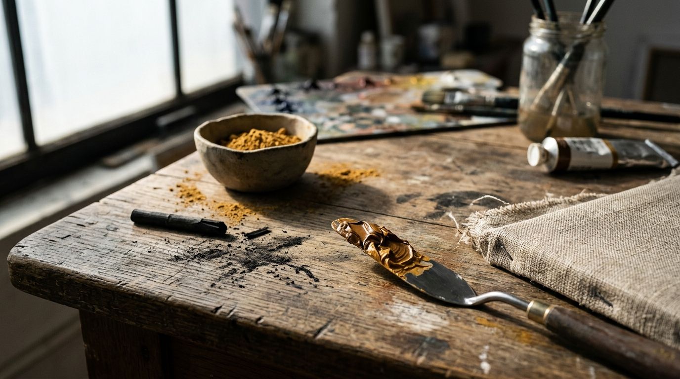
In studio teaching, texture covers two experiences that share a name. Tactile texture (also called actual or physical texture) is the real relief of a surface: ridges of oil, weave of canvas, tooth of paper, grain of wood, nap of fur. Visual texture (also called implied or simulated texture) is the optical stand-in: hatching that reads as hair, stipple that reads as seed-head, glaze that reads as glass. You do not need to touch the object to register either. Gallery rules forbid touching most works. The eye still sorts rough from smooth because light behaves in a predictable way on peaks, pits, and sheen.
The element is not a mood word. “Gritty” as a metaphor for subject matter is not texture. A photograph of a ruined wall has implied texture if the print records plaster and brick; a smooth, high-gloss print of the same wall still depicts roughness. A monochrome drawing of silk can be more “textured” as an illusion than a coarse primed canvas that depicts nothing. Name the surface first, then the subject.
Texture also sits next to two other elements that students often fuse with it. Form is the three-dimensional volume of a thing: cylinder, sphere, block. Texture is the skin of that volume. Value is the scale from light to dark. Painters use value changes to imply texture, because a rough surface breaks light into many small lights and darks. The elements cooperate. They are not synonyms.
How texture works technically
A surface becomes readable as texture when light, material, and mark agree. Conservators and studio teachers describe the same physics from different desks. Light hits a peak and leaves a highlight. It falls into a groove and leaves a shadow. The eye reads that pattern as roughness even when the relief is a fraction of a millimetre. On a flat sheet, the painter copies that pattern with tone and edge. On a carved block, the sculptor cuts the pattern into the stone. On a woven hanging, the weaver builds the pattern as structure.
Scale matters. A canvas weave that vanishes at three metres becomes the whole subject at ten centimetres. Van Eyck’s oak panel in London rewards a nose-to-glass look because the implied textures live in millimetres. An installation of bottle caps by El Anatsui rewards a step back, because the metal tesserae read as cloth from across a hall and as scrap from an arm’s length. You change distance, and the texture category can shift from implied drape to actual hardware.
Actual texture: materials you could feel
Actual texture is the physical fact of the object. Sculpture, ceramics, textiles, and assemblage live here by default. So does any painting whose paint film stands proud of the support. The viewer’s hand is not invited; the eyes still register thickness, polish, and join. Meret Oppenheim’s Object (1936, Museum of Modern Art, New York) is a porcelain cup, saucer, and spoon wrapped in fur. MoMA’s account of the work, and later conservation notes, treat the fur as the point: a domestic set you cannot use without imagining hair in the mouth. The species of the pelt is under review; the artist spoke of Chinese gazelle, and MoMA conservators have questioned that label. The texture claim does not wait on the zoology. Soft animal hair on hard crockery is the work.
Painters produce actual texture whenever the medium keeps a topography. Loaded oil, sand mixed into ground, collage, embroidery on canvas, and impasto all raise the surface. Van Gogh’s Sunflowers (1888, National Gallery, London, NG3863) uses stiff, nineteenth-century tube oil so that seed-heads stand as raised dabs. The Gallery’s own description names those dabs as impasto, from the Italian for dough. How to mix, load, and dry that paint is a technique subject of its own; this series parks the recipe with what is impasto (S2-08). For vocabulary, note only that the National Gallery picture has a tactile crust as well as a depicted flower.
Supports carry texture before the image arrives. Canvas tooth, laid paper, oak grain, and gesso all print through thin paint. Conservators read those facts under raking light. You can do a version of the same thing in a gallery: stand to one side and let light rake the surface. Ridges of brushwork, canvas weave, and later restorations separate from the depicted scene.
Implied texture: marks that stand in for touch
Implied texture is a visual claim on a surface that may be almost flat. Jan van Eyck’s Arnolfini Portrait (1434, National Gallery, London, NG186) is oil on oak, 82 × 59.5 cm. The National Gallery stresses that the pigments are ordinary; the illusion of fur, brass, wood, glass, and dog hair comes from how van Eyck handled them. Technical notes record a thumbprint by the dog’s leg and bristles scratched into wet paint near the hanging brush. Those are tiny actual marks. The fur lining of the robes, the oranges on polished wood, and the convex mirror remain implied: you cannot feel them as fur or brass. You read them because highlights, edges, and colour shifts copy how those materials take light.
Albrecht Dürer’s Young Hare (Feldhase, 1502, Albertina, Vienna, inv. 3073) is watercolour and bodycolour on paper, 25.1 × 22.6 cm. The Albertina’s collection record and later catalogue literature describe a brown wash, then a build of dark and light strokes for the coat, then whiskers and a window catchlight in the eye. The sheet is thin. The fur is an inventory of directional marks. Dürer’s monogram and date sit on the page as if the study were a finished work, which is how the Albertina treats it.
Drawing vocabularies for implied texture are stable: hatching and cross-hatching for grain and weave; stipple for pores and seed; scumble for worn plaster; reserved white for sheen. None of these is a trick unique to one century. Vermeer’s The Milkmaid (c.1660, Rijksmuseum, Amsterdam, SK-A-2344) uses dense, light-catching points on bread crust and basket. The museum’s label notes hundreds of colourful dots where light plays over objects. Those dots are paint, almost flush with the canvas. They function as implied roughness, not as a built crust.
Light, value, and the eye’s shortcut
Texture perception is a lighting problem. A raking source exaggerates relief. A frontal, even source flattens it. Photographers of sculpture know this; so do painters of still life. A pewter jug needs softer, greyer reflections than silver. A loaf needs a broken highlight, not a single specular ping. Those are value decisions that produce a texture reading. The sibling article on value covers the light-to-dark scale as such. Here the point is narrower: small, irregular value changes read as rough; long, smooth value changes read as polished.
Colour can help or mislead. Van Gogh’s yellow-on-yellow Sunflowers still separate petal from seed-head because the marks change direction and thickness, not because hue jumps. A grey drawing of bark can out-texture a coloured but uninflected wash of the same trunk. If you describe a work, name the mark and the light before you name the emotion.
Types of texture: two in the exam, four in the textbook
Search results and classroom posters often promise four types of texture. AQA GCSE, via BBC Bitesize, names two: actual and visual. US foundation textbooks after Ocvirk’s Art Fundamentals split visual texture further into simulated, abstract, and invented. The four-way list is a teaching grid, not a museum classification. Use it when it helps you sort marks. Do not treat it as a law of art history.
Simulated texture (sometimes used as a synonym for implied texture, sometimes as a tighter word) copies a known material: wood grain drawn so you name it as oak, fur painted so you name it as pelt. Trompe-l’oeil painting pushes simulation until the picture pretends to be the thing. Abstract texture keeps a hint of a source but simplifies or exaggerates it: a coat of marks that still say “fur” without counting hairs. Invented texture has no worldly analogue: a pattern that exists only as design, as in some textile repeats and some non-objective painting.
Those extra names overlap. Van Gogh’s seed-heads sit between actual relief and abstract texture of a flower. Anni Albers’s weavings are actual fibre and invented or abstracted pattern at once. If a label in a classroom asks for “four types,” map the work onto the grid and say where it sits on two axes at once. If you write for a museum visit, actual versus implied will carry you further, with simulated as a useful word for virtuoso copy.
| Work | Date | Medium and support | Collection | Dominant texture mode | What to look for |
|---|---|---|---|---|---|
| Jan van Eyck, The Arnolfini Portrait | 1434 | Oil on oak | National Gallery, London | Implied (with tiny actual tool marks) | Fur, brass, wood, glass, dog hair under window light |
| Albrecht Dürer, Young Hare | 1502 | Watercolour and bodycolour on paper | Albertina, Vienna, inv. 3073 | Implied | Directional fur strokes, whiskers, eye catchlight |
| Gian Lorenzo Bernini (workshop), Apollo and Daphne | 1622–1625 | Marble | Galleria Borghese, Rome | Actual, carved to imply many materials | Flesh polish, bark, hair, leaves (Finelli on fine details) |
| Johannes Vermeer, The Milkmaid | c.1660 (catalogues also c.1657–58) | Oil on canvas | Rijksmuseum, Amsterdam | Implied | Dots on bread and basket; still milk stream |
| Vincent van Gogh, Sunflowers | 1888 | Oil on canvas | National Gallery, London (NG3863; on loan 2026) | Actual relief plus implied flower | Raised seed-head dabs; directional petal strokes |
| Meret Oppenheim, Object | 1936 | Fur-covered cup, saucer, spoon | Museum of Modern Art, New York | Actual | Soft pelt on hard porcelain; unusable tea set |
| Anni Albers, weavings such as Ancient Writing | 1936 | Textile | Smithsonian American Art Museum | Actual fibre, designed pattern | Hand-woven surface versus industrial slickness |
| Chris Ofili, No Woman, No Cry | 1998 | Mixed media on canvas, including elephant dung | Tate | Actual collage plus painted surface | Dung supports, glitter, layered media |
Six close readings across periods
Classroom pages on texture tend to list materials (sand, fur, thick paint) without staying with a named work long enough to see how the element behaves. The six readings below keep the object in a collection you can check. They skip a full history of oil, marble, or mixed media. Each one answers a narrower question: what is actual, what is implied, and what the artist asked the eye to do.
Northern oil of the fifteenth century and German watercolour of 1502 show implied texture at a scale that still surprises people used to photographic close-ups. Baroque marble in Rome shows actual texture used as narrative: one stone pretending to be several substances. Dutch genre painting of about 1660 shows implied texture as a theory of light. Late nineteenth-century oil in Arles shows paint as crust. A Surrealist object of 1936 shows actual texture as a joke that still works because the body recoils.
Oil, fur, and the convex mirror: van Eyck and Dürer
Stand in front of NG186 and the first texture lesson is contrast of materials in one small room: the man’s tabard, the woman’s green gown and fur, the brass chandelier, the wooden pattens, the oranges, the terrier, the glass of the mirror. The National Gallery’s film on the picture lists those surfaces in a row and notes that you almost feel you can touch them. That “almost” is the definition of implied texture. Infrared work published by the Gallery shows van Eyck adding the dog, chandelier, and beads late. The famous textures were not all in the first underdrawing. He built the sensory inventory as he went.
The panel is also a record of tools. A thumbprint and scratched bristles are actual. They do not make the painting a relief. They remind you that implied texture is made with the body. Van Eyck bounced the brush, used fingers and handles, and still produced an image that reads as enamel-smooth from a few steps back. Distance flips the category: from across the room the picture is a polished object; from close in it is a field of decisions.
Dürer’s hare is a different contract. No interior, no brass, no narrative props. Fur is the subject. Light from the left, a warm coat, a shadow to the right, a window in the eye that later writers have treated as studio evidence and as a Dürer habit. The debate over live model versus dead specimen does not change the marks. You can count the change of direction around the ears and the chest. That count is how implied texture is taught in drawing rooms: follow the form of the animal (the volume) with strokes that describe the coat (the skin). Form and texture share the page and stay distinct.
Marble that behaves like bark: Bernini’s Apollo and Daphne
Bernini’s group in the Galleria Borghese, commissioned by Cardinal Scipione Borghese and finished in 1625, shows Daphne turning into laurel as Apollo reaches her. Ovid supplies the story. Marble supplies one substance. The sculpture’s texture programme is the conversion: flesh, hair, bark, leaves, roots. Workshop practice matters. Giuliano Finelli, a gifted assistant, worked the finer botanical details, the twigs and leaves from the hands and the blown hair. Historians disagree on how much that assistance should count. The Borghese statue as you see it is a collaboration under Bernini’s design. The texture argument does not require a single chisel.
Walk around the group if the gallery allows the circuit. From Apollo’s side the pursuit is still human: polished muscle, flying drapery. From Daphne’s raised hands the material changes: fingers become twigs, skin becomes bark. The same stone takes a different finish. Polish reads as flesh. A more open, fibrous cutting reads as wood. Hair is a third finish, strands undercut so that light catches edges. This is actual texture used to imply other materials. You could, in theory, feel the difference. You are not allowed to. The eye does the touching.
Compare this with a sanded Neoclassical marble of a century and a half later, where one polish covers the whole figure. The later statue may still have implied texture in carved irises and hair pattern, but the skin of the stone is more uniform. Bernini’s group makes texture a plot point. Daphne’s escape is a change of surface.
Paint as light, paint as crust: Vermeer and Van Gogh
Vermeer’s kitchen in the Rijksmuseum is 45.5 × 41 cm, oil on canvas, dated about 1660 by the museum (some catalogues c.1657–58). A maid pours milk. Bread sits in a basket. A brass pot and a wicker basket hang by the window. The museum stresses stillness except for the stream of milk, and the play of light in coloured dots. The crust of the bread is a textbook implied texture: broken, granular, built from small lights rather than from piled paint. The wicker is a weave drawn in tone. The milk is a continuous ribbon, smoother than the bread, so the two substances separate.
Van Gogh’s London Sunflowers is 92 × 73 cm, oil on canvas, 1888, one of the Arles series made for the Yellow House before Gauguin’s stay. The National Gallery counts fifteen flowers at different stages, from bud to seed. Long strokes follow petals and stems. Small raised dabs imitate bristling seed-heads. The Gallery names the thick application as impasto and ties it to the stiff new tube oils of the nineteenth century. That is actual texture you can see in raking light, plus implied texture of a plant’s life cycle. Do not stop at “he used thick paint.” Name which parts stand up (the discs) and which parts stay as directional strokes (the petals). The method of loading a knife or bristle brush is S2-08. The element of art, here, is the crust you can still see on NG3863, even when the canvas is on loan.
If an old picture shows a network of fine cracks in the paint or varnish, that pattern is a condition of age, not a texture the painter designed. Conservators call it craquelure. A cracked surface can look like a texture, and it does catch light, but it is a different vocabulary.
How contemporary artists use texture
From the 1930s onward, many artists treated actual texture as content rather than as a means to describe fur or bread. Oppenheim’s tea set is the short version of that shift: the object is the texture. Tate’s student guide on texture then follows fibre into the gallery: Anni Albers at the Bauhaus and later, Sheila Hicks’s yarns, Magdalena Abakanowicz’s sisal Abakans, Michael Raedecker’s stitched landscapes, Mrinalini Mukherjee’s knotted forms. Factory smoothness, Albers argued, had dulled touch. Hand weaving put resistance back into the surface.
Mixed-media painting in Britain in the 1990s made collage and unusual supports ordinary on the wall. Chris Ofili’s No Woman, No Cry (1998, Tate) is a memorial image of Doreen Lawrence with elephant dung as a physical support among layers of paint, resin, collage, and glitter. The dung is actual texture and a material with a public argument attached. You can discuss that argument; you can also, as a student of the element, name the surface: lumpy supports, sparkle, a built skin that is not trying to be oil-on-linen illusion.
Fibre, metal, and the wall as cloth
El Anatsui’s wall pieces, shown in museums worldwide, stitch liquor-bottle caps and foil with copper wire into sheets that hang like cloth. From a distance the work has a textile drape: folds, shimmer, a woven field. Close in, each cap is a hard, printed scrap. The texture is actual metal behaving as implied fabric. That double reading is the contemporary version of Bernini’s marble-as-bark, without the myth. Trade, waste, and colonial commodity histories sit in the materials. The element of art is still the surface: rigid units, flexible join, light on foil.
Hicks’s Landing (2014), discussed in Tate’s texture guide, drops pigmented acrylic fibre from ceiling to floor. The pile is sculpture and a parody of poured paint. Mukherjee’s Jauba (Hibiscus) (2000, Tate) knots yarn over a metal frame until plant-like pleats take on volume. In both, texture and form share a sentence. The form is the hanging mass. The texture is the fibre’s tooth and the knot’s ridge. Keep the words apart even when the object fuses them.
Painting that admits the stuff on the support
Painters who scrape, collage, or sew treat the picture as an object with a skin. Raedecker stitches pool-like horizontals into landscape canvases such as spot (1998, Tate), then paints over thread so that some areas roughen. Picasso’s Still Life with Chair Caning (1912, Musée national Picasso-Paris) pastes oilcloth printed with a caning pattern and binds the oval with rope. The printed caning is implied texture supplied by industry. The rope is actual. The joke of Cubist still life is that the element can be bought by the metre.
Anselm Kiefer’s lead, straw, and ash pictures (held across European and American museums; check the label in front of you for the exact work) push actual texture toward landscape as ruin. Straw is straw. Lead is lead. The depicted field and the physical field occupy one plane. That is a late-twentieth-century habit. It does not cancel van Eyck. It answers him: instead of implying brass with oil, attach the stubborn material and let weight and hazard do the talking.
How to identify texture when you look
Start with permission and light. You will not touch the work. You can change your stance. Face the object, then step to one side so that gallery lighting rakes the surface. Actual relief (impasto, collage, weave, polish versus tooth) shows as ridges and sheen. If the surface stays busy to the eye but quiet to imagined touch, you are in implied territory.
Name materials before adjectives. “Oil on oak,” “marble,” “fur on porcelain,” “yarn over a frame” will take you further than “rich” or “tactile” as empty praise. Then name the contrast: fur against porcelain, bark against flesh, seed-head against petal, bottle cap against the drape of the whole sheet. Texture is easier to see as a pair than as a single quality.
Use a short checklist, then stop. One pass is enough.
- Support and medium (panel, canvas, paper, stone, fibre, found object).
- Actual relief: yes, no, or mixed; where on the object.
- Implied materials: which ones, and by what marks (stroke direction, dots, polish, print).
- Light: raking or frontal; what it exaggerates.
- Distance: what vanishes at two metres.
- Neighbour elements: does the texture model form, or sit as a skin on a flat pattern?
Write two sentences, not a paragraph of synonyms. Example: “Vermeer’s bread is implied texture: granular lights on a low film of oil. Van Gogh’s seed-heads are actual dabs that also depict a plant.” If a teacher wants the four-type grid, add one word: simulated, abstract, or invented. If the work is a design object, add function: Chanel’s chiffon has to slide; Oppenheim’s fur cup refuses to.
In a museum, the wall label and the collection site will give medium and date. Cross-check those before you lean on a memory of “thick paint” or “photoreal fur.” Locations move on loan. Van Gogh’s London Sunflowers (NG3863) was on loan to the Philadelphia Museum of Art for Van Gogh’s Sunflowers: A Symphony in Blue and Yellow (6 June–11 October 2026) at the time of writing; the accession still belongs to the National Gallery. For a wider list of collections, use the museums directory.
Common confusions and misuses
Texture is not form. A sphere can be glassy or pitted. The volume is form; the pit is texture. Students who call every 3D effect “texture” lose the word for surface. Point at the contour and the shading that turn the page into a cylinder, then at the marks that make the cylinder look like bark or porcelain.
Texture is not value, though value builds implied texture. A smooth gradient on a cheek is value modelling form. A broken, flickering set of lights on a loaf is value recruited as texture. If you can describe the work as only light and dark without naming a material, you are still on value. If you can name the material the lights suggest, you have crossed into texture.
Texture is not “impasto” as a personality trait. Impasto is a way of putting paint down so that it stays proud. Van Gogh used it; so did many others. A thin, enamel-like van Eyck is full of implied texture and almost empty of impasto. Calling every exciting surface impasto flattens both terms. Leave the studio recipe, the mediums, and the drying problems to what is impasto.
Texture is not craquelure, dirt, or a glare from discoloured varnish. Age and storage write on a painting. Conservators separate original topography from later crackle, abrasion, and discoloured varnish. You can enjoy the look of an old surface and still keep the categories straight.
Texture is not a moral. Rough does not mean honest. Smooth does not mean cold, except in a particular work that argues that. Albers wanted touch back in a slick industrial world; that is her argument, not a law. A polished Bernini flesh is as “worked” as a Kiefer straw field.
“Four types of texture” is a worksheet, not a discovery. Two types (actual, visual) match UK exam boards. Four types add simulated, abstract, and invented as shades of the visual. If an online list adds “invented” and “abstract” without examples, supply your own from a named work or drop the extra labels.
FAQ
These questions repeat the search box and the classroom poster. The answers stay inside the same fence as the rest of the article: actual versus implied surface, named works where a name helps, and a refusal to treat thick paint or age cracks as the whole subject. If you came here from a GCSE list, start with the two-type answer. If a US textbook asked for four types, read the short mapping below and then go back to a work in a collection. Description is a habit of pointing at materials, not a bag of adjectives. Keep form and value in their own sentences when they show up.
What is texture in art in one sentence?
Texture is the surface quality of a work: the way it would feel, or the way marks and light make it look as if it would feel.
What is the difference between actual and implied texture?
Actual (tactile) texture is physical relief or material: fur, weave, carved bark, raised paint. Implied (visual) texture is an optical stand-in on a surface that may be flat: strokes for hair, dots for crust, polish patterns for metal. Many works use both.
What are the four types of texture in art?
Some foundation textbooks list actual, simulated, abstract, and invented. Simulated copies a real material; abstract simplifies a source; invented has no real-world match. UK GCSE materials more often stop at actual and visual. Use the four-way list as a sorting grid, not as a historical sequence.
How do you describe texture in a painting or sculpture?
Name the medium, then the contrast of surfaces, then whether the quality is actual or implied. Prefer material words (wicker, brass, sisal, porcelain) over mood words. Note what changes when you step sideways into raking light.
Is Van Gogh’s thick paint the same thing as texture?
The crust is actual texture. The flowers are also implied by the direction of strokes. Thick paint is one method for making actual texture. It is not the definition of the element; the studio method is what is impasto.
Can a photograph have texture?
The print has actual texture (paper, gloss, pigment load). The image has implied texture if it records surfaces. A glossy print of bark still depicts roughness; the photograph’s own skin may be smooth.
Does texture always make a work more realistic?
No. Oppenheim’s fur cup is less “real” as a tea set because the texture blocks use. Albers’s weavings can be abstract. Texture can describe the world, contradict it, or ignore it.
How is texture different from pattern?
Pattern repeats a motif. Texture is the sensory quality of a surface. A pattern can create implied texture (a drawn weave). A texture can be unpatterned (random crackle, a single polish). If the marks repeat on a grid, say pattern as well as texture.
Texture is a word for skin: of paint, of stone, of fibre, of a depicted orange. Keep actual and implied apart, keep form and value in their own files, and point at a named surface when you use the term. The rest of the elements and principles series will pick up the neighbouring vocabulary.
Related reading
Kiasma Outlines a Robust 2027 Season Featuring Major Surveys and Prize Showcase
Helsinki's Museum of Contemporary Art Kiasma unveils a comprehensive schedule balancing institutional retrospectives, immersive solo projects, and regional award programmes.
The 2027 calendar at Kiasma positions spatial experimentation and critical historiography at the forefront of Nordic contemporary practice.
Ukrainian Museum Celebrates Half-Century With Community-Led Lobby Project
Molly Gochman transforms archive fragments into a projected collage marking five decades of cultural preservation
As the institution turns fifty, an immersive lobby installation invites locals to contribute personal artefacts, weaving private histories into a broader narrative of Ukrainian heritage and resilience.
When Defending Heritage Becomes a Crime: The Arrest of Iraqi Archaeologists
Whistleblowers targeted over corruption claims and controversial investment legislation
Detentions of leading experts raise alarms over censorship, rapid site clearance, and the future of Iraq's archaeological record.