
Exhibo Editorial
What Is Value in Art?
Tonal value is the light-to-dark scale in a picture: how it works, six museum examples, and how to read it by squinting.
In studio language, value is how light or dark a surface, a colour, or a patch of paint appears, from white through a run of greys to black. The Getty Art & Architecture Thesaurus treats this as the relative degree of lightness or darkness given to a surface by the light it reflects. Painters also call it tone. The word does not, in this article, mean price, rarity, or whether a canvas would sell. That other sense of “value” belongs to market writing.
Value is one of the elements of art. Together with line, shape, form, space, colour and texture it is the raw material a maker arranges. Hue tells you red from blue. Chroma, or saturation, tells you how intense that red is. Value tells you whether the same red sits near white, near middle grey, or near black. A yellow lemon and a pale grey wall can share a value. A navy coat and a forest at dusk can share another. If you convert a colour photograph of a painting to greyscale, you are looking at its value structure with the hues stripped out.
What studios mean by value
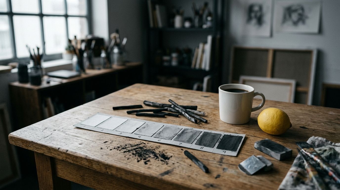
Students meet the term in foundation drawing: a charcoal still life, a nine-step strip from white paper to compressed black, a lecture on “keeping your values organised.” The same idea sits under older workshop habits. A grisaille underpainting is a full picture in greys before colour glazes go on. A tenebrist canvas such as Caravaggio’s The Supper at Emmaus (1601, National Gallery, London, NG172) stages the story by placing a few lit faces against a dark field. Ad Reinhardt’s Abstract Painting (1963, Museum of Modern Art, New York) does the opposite job with almost no range: blacks so close that you wait for your eyes to separate them.
British classrooms often say “tone” where American ones say “value.” Both point at lightness. “Tonal value” is the unambiguous phrase when a search query might mean money. Munsell’s colour system, published in atlas form in 1915, numbered value from 0 (ideal black) to 10 (ideal white), with 5 as a middle grey. Studio strips are coarser: five or nine steps you can mix and match by eye. Photographers inherited a parallel ladder in Ansel Adams and Fred Archer’s Zone System, worked out in the 1930s, with Zone 0 as maximum black in the print and Zone X as paper white.
Value does three practical jobs. It models volume: a sphere turns from highlight through half-tone into core shadow. It sets a key: a high-key picture lives in lights and pale greys; a low-key picture lives in darks. It ranks attention: the eye goes first to the largest jump between light and dark. That jump is contrast, a principle with its own article in this series. The present page stays with the scale itself.
How the value scale works
A scale is a teaching device, not a law of nature. Light in a room is continuous. Pigment on paper is not. You mix a finite set of greys, then decide which of those greys each part of the subject should occupy. The common beginner error is to copy local colour (the “true” colour of an object in even light) and ignore the light that is on it. A white shirt in a cellar can be darker than a navy jacket in sun. The scale trains you to match appearance, not the name of the object.
Studio scales and scientific scales overlap but do not match step for step. A nine-step student strip is even enough for charcoal. Munsell Value is closer to equal perceived steps, which is why conservators and industrial colour matching still use it. CIE Lightness (L*) runs 0 to 100 and tracks Munsell Value at about a factor of ten. You do not need those numbers to read a painting. You do need the idea that equal jumps in pigment mixture are not equal jumps in sensation, and that two hues of identical chroma can still sit far apart on the light-dark axis.
Studio scales from white to black
A typical classroom strip has nine numbered boxes. Box 1 is the white of the paper. Box 9 is as dark as the charcoal or ivory black will go. The middle box is a grey that, held at arm’s length, sits halfway. You fill the intermediates by halving: mix 1 with 5 to get 3, mix 5 with 9 to get 7, then fill 2, 4, 6 and 8. Oil painters build the same ladder with white and a dark (ivory black, raw umber, or a mixed chromatic dark) so they can test a colour mixture by parking a dab next to the strip.
High-key work uses the light half of that strip and keeps the darks scarce. Whistler’s Arrangement in Grey and Black No. 1 (1871, Musée d’Orsay, Paris, 144.3 × 163 cm) lives in mid-greys and blacks, with the white lace cap and handkerchief as the high notes. Low-key work uses the dark half and rations the lights. Caravaggio’s Emmaus canvas keeps most of the field in deep brown-grey; the white cloth, the sleeve, and the lit faces carry the story. A full-range picture, such as Vermeer’s View of Delft (c. 1660–1661, Mauritshuis, The Hague, inv. 92, 96.5 × 115.7 cm), puts bright cloud, dark water, and sunlit masonry on the same panel so the city reads as weather.
Numbering conventions clash. Some teachers call white “10” and black “1,” following Munsell. Others reverse it. Say “lightest” and “darkest” when you write notes in a gallery, and you avoid the quarrel.
Local colour and perceived value
Local colour is the colour you would name if you described the object in a catalogue: a lemon is yellow, a brick is orange-red, a sky is blue. Perceived value is how light that patch looks here, under this illumination, next to these neighbours. Simultaneous contrast shifts both. A mid-grey square on a black field looks lighter than the same grey on white. A yellow that looks loud in isolation can sit at the same value as a pale blue beside it; in greyscale they merge.
Painters exploit that merge. A yellow highlight on a brass ewer can match the value of a white tablecloth and still read as metal because the hue differs. Students who “paint the yellow” too light punch a hole in the form. The correction is to squint until hue drops out, then mix to the grey you see. Photography does the same test in one click: convert the study to greyscale, or view it on a desaturated layer. If the lemon and the cloth become one blob, the values were too close for the job you wanted, or close on purpose.
Albert H. Munsell separated hue, value and chroma so a notation such as 5YR 6/8 names a yellow-red of middle-light value and strong chroma. You can hold value steady and change hue; you can hold hue steady and drop value. Colour theory as a full system belongs elsewhere in this series. The working rule on this page is smaller: two colours that look unrelated can share a value, and two colours that look related can sit far apart on the scale.
Grisaille: pictures built only from value
Grisaille (French gris, grey) is painting in monochrome, most often greys, sometimes browns (brunaille) or greens (verdaille). The Getty AAT and the Fitzwilliam Museum’s terminology record the same core: images in monochrome, used on panel, mural, stained glass, enamel and pottery. The technique has two historical jobs. One is finished work that imitates sculpture, common on the closed wings of Northern altarpieces. The other is an underpainting: a full value map in grey over which the painter lays transparent colour.
On the closed Ghent Altarpiece, dedicated 6 May 1432 in what is now Saint Bavo’s Cathedral, Ghent, Jan van Eyck (completing a work begun with Hubert van Eyck) painted Saints John the Baptist and John the Evangelist as fictive stone statues in niches. The Met’s Heilbrunn essay on the altarpiece treats those panels as a painter’s challenge to sculpted retables. Shadows in the niches follow the chapel light. Colour is withheld so that, on ordinary days when the polyptych stayed shut, the congregation saw stone-coloured saints rather than the jewelled interior. Grisaille here is liturgical pacing as much as trickery.
Italian workshops used grey-and-white painting for illusionistic architecture and for Lenten decorations. Later academies taught grisaille as a way to lock drawing and light before “colouring.” Pierre-Paul Prud’hon’s academy studies and Ingres’s oil sketches still show that habit. Contemporary painters who block in umber or grey before colour are in the same line, even when they skip the French name. S17 in this programme will treat grisaille as a technique in its own right (pending). The point here is that the method is a value problem with hue switched off.
Six works, six value structures
A definition becomes usable when you can point at a named object in a named room. The six examples below run from a fifteenth-century altarpiece to a 1963 square of mixed blacks. Each uses the light-dark scale as the main organising decision. Contrast as a principle, and chiaroscuro as a full modelling method, sit on later pages; what you need here is the map of lights and darks.
Stand far enough back that the picture becomes a pattern of patches. Ask where the lightest light sits, where the darkest dark sits, and how many steps lie between. Then move in. The table after these readings lists the same works with dates, sites and a short note on key (high, middle, low, or compressed).
Van Eyck’s stone-coloured saints and Vermeer’s weather
The Ghent exterior grisailles, already named, are a closed system: grey stone, grey niches, donors in colour on the outer panels so that living patrons and fictive statues occupy different registers. Value does the stone. Hue does the living. When the wings open, Adam and Eve on the interior return to full colour; small grisaille scenes of Cain and Abel sit in the lunettes above them, a second, reduced monochrome world. The Closer to Van Eyck research site, which published the post-restoration photography, labels those John panels as grisaille.
Vermeer’s View of Delft is the opposite economy: full colour, full weather, a value structure you can still read if you squint. The Mauritshuis dates the canvas c. 1660–1661. Three horizontal bands (water, city, sky) carry different keys. The sky holds the lightest lights in the breaking cloud. The water holds dark reflections and a few pale gleams. Sun hits the Nieuwe Kerk tower and a stretch of roof while the left-hand ramparts stay in cloud-shadow. Blue recurs across bands, but the picture coheres because the lights and darks are grouped. Proust’s narrator in In Search of Lost Time stops before this painting; the literary fame is a distraction. The studio lesson is grouping: Vermeer did not sprinkle equal brightness across every brick.
Caravaggio’s tenebrist supper
Michelangelo Merisi da Caravaggio painted The Supper at Emmaus in 1601 for Ciriaco Mattei, after the public success of the Saint Matthew canvases in San Luigi dei Francesi, Rome (the Calling and Martyrdom, contracted 23 July 1599, paid July 1600). The National Gallery’s canvas measures 141 × 196.2 cm, oil on canvas, inventory NG172, presented by Lord Vernon in 1839. Gallery text describes a strong light from the left on Christ’s face and on the disciple at the right, a shadow on the wall behind Christ’s head “almost like a reverse halo,” and an innkeeper whose face stays in shadow.
Tenebrism names the habit of letting darkness occupy most of the field so that a few illuminated forms carry the narrative. It is an extreme use of value, not a synonym for every picture that has a shadow. The Calling of Saint Matthew (1599–1600, still in the Contarelli Chapel) sends a diagonal of light across a tavern table; Levi’s face and the coin-counters’ sleeves catch it, the back wall does not. In London, the Emmaus still life (white cloth, basket on the lip of the table, glass) is as much a value demonstration as the gestures. The cloth is the high-key island. Without it the faces would float. The National Gallery uses the Italian word chiaroscuro for these contrasts of light and shade; the full technique, with its academic descendants, is a separate guide. Here the useful observation is narrower: Caravaggio assigned most of the square metres of canvas to the dark end of the scale and spent the light end on faces, hands and linen.
Whistler’s greys and Reinhardt’s blacks
James McNeill Whistler titled the 1871 portrait of his mother Arrangement in Grey and Black No. 1. The Musée d’Orsay holds it (oil on canvas, 144.3 × 163 cm; painted at 2 Lindsey Row, London). The title is a claim: the picture is a distribution of greys and blacks, and the sitter is the occasion. Anna Whistler’s black dress, the grey wall, the dark curtain and the pale picture-within-the-picture form a limited scale. The white of the lace cap and the handkerchief are placed, not scattered. Viewers who know the canvas only as “Whistler’s Mother” miss the argument. He was organising values the way a printmaker organises a lithographic stone.
Ad Reinhardt’s Abstract Painting of 1963, in MoMA’s collection, is a five-foot square (152.4 × 152.4 cm). MoMA’s entry describes a three-by-three grid that first reads as one black, then separates into reddish-black corners and a cross of bluish and greenish blacks. Reinhardt mixed black oil with small amounts of red, green or blue, let pigment settle, poured off solvent, and brushed a matte film with no highlight. He wanted, in his own list, a painting “timeless, spaceless, changeless.” The Whitney’s related Abstract Painting (1960–1966) makes the same demand: prolonged looking. Museum wall texts disagree on how many black paintings belong in the series; this page names two dated canvases rather than a census. These works are value studies at the threshold of discrimination. They refuse the Caravaggio jump. If you photograph them with on-camera flash you destroy the work, because the flash equalises what the eye was meant to tease apart.
Ansel Adams’s Moonrise, Hernandez, New Mexico (negative 1941; later prints vary) sits with these paintings as a photographic sibling. Adams and Archer’s Zone System gave photographers a vocabulary for placing a metered tone on a chosen step from Zone 0 to Zone X. Public collections hold many prints (MoMA, the Getty, teaching sets such as Texas Tech’s Arrington holdings, and others); there is no single canonical sheet. Different prints from the same Hernandez negative shift how much of the sky goes to near-black and how bright the moon and the graveyard crosses read. Greyscale photography is value with the camera’s meter as the mixing stick.
| Work | Date | Location | Medium | Value strategy | Key |
|---|---|---|---|---|---|
| Jan (and Hubert) van Eyck, Ghent Altarpiece exterior: SS. John | Dedicated 1432 | Saint Bavo’s Cathedral, Ghent | Oil on panel | Grisaille fictive sculpture; chapel light in niches | Mid to light greys, limited darks |
| Caravaggio, The Calling of Saint Matthew | 1599–1600 | San Luigi dei Francesi, Rome | Oil on canvas | Tenebrism: diagonal light on a dark interior | Low key, small high lights |
| Caravaggio, The Supper at Emmaus | 1601 | National Gallery, London (NG172) | Oil on canvas, 141 × 196.2 cm | Lit faces and white cloth against a dark ground | Low key with a high-key still life |
| Johannes Vermeer, View of Delft | c. 1660–1661 | Mauritshuis, The Hague (inv. 92) | Oil on canvas, 96.5 × 115.7 cm | Grouped lights in cloud and sunlit masonry | Full range, weather as key |
| James McNeill Whistler, Arrangement in Grey and Black No. 1 | 1871 | Musée d’Orsay, Paris | Oil on canvas, 144.3 × 163 cm | Restricted greys and blacks; white lace as accent | Low to middle, few lights |
| Ad Reinhardt, Abstract Painting | 1963 | MoMA, New York | Oil on canvas, 152.4 × 152.4 cm | Near-black grid; value at the edge of sight | Compressed darks |
| Ansel Adams, Moonrise, Hernandez, New Mexico | Negative 1941 | Multiple print collections (no single canonical holding) | Gelatin silver print | Zone System placement of sky, moon, graves | Low sky, bright moon; print-dependent |
How contemporary artists use a narrow value range
After Reinhardt, a line of painters and photographers treated a tight band of the scale as the subject. Gerhard Richter’s grey paintings of the 1970s (Grau) scrape and roll a single mid-to-dark register until gesture is almost all that remains. Pierre Soulages named his late work Outrenoir: black as a colour that reflects, so the “value” you see changes as you walk, because gloss and matte catch gallery light in different ways. Vija Celmins’s night skies and ocean drawings (for example the night-sky works in museum collections such as MoMA and the Met) pack graphite into a field that looks empty until the eye finds the stars as value pricks. Hiroshi Sugimoto’s seascape photographs split the print into two greys, water and air, with the horizon as the only seam.
Painters who work with high chroma still have to place it on the scale. Kerry James Marshall has said in interviews that he paints Black figures with a range of blacks so that bodies do not collapse into a single silhouette against a dark ground; the studio problem is discrimination within the low end, the Reinhardt problem with people in it. Luc Tuymans often works high-key, bleaching news images until the mid-tones take over and the darks almost vanish. Neither artist is “about value” as a manifesto. Both make the scale do rhetorical work: Marshall refuses erasure by keeping form inside darkness; Tuymans uses pale values to make a history image feel second-hand.
Digital painters inherit the same axis as a slider labelled Brightness or Value in HSB. The tool is honest. The error is to push saturation and ignore whether the colour still sits on the right step. A neon green at value 8 and a flesh tone at value 8 will fight or fuse depending on the job. Contemporary muralists who work from a greyscale printout of the design are using van Eyck’s logic with a laser printer.
How to identify value when you look
Gallery lighting, phone screens and reproduction all lie. A postcard of the Emmaus canvas lifts the shadows. A phone photograph of a Reinhardt is a black rectangle. The habits below work in a room with the object, and they transfer to your own studies. They do not require a Munsell book. They do require that you stop naming colours for a minute.
Walk the museums directory when you plan a trip; the works in the table above are in public collections, except where a print of Moonrise is the object and the holding varies. In front of a painting, stand back first. The value structure is a large-scale fact. Detail is a late reward.
The squint test
Half-close your eyes until eyelashes blur the surface. Hues weaken. The big light and dark masses remain. You are approximating how a low-pass filter, or a small thumbnail, sees the picture. Ask three questions. Where is the lightest patch? Where is the darkest? Do the lights connect into one family or sit as isolated sparks?
If the lights are scattered, the picture may still succeed (a night sky with stars is scattered on purpose). If you are copying a head and the thumbnail is a speckled mess, the values are chopped. Group them: forehead and cheek in one family, hair and eye socket in another, shirt in a third. Caravaggio groups. Vermeer’s Delft groups by weather. Whistler groups by arranging greys. Reinhardt groups by almost refusing the difference.
A second pass: open your eyes and hunt for a colour that fooled you. Cadmium yellow, a bright red, a clean blue. Squint again. If the yellow is as light as you thought, good. If it dropped into the mid-greys, you were reading chroma as value. That is the most common studio confusion, and it is the reason teachers confiscate the yellow until you can mix a dark yellow.
A greyscale photograph of a colour painting
Take a picture, convert it to greyscale, and look at it beside the painting (or beside a decent colour reproduction if you are at home). The photograph is not the work. It is a check. You will see whether the composition still reads. If the greyscale image is a muddle, the colour was doing structural work that value was not; some pictures rely on hue contrast (a red against a green of equal value). That is a legitimate structure. Know that you are looking at it. If the greyscale image is clearer than the colour one, the painter built a strong value map and then dressed it.
Printmakers live in this check. An etching or a lithograph is a value structure. When a painter translates a coloured sketch into a print, they are forced to decide which reds become dark and which yellows become light. Photography’s Zone System is the same decision with a densitometer. Adams’s later prints of Moonrise often deepen the sky; the moon stays a high zone so the graveyard reads. You can do a cheap version in any image editor: posterise the greyscale to four steps and see whether the four blobs still describe the subject.
Common confusions and misuses
Value and saturation. Saturation (chroma) is intensity, how far a colour sits from grey. A dull olive and a screaming yellow-green can share a value and split on chroma. Students darken a colour by adding black, which drops value and kills chroma, then wonder why the mixture looks dirty. You can darken a yellow with a complementary violet or a transparent brown and keep more hue. The reverse error is to add white to “lighten” a shadow, which raises value and chalks the colour. Shadows are often darker and less chromatic, not paler.
Value and tone. In British teaching, tone often means value. In music, tone means pitch and timbre. In writing about photographs, “tonal range” means the spread from black to white in the print. None of these is moral tone. If an essay says “the painting’s tone is sombre,” ask whether the writer means low-key values or a mood inferred from subject matter. The first claim you can check with a squint. The second is interpretation.
Value and contrast. Contrast is the difference between values (and between hues, textures, scales). A high-contrast picture has a large jump, often light against dark. A low-contrast picture can still have a full, subtle scale, as in Reinhardt or a fog landscape. Treating “more contrast” as a universal upgrade wrecks pictures that need a narrow band. The principle of contrast is the subject of a sibling article; do not inflate every value discussion into a contrast lecture.
Value and chiaroscuro. Chiaroscuro is the Italian workshop word for modelling with light and dark, later a period look. Tenebrism is the more extreme, darkness-heavy branch associated with Caravaggio and his followers. Both are applications of value. The step-by-step method (underdrawing, umber wash, heightening) belongs with technique writing.
Value and money. Auction estimates, insurance figures and “is this painting valuable?” use the same English word for a different question. One sentence is enough: price is not an element of art.
Value and “the values of a culture.” Social or moral “values” in wall labels are a third homonym. They do not live on the Munsell axis.
Misuse in student work follows a pattern. The page is covered, every object is outlined, and every local colour is at full strength, so the picture has no key. The fix is to choose a key first (high, middle, low), then place a few accents at the far end of the scale. Another pattern: outlining the figure in a dark contour that does not exist in the light. The contour is a line habit fighting a value habit. Soften the edge where the form turns toward the light.
High-key, low-key and the middle greys
Key is the part of the scale you live in. Photographers borrowed “high-key” and “low-key” from studio lighting; painters had the idea earlier under other names. A high-key interior (white walls, pale wood, a window) can still contain a black piano; the piano is an accent, not the key. A low-key tavern can still contain a white collar. The collar is the spark.
Middle greys do unglamorous work. They are the half-tones that turn a cheek, the sky that is not the brightest cloud, the ground that lets a dark tree stand. Pictures that skip the middle and jump from white to black look graphic, which is a choice (a woodcut, a tenebrist chapel, a stencil). Pictures that live only in the middle without a dark or a light can look fogbound, which is also a choice (Whistler’s Nocturnes, certain Impressionist envelopes, Tuymans). Name the choice.
When you mix, keep a wet middle grey on the palette as a reference. Park a suspected colour next to it. If your “shadow” is lighter than that grey, you are not in a low-key picture, whatever the subject is called. If your “highlight” is darker than that grey, you are not in a high-key one. The names of objects will argue with you. The grey will not.
FAQ
What is value in art, in one sentence?
Value is how light or dark a colour or a surface appears, on a scale from white to black, separate from which hue it is and separate from what the work would sell for.
What is the difference between tone and value in art?
In most UK art rooms they are the same axis: lightness. American textbooks prefer “value”; British ones often prefer “tone.” Confusion starts when “tone” means mood, or when “tonal painting” means a muted, close-value method rather than the element itself. Ask which scale the speaker is pointing at.
What is a value scale?
A value scale is a stepped strip from white to black, five or nine boxes in a classroom, or Munsell’s 0 to 10 in colour science. You use it to mix and to judge. It is a ruler, not the subject of every picture. Reinhardt’s blacks occupy a sliver of it. Vermeer’s View of Delft occupies most of it.
How do you explain value in art to children?
Give them a grey marker and a yellow one. Ask them to squint at a lemon and a white cup. If both look pale, they share a value even though one is “yellow.” Then ask them to fill a strip from the white of the page to the black of a soft pencil. That strip is the idea. Keep money out of the lesson.
What are some examples of value in art?
Van Eyck’s grisaille saints on the closed Ghent Altarpiece; Caravaggio’s Supper at Emmaus in London and Calling of Saint Matthew in Rome; Vermeer’s View of Delft; Whistler’s Arrangement in Grey and Black No. 1; Reinhardt’s 1963 Abstract Painting at MoMA; Adams’s Moonrise, Hernandez. Each is listed with dates and sites in the table above.
Is tenebrism the same as value?
Tenebrism is a way of using value: most of the picture at the dark end, a few forms lit. Value is the scale those decisions sit on. You can have value without tenebrism (a high-key still life, a grey Reinhardt). You cannot have tenebrism without value.
Why do my colours look wrong even when the hue is right?
The hue can be correct while the value is not. A too-light yellow on a brass pot, a too-dark red in a sunlit brick, a blue sky that is as dark as the trees. Convert a photo of the study to greyscale. If the masses fail, fix value before you buy a new tube.
Does value apply to sculpture and architecture?
Yes. A marble figure is a map of lights and darks created by planes and by the room’s lighting. Architects talk about the same axis when they choose a pale limestone against a dark bronze. The element is not owned by painters. Drawing, print, photography and screen design use it without apology.
Related reading
Kiasma Outlines a Robust 2027 Season Featuring Major Surveys and Prize Showcase
Helsinki's Museum of Contemporary Art Kiasma unveils a comprehensive schedule balancing institutional retrospectives, immersive solo projects, and regional award programmes.
The 2027 calendar at Kiasma positions spatial experimentation and critical historiography at the forefront of Nordic contemporary practice.
Ukrainian Museum Celebrates Half-Century With Community-Led Lobby Project
Molly Gochman transforms archive fragments into a projected collage marking five decades of cultural preservation
As the institution turns fifty, an immersive lobby installation invites locals to contribute personal artefacts, weaving private histories into a broader narrative of Ukrainian heritage and resilience.
When Defending Heritage Becomes a Crime: The Arrest of Iraqi Archaeologists
Whistleblowers targeted over corruption claims and controversial investment legislation
Detentions of leading experts raise alarms over censorship, rapid site clearance, and the future of Iraq's archaeological record.