
Exhibo Editorial
Colour Theory for Artists
Hue, mixing and the colour wheel as studio grammar, read through six named paintings from Titian through to Bridget Riley.
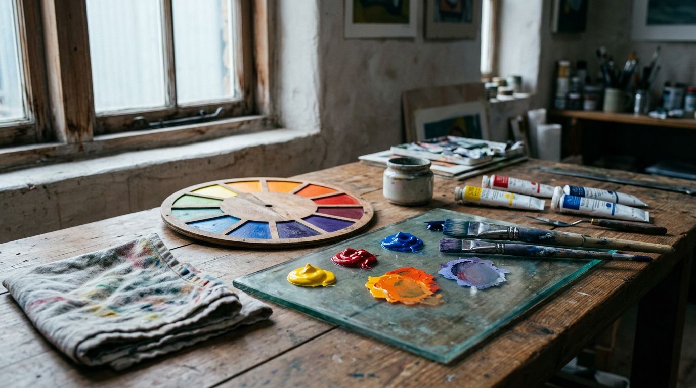
Colour theory in art is the studio grammar of hue: how colours mix, sit next to one another, and organise a picture. Painters and teachers use it to name primaries, to map a colour wheel, and to predict what happens when you place orange against blue or grey a chroma down. The same grammar covers light mixing on a screen (additive) and pigment mixing on a palette (subtractive). It is a tool for looking and making, not a chart of what red “means.”
Hue is the name you give a patch (yellow, blue-green). Value is how light or dark that patch is; that scale has its own page in this series. Chroma, or saturation, is how far the patch sits from grey. Harmony names the usual layouts on a wheel: complementary, analogous, triadic, split-complementary, monochrome. You will meet those terms below with named pictures, not as slogans. Colour as learned meaning (Marian blue, liturgy, imperial purple) already lives in colour symbolism in art. Ultramarine as a crushed stone, a price, and a factory date belongs with pigment history. This page stays with optics, mixing and the wheel.
The cluster map sits at the Elements and Principles of Art hub. Rooms that hold the works named here are listed in the museums directory.
What studios mean by colour theory
Foundation courses still hand out a printed wheel and a lecture on red, yellow and blue. That RYB set is a mixing convention for opaque paint, not a law of physics. You cannot mix those three from other tube colours in a useful way, so teachers call them primaries. Mix two and you get secondaries: orange, green, violet. Mix a primary with a neighbouring secondary and you get tertiaries: yellow-green, blue-green, and so on around a twelve-hue ring. Johannes Itten published that classroom ring as a twelve-hue Farbkreis in 1961, after teaching the Bauhaus preliminary course at Weimar from 1919 to 1922. The ring is a map of relationships, not a picture of light.
Albert H. Munsell split colour into three independent axes so you can hold one still while you change another. His Atlas of the Munsell Color System (1915) numbered value from 0 (ideal black) to 10 (ideal white) and chroma as steps out from a neutral grey. A notation such as 5R 4/14 names a red of middle-dark value and high chroma. Conservators and industrial matching still use that language. You do not need the numbers in a gallery. You do need the habit of asking three questions of any patch: which hue, how light, how intense.
The phrase “colour theory” also covers simultaneous contrast: a grey looks warmer against a cool neighbour and cooler against a warm one; a hue looks more intense beside its complement. Michel-Eugène Chevreul, director of dyeing at the Gobelins tapestry works in Paris, published De la loi du contraste simultané des couleurs in 1839 after weavers complained that blacks looked dull next to certain colours. He showed that the eye supplies the missing complement. Charles Blanc restated the same pairs for painters in Grammaire des arts du dessin (1867). Vincent van Gogh copied those pairs into letters to his brother Theo in 1885. The theory you meet in a YouTube tutorial is still, in large part, Chevreul and Blanc with a Bauhaus diagram on top.
How mixing and looking actually work
Light and paint do not mix by the same arithmetic. Students who treat a monitor like a palette, or a palette like a spotlight, get mud or glare and then blame the tubes. The two systems share names (red, green, blue) and part company as soon as you stack them. Additive mixing starts from darkness and adds light. Subtractive mixing starts from a reflecting ground (paper, primed canvas) and subtracts wavelengths as pigment absorbs them. Digital painters live in the first. Oil, watercolour and most print live in the second. A few studios, James Turrell’s rooms among them, treat coloured light as the material; that is still additive looking, even when the room feels like paint.
You can test both with cheap kit. Three theatre gels over lamps, overlapped on a wall, make white where red, green and blue meet. Three gouache blobs on white paper, overlapped, make a dark near-black where cyan, magenta and yellow meet. The paper experiment is closer to what a printer means by CMYK. The lamp experiment is closer to what a screen means by RGB. Neither is the red-yellow-blue set on the classroom poster. Keep the three systems distinct and mixing arguments get shorter.
Additive light and subtractive paint
Isaac Newton’s Opticks (1704) closed the spectrum into a circle so that the two ends, red and violet, met. He listed seven named bands, including indigo. Painters who quote that list as “the seven primary colours” are quoting optics, not a palette. Van Gogh, writing to Theo about 18 April 1885, already flagged the muddle: Newton’s seven include mixtures; indigo is a variety of blue; the mixing primaries painters accept are yellow, red and blue. The letter is in the Van Gogh Museum’s edition. Use it as a period document, not as a physics textbook.
On a screen, primaries are red, green and blue. Mix red and green light and you get yellow. Mix all three at full strength and you get white. On a palette, mixing those same named hues of paint tends toward brown or grey because each pigment absorbs some of the light the others would reflect. Printers therefore use cyan, magenta and yellow as subtractive primaries, plus black (K) because the three inks never make a clean dark. Painters still keep RYB because cadmiums, cobalts and earths do not behave like process inks, and because the wheel they inherited from Itten and Hölzel is drawn that way. When a tutorial says “primary colours art,” ask which system the speaker is standing in.
Optical mixing is a third case. Small patches of unmixed colour sit side by side. At a distance the eye averages them. Seurat used this in later pointillist pictures and, in a limited way, when he reworked parts of Bathers at Asnières. The orange hat of the boy in the water carries later spots of yellow and blue. You are not mixing on the palette. You are mixing in the looking.
Hue, value and chroma on the same patch
A lemon in sun is high-value yellow of strong chroma. The same lemon in a cellar is still yellow in name (local colour) but darker and often greyer. If you “paint the yellow” at the same lightness as the sunlit version, you punch a hole in the form. What is value in art treats that light-dark scale on its own. Colour theory needs the other two axes in play at the same time. Two complementary hues of equal value and high chroma will vibrate at the boundary: the eye cannot settle. Drop the chroma of one, or shift its value, and the vibration stops. Albers built whole lessons on that adjustment.
Warm and cool are relative, not moral. A cadmium red looks warm next to a rose madder and cool next to an orange. Blue-green can read warm against a colder blue. Temperature is a comparison you make in the picture, not a sticker on the tube. After-images follow the same relativity. Stare at a red square, then look at white paper: a greenish patch appears. Chevreul described the effect as the eye restoring balance. Painters use it when they drop a little of the complement into a shadow instead of reaching for black.
The colour wheel as a map, not a law
A wheel is a flattened diagram of hue relationships. Newton bent a linear spectrum into a circle. Goethe, in Zur Farbenlehre (1810), drew a different ring from perceptual opposites rather than from prism physics; he put yellow and blue as poles and treated red and violet as darkened versions. Chevreul and Blanc placed complements opposite each other so that simultaneous contrast had a picture. Itten’s twelve-hue ring, the one most art schools still photocopy, puts yellow at the top, then yellow-orange, orange, red-orange, red, red-violet, violet, blue-violet, blue, blue-green, green, yellow-green. Complements sit across the centre: yellow opposite violet, red opposite green, blue opposite orange.
The wheel does not tell you which pigments will mix cleanly. A “perfect” green on the diagram may need a blue-leaning yellow and a yellow-leaning blue in the box; two tubes that both look “primary” on the label can still make olive. The wheel also does not tell you how much of each hue to use. Itten listed seven contrast types in The Art of Color (German Kunst der Farbe, 1961), including contrast of hue, of light and dark, of cold and warm, of complements, of saturation, of extension (how much area each hue occupies), and simultaneous contrast. Extension is the one classrooms skip. A small high-chroma complement can balance a large field of a duller hue. Matisse’s red room works that way: blue pattern and green window occupy less area than the red, and the picture still holds.
Treat any printed wheel as a hypothesis. Hold a colour sample against its supposed complement in the actual painting. If the pair does not heighten, the picture is using a different opposition (warm-cool, light-dark) or the pigments have shifted. Do not force the diagram onto a fifteenth-century panel that was mixed from workshop recipes, not from Itten.
Harmony schemes painters actually use
Harmony, in studio English, means a limited set of hue relationships that you can name and repeat. It does not mean “pretty.” A complementary scheme can be harsh. A monochrome scheme can be dull. The names below are planning tools. Painters often break them on purpose once the picture is underway.
A complementary pair sits opposite on the wheel. Analogous hues sit beside one another, usually three or four steps. A triad spaces three hues equally (the RYB triad is the classroom default). Split-complementary takes one hue and the two neighbours of its opposite, which keeps the opposition with less vibration. Monochrome stays inside one hue and plays value and chroma. Tetradic or rectangular schemes use two complementary pairs; they are harder to rank and easier to clutter.
The three-colour rule that People Also Ask still serves is a studio heuristic: limit a painting to a small set of hues so the picture coheres. It is not a law, and it does not explain iconography. Van Gogh’s London Sunflowers is a one-primary picture with a blue line as punctuation. Titian’s Bacchus and Ariadne uses many high-chroma hues, kept apart in large unmixed fields. Both are colour theory. They are different extension problems.
| Scheme | Wheel relationship | What you look for | Named example | Date | Collection |
|---|---|---|---|---|---|
| Complementary (yellow–violet) | Opposites on the wheel | Heightening at the join; artist named the pair | Van Gogh, Irises against lemon yellow (letter 870, 11 May 1890); violets now read bluer | 1890 | Van Gogh Museum, Amsterdam |
| Complementary (orange–blue) | Orange boat against blue water | NG: unmixed paint; pair intensifies | Renoir, The Skiff (La Yole), not Monet | 1875 | National Gallery, London, NG6478 |
| Triadic | Three hues equally spaced | Three families, one usually dominant | Titian, Bacchus and Ariadne: blue field, red sash, yellow drapery among other full-strength hues | 1520–23 | National Gallery, London, NG35 |
| Split-complementary | One hue plus two neighbours of its opposite | Opposition without a single hard pair | Seurat, Bathers at Asnières: orange hat reworked with yellow and blue spots | 1884 (later spots) | National Gallery, London, NG3908 |
| Monochrome / dominant hue | One family, value and chroma vary | A key hue with small counters | Matisse, Red Room (Harmony in Red) | 1908 | Hermitage, St Petersburg |
| Simultaneous contrast (relative hue) | Neighbours change each other’s appearance | Same paint reading as two hues | Albers, Homage to the Square series | from 1950 | Multiple; prints at MoMA |
| Optical mixture | Small unmixed patches average at a distance | Flicker that calms as you step back | Seurat, later pointillist canvases; hat in Bathers | 1884–86 onward | NG3908; Art Institute of Chicago for La Grande Jatte |
Renoir’s The Skiff (NG6478) is the National Gallery’s own comparison when it discusses Seurat’s river: complementary colour used for a leisure subject at the same stretch of the Seine. Do not confuse it with a Monet boating picture; the inventory is Renoir. Monet and Renoir mixed on the canvas in broader strokes. Seurat planned in the studio. The scheme name does not fix the method.
Six pictures, six colour decisions
A definition becomes usable when you can point at an object in a room. The six readings below run from a Ferrarese ducal commission of the 1520s to a 1993 stripe painting in Tate’s collection. Each is a looking problem: where the hues sit, how they mix or refuse to mix, which opposition organises the field. Meaning (friendship in sunflowers, myth in bacchanals) is present in the catalogues. The job here is the grammar. Pigment chemistry (lapis as a rock, synthetic ultramarine after 1826) is a pointer only.
Stand far enough back that the picture becomes a few large hue-shapes. Name the dominant family. Name the strongest opposition. Then move in and see whether those shapes were mixed on the palette, laid in unmixed, or broken into dots. Contrast as a principle, including value contrast, has its own article; keep this walk to hue relationships.
Titian’s unmixed fields and Seurat’s planned river
Titian painted Bacchus and Ariadne in Venice from 1520 or 1522 and finished it at Ferrara early in 1523 for Alfonso I d’Este’s Camerino d’Alabastro. Oil on canvas, 176.5 × 191 cm, National Gallery NG35, bought 1826. The Gallery’s technical account is the one to trust: he used the most vibrant pigments then available in Venice in their purest form, unmixed except with white, in large well-spaced areas at full strength. Ultramarine in the sky is the most intense patch; treat that sentence as a hue claim. The material story of lapis, its cost, and later synthetics sits with pigment history. Azurite in the distant landscape is a slightly greenish blue, so the sky and the hills do not collapse into one name.
The Gallery states that juxtaposition of strongly contrasting colours intensifies them, and that oil-rich glazes give depth, while flesh tones and an ochre tree at upper right unify the field and continue a diagonal toward Ariadne. That is complementary and warm-cool grammar before anyone had drawn Itten’s ring. Titian was not applying 1839 theory. He was spacing high-chroma hues so they heighten rather than cancel, and planting a rusty-brown tree (always intended as ochre, the Gallery says, even in a spring landscape) as a warm counter at the corner. You look at extension and purity, not at a worksheet.
Georges Seurat painted Bathers at Asnières in 1884, oil on canvas, 201 × 300 cm, NG3908. He was not yet 25. The Salon rejected it; he showed it at the Salon des Artistes Indépendants. The National Gallery is explicit that this canvas is not yet the pointillist method of The Channel of Gravelines, though he later reworked parts, including the orange hat with spots of yellow and blue. He used the same colour theories as the Impressionists, the Gallery writes, but planned in the studio from oil sketches and conté drawings. Complementary thinking is already there in the orange-blue hat and in the comparison with Renoir’s The Skiff. Optical mixture is present as a later revision, not as the whole surface. A Sunday on La Grande Jatte (1884–86, Art Institute of Chicago) looks across the same river with a denser dot method. Read Bathers as the moment theory enters the large picture without yet covering every centimetre.
Van Gogh’s yellow key and Matisse’s red field
Van Gogh’s Sunflowers in London (NG3863, 1888, 92.1 × 73 cm, Courtauld Fund 1924) is, in his own phrase to Theo, “a picture all in yellow,” a symphony he had first imagined “in blue and yellow.” Yellow here runs from orange ochre seed-heads to a pale greenish-yellow ground. A thin bright blue line separates ground from table and repeats in the signature on the vase. The National Gallery counts this among the August 1888 group painted for the Yellow House in Arles before Gauguin arrived on 23 October. Fifteen flower-heads sit at different stages; that vanitas reading is the Gallery’s. The colour-theory reading is narrower: one primary family, ranked by value and chroma, with a complementary blue used as a small-extension accent so the yellows do not fuse.
He had already written the complementary pairs out of Blanc. Letter 494 (about 18 April 1885) restates that orange is heightened by blue, violet by yellow, green by red. Letter 536 (about 20 October 1885) applies the same to apples: green and red complementary, a pink as the broken mixture of both, plus simultaneous contrast between foreground and ground. By Arles he could hold a near-monochrome and still think in pairs. Letter 870 (11 May 1890) describes the Saint-Rémy vase of violet irises against lemon yellow, now in the Van Gogh Museum, as “an effect of terribly disparate complementaries that reinforce each other by their opposition.” That sentence is the complementary claim; it is not a wall text for the Getty’s 1889 garden Irises. Use the letters for the grammar. Leave gratitude, friendship and Provençal heat to the catalogues.
Henri Matisse painted Red Room (Harmony in Red) in 1908 in Paris as a decorative panel for Sergey Shchukin’s Moscow dining room. Oil on canvas, about 180 × 220 cm, Hermitage, entered 1948 from the State Museum of New Western Art, originally Shchukin’s. The Hermitage text calls it one of his most important works of 1908–13: raspberry-red fabric with blue pattern takes over wall and table, flattening the room while a window opens onto a green garden. Wikipedia and later accounts add that the panel was shown with a blue (and earlier green) ground and that Matisse changed it to red in 1909; the Hermitage’s public object page dates the work 1908 and describes the red field as the device. Flag the overpaint chronology as a catalogue dispute if you need a wall label. The looking fact is stable: a dominant hue at high extension, blue pattern as a cool counter, green as a complementary glimpse through the window. Harmony here is a title and a method. Space is almost cancelled, then returned by chair, figure and window. That is colour organising the picture plane, not colour standing for a virtue.
Albers’s squares and Riley’s tempo
Josef Albers began the Homage to the Square paintings around 1950, the year he started teaching at Yale, and continued them until his death in 1976. The Brooklyn Museum’s 1957 example is oil on masonite, 18 × 18 in (45.7 × 45.7 cm). MoMA holds the 1962 portfolio Homage to the Square: Ten Works. Nested squares, paint often spread with a palette knife from the tube, margins unequal so some squares seem to drop or recede. Interaction of Color appeared with Yale University Press in 1963 as a silkscreened teaching book after the Black Mountain and Yale courses. Albers’s claim, in the Foundation’s summary, is that colour is relative: you study it in the push of neighbours, not as a fixed chip. The squares are experiments you can repeat. A centre hue that looks lemon on one ground looks ochre on another. That is simultaneous contrast stripped of landscape.
Bridget Riley’s Nataraja (1993, oil on canvas, 165.1 × 227.7 cm, Tate T06859, purchased 1994) puts related hues in diagonal stripes. The title refers to Shiva as cosmic dancer. ACMI, citing Tate, records Riley’s own language of tempo: different tones pitched against a formal movement. You are not decoding a myth on this page. You are watching adjacent hues speed up or slow the eye as width and interval change. Op art of the 1960s had already used black-white flicker; the later colour paintings make the same optical bet with chroma. Stand close and the stripes are separate. Stand back and they mix toward a climate. That is the classroom optical-mixture lesson at mural scale, without Seurat’s figures.
How contemporary artists use the same grammar
Living painters still mix RYB on a glass slab. They also work in RGB, in LEDs, and in rooms where the “paint” is sodium light. The grammar does not change: hue, value, chroma, neighbour, complement, extension. The support does.
Riley’s stripe and rhomboid paintings of the 1980s and 1990s remain the clearest museum demonstration in Britain. Nataraja is one; Tate holds others. The looking task is to notice which hue is the pacemaker (the one that returns most often or at highest chroma) and which pair vibrates. Digital illustrators run the same test with a hue-saturation-lightness panel. James Gurney’s Color and Light (2010), which related searches still attach to this topic, restates Munsell for illustrators: gamut mapping, triads, and the warning that a photograph’s white balance is already a colour decision. You do not need the book to use the idea. Limit the gamut on purpose, then spend chroma where you want the eye.
Installation work makes additive mixing public. Olafur Eliasson’s The Weather Project (Turbine Hall, Tate Modern, 16 October 2003 to 21 March 2004) filled the hall with mono-frequency yellow lamps and a mirrored ceiling, so the space read as a single hue and skin tones collapsed toward a sickly monochrome. Step outside and daylight looked violet-blue for a few seconds: after-image as architecture. That is Chevreul’s restoration idea at the scale of a turbine hall. James Turrell’s Skyspaces (including Deer Shelter Skyspace at Yorkshire Sculpture Park) frame daylight so the sky’s hue and value shift against a painted reveal. Colour here is light arriving, which is still theory: simultaneous contrast between aperture and surround.
Painters who keep to oil often grey a complement into a shadow rather than using tube black, a habit that goes back through Impressionist teaching to Chevreul. Others, after Albers, will place two identical chips in different contexts to prove they no longer match. If you teach, that exercise is still the fastest way to kill the belief that a colour is a property of the pigment alone.
How to identify colour theory when looking
Start at a distance. Squint until detail drops. You should be able to count the main hue-shapes on one hand. Write them down as families (yellows, blue-greens, a red accent), not as objects (sunflower, river, sash). Note which family occupies the most area. That is extension. Note the strongest opposition: complement, warm-cool, or light-dark. If the opposition is mainly light-dark, you have wandered into value; finish that thought on the value page and come back.
Move to middle distance. Ask whether the hues were mixed on the palette (blended edges, dirty secondaries) or left unmixed (Titian’s fields, Van Gogh’s hatched yellows) or broken (Seurat’s later dots, Impressionist commas). Check the boundaries. A vibrating edge usually means two complements of similar value and high chroma. A soft edge may be close hues or a value match across a hue change. Hold a grey card or your closed fist as a neutral if the gallery lighting is warm; museum LEDs shift yellows.
At the rail, if the museum allows, look for a complement dropped into a shadow: a little green in a red drape, a little orange in a blue coat. That is simultaneous contrast used as modelling, not as a scheme for the whole picture. Then step back again and see whether that small note still reads. Colour theory that only works with your nose on the varnish is drawing, not harmony.
A pocket test: photograph the picture, convert a copy to greyscale, and compare. If the design collapses, the picture was relying on hue contrast more than value contrast. If the design holds, hue was extra music on a tonal structure. Neither result is a grade. It tells you which axis the painter spent.
Common confusions and misuses
The usual error is to treat a classroom wheel as a decoder ring for every century. Titian did not mix from Itten. Medieval workshops mixed from recipes and cost. You can still describe their oppositions in modern terms if you say you are translating.
The second error is to confuse colour theory with colour symbolism. A complementary pair can organise a Virgin and Child; the theology of blue is a different argument, already written. A third is to confuse hue with pigment history: calling a sky “ultramarine” names a material family. On this page you care that it is a high-chroma blue set against ochre and red, and that Titian kept it unmixed. How the stone was mined, and when the French process replaced it, is S18.
Primaries are not one set. “What three colors cannot be mixed together?” in American People Also Ask wants RYB. Printers will answer CMY. Lighting designers will answer RGB. All three answers are right inside their system. “What are the 7 types of color theory?” wants Itten’s seven contrasts; it is a poor question (they are types of contrast, not seven theories) but you can answer it as a Bauhaus list.
Mixing complements to make a dark is useful; mixing them in equal high-chroma piles to make a “neutral” often makes mud, then a student adds white and gets a dead pastel. Grey a complement gradually, or use an earth. Black is a hue with near-zero chroma, not an absence; mixing it into yellow makes a dull green, which surprises anyone who thought black was neutral.
Van Gogh did use colour theory. The letters name complements, broken tones and simultaneous contrast years before Arles. He also ignored the wheel when a “symphony in yellow” served the picture. Theory is a set of predictions. The painting decides whether to take them.
FAQ
What is color theory in art?
Color theory in art is the studio grammar of hue: how colors mix, how they change beside neighbours, and how limited schemes (complementary, analogous, triadic, monochrome) organise a picture. It covers additive light (RGB) and subtractive paint (RYB and CMYK). It does not, on this page, mean the cultural meanings of a color. Those sit with colour symbolism in art.
What is the 3 color rule in art?
The three-color rule is a teaching tip: limit a painting to about three hue families so the surface coheres. Van Gogh’s London Sunflowers is a stricter version, a picture almost all in yellow with a blue accent. The rule is a harmony heuristic. It does not explain liturgical color or Marian blue.
What are the 7 types of color theory?
Search results recycle Johannes Itten’s seven contrast types from The Art of Color (1961): contrast of hue, of light and dark, of cold and warm, of complements, of saturation, of extension, and simultaneous contrast. They are seven ways two patches can differ, not seven separate sciences. Light and dark is value; this series treats that scale in what is value in art.
What three colors cannot be mixed together?
In the red-yellow-blue (RYB) paint convention, those three primaries cannot be mixed from other tube colors in a useful way, which is why classrooms call them primary colors in art. On a screen the unmixable set is red, green and blue light. In process printing it is cyan, magenta and yellow. Name the system before you name the three.
Did Van Gogh use color theory?
Yes. In 1885 he wrote out complementary pairs and simultaneous contrast after Charles Blanc, and he applied them to still life (apples: red and green, plus a broken pink). In Arles he also painted near-monochrome yellow Sunflowers. In May 1890 he described the yellow-ground Irises (Van Gogh Museum) as disparate complementaries that reinforce each other. He used the theory and he overrode it when a single-hue key did more work.
How is a color wheel different from pigment history?
A color wheel maps hue relationships (opposites, neighbours, triads). Pigment history maps materials: what the color is made from, when a recipe changed, how it fades. Ultramarine as a blue field in Titian is a wheel-and-extension fact. Ultramarine as lapis or as a nineteenth-century synthetic is a material fact. Keep the two jobs apart.
Why do American and British pages spell color and colour differently?
American English uses color, color wheel, color theory, primary colors. British English, including this site, uses colour, colour wheel, colour theory, primary colours. The studio facts are the same. If you searched “color theory in art,” you are in the right article.
For the cluster map, the Elements and Principles of Art hub. For tonal scale, what is value in art. For meaning rather than mixing, colour symbolism in art. For rooms that hold Titian, Seurat, Van Gogh and Riley, the museums directory.
Related reading
Ana Vaz: The Camera is the Body at Mudam Luxembourg
Mudam stages the inaugural major institutional survey of the Brazilian filmmaker's interdisciplinary practice
An immersive exhibition reimagines cinematic perception through embodied filmmaking, ecological inquiry, and postcolonial critique.
Lovis Corinth: Then Came Berlin!
How a mid-life relocation ignited a German modernist revolution
An expansive survey at the Berlinische Galerie traces how Lovis Corinth's 1901 move transformed him into a cornerstone of early twentieth-century avant-garde practice.

Bridging Japanese Craftsmanship and Contemporary Design
How international makers engage with Tokai's industrial heritage at the V&A
An exploration of how global designers collaborate with Japanese artisans to fuse ancestral techniques with modern conceptual frameworks.