
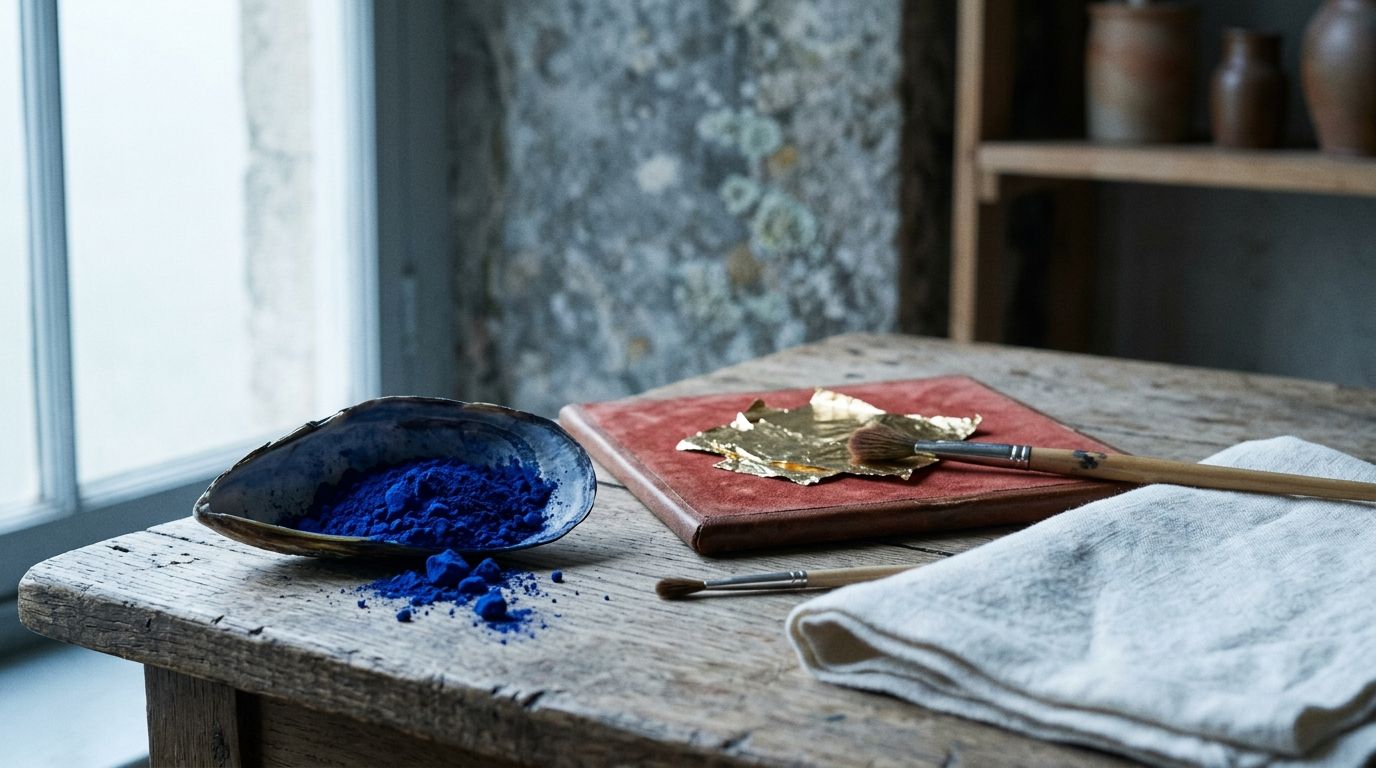
Exhibo Editorial
Colour Symbolism in Art History
Marian blue, imperial purple, gold ground and modernist hues as dated Western conventions you can check against named museum works.
Colour symbolism in Western art history is the use of hue as a conventional sign: a colour a period viewer could attach to a person, a feast, an office or a world. It is a branch of iconography. Blue on the Virgin in a late-medieval panel is a type, like a lily or an open book. The same blue on Titian’s Ariadne is splendour and cold mass against warm flesh. You read the colour the way you read an attribute: by date, by garment, by who paid for it, and by the other signs in the picture.
Hue, value and saturation as grammar belong with colour theory (pending). Lapis, azurite and synthetic ultramarine as materials belong with pigment history (pending). This guide stays with meaning in the Western canon: gold as uncreated light, purple as imperial office, liturgical vestment colours, Marian blue, and the later codes of Malevich, Klein and Rothko. The method sits with the iconography guide. Full Christian types sit with Christian iconography. The cluster map is Genres & Symbolism in Art. Collections that hold the works named below are listed in the museums directory.
What colour symbolism names
Search results treat colour symbolism as a mood chart. Red equals passion. Blue equals calm. Those lists mix art therapy, branding and greeting-card habit. They do not tell you why a fourteenth-century king paid for eleven angels in ultramarine, or why a Byzantine emperor wears a purple chlamys with a gold halo in a mosaic of 547.
In this article colour symbolism means a shared, dated agreement about what a hue does in a picture. The agreement can rest on liturgy (white for Easter, red for a martyr), on sumptuary law (purple reserved for the emperor), on workshop practice (the Virgin’s mantle in the most costly blue), or on an artist’s published programme (Klein’s claim that blue has no dimensions). The agreement can also fail. A later viewer who has never seen a missal will still feel the punch of a saturated blue. Feeling is not the same as a recoverable convention.
Michel Pastoureau’s Blue: The History of a Color (French 2000; English Princeton, 2001) is the baseline social history for Europe. He tracks blue from a minor, even undervalued, hue in early medieval ranking, through its rise with the Virgin’s cult and with royal dress in France, into modern associations that museums still inherit. He is a historian of heraldry and costume, not a psychologist. Use him for dates and ranks. Do not use him as a dictionary of eternal meanings.
Tate’s glossary treats colour as both a physical property of paint and a carrier of association. The useful split for a gallery visit is this. First name the hue you see (and whether varnish, dirt or fading has shifted it). Then ask whether that hue, in this garment or this ground, belonged to a named type in the decade of the work. Then stop. A third-layer meditation on “what blue says about us” is optional, and it is the layer that blogs invent first.
How a colour becomes a convention
A colour becomes a sign when people repeat it in the same job until a viewer can name the job. Workshops, courts and churches did that work. Painters did not invent Marian blue in a studio epiphany. They inherited a ranking of materials, a calendar of vestments, and contracts that named the dear pigments by the ounce.
Cennino Cennini’s Il Libro dell’Arte, written around 1400, calls ultramarine “a colour illustrious, beautiful, and most perfect, beyond all other colours.” He is ranking a material. Patrons heard the ranking as theology and as display. National Gallery wall text on Sassoferrato’s The Virgin in Prayer (1640–50, NG200) still leads with expense: the blue is ultramarine, “the most expensive of blue pigments.” Expense is not a side note. In a culture that reserved the best stuff for the highest figure, the best blue was the meaning.
The same logic governs gold. In Byzantine mosaic and in medieval panel painting a gold ground stands for a light other than sunlight: the uncreated brightness of the divine. Figures stand in that light rather than in a room. Once painters of the fifteenth century put Mary in a Tuscan street, gold retreated to haloes, orphreys and punchwork. The meaning moved with the job.
Contracts, cost and who wears the hue
Renaissance contracts in Italy often specified ultramarine and gold as extras, paid by the patron on top of the painter’s fee. The National Gallery’s colour stories on ultramarine record that the best grades could cost more than gold, and that patrons named the quantity they would fund. Pierre Mignard’s The Marquise de Seignelay and Two of her Sons (1691, NG2967) uses a large field of high-grade ultramarine on a living woman’s robe so that rank, not sanctity, is the first reading. The hue has jumped office. The convention (costly blue equals highest status) remains.
Titian’s Bacchus and Ariadne (1520–23, NG35), painted for Alfonso d’Este’s camerino in Ferrara, spreads ultramarine across sky, sea and Ariadne’s cloak. Gallery text notes that the pigment was on the order of a hundred times more expensive than others in the box, used at full strength, unmixed except with white. The job is a ducal boast and a colourist’s structure: a cold triangle of blue against a warm, moving rout of bacchants. If you file every expensive blue under “Virgin,” you have missed the picture.
Cost can also fake a convention. Azurite, a copper carbonate, looks blue and cost less. Painters used it for skies, linings and underlayers. Conservators distinguish the two; viewers in the nave often did not. A faded azurite that has gone greenish is a materials problem. Do not build a symbolic reading on a colour that chemistry has altered until you have checked the technical literature. That literature belongs with pigment history. The looking rule here is modest: if the blue looks wrong for its job, ask whether the job or the paint has changed.
Liturgical colours as a public code
Western church colour is a calendar you can still watch on Sunday. Pope Innocent III, writing De sacro altaris mysterio around 1195 before his election, listed white, red, green and black as the principal colours of the Roman see, with violet in occasional use. Guillaume Durand’s Rationale divinorum officiorum in the thirteenth century spread that scheme. The present General Instruction of the Roman Missal (no. 346) keeps white, red, green, violet and, where custom holds, rose on Gaudete and Laetare Sundays; gold or silver cloth may stand in for white, red or green on solemn days, not for penitential violet or black.
White marks Christmas, Easter, the Virgin (except where local custom differs), angels and saints who were not martyrs. Red marks Palm Sunday, Good Friday, Pentecost, apostles and martyrs: blood and fire. Green marks Ordinary Time. Violet marks Advent and Lent. Black remains available for the dead in some dioceses; white is now common at funerals because it points to resurrection. Rose interrupts penance with a permitted joy.
Painters of altarpieces lived inside that calendar. A Magdalene in red is not “passionate” in the magazine sense; she can be a witness of the Passion or a figure whose attribute is a red robe in a local type. A deacon in a mosaic who wears a gold dalmatic is dressed for liturgy, not for a colour-wheel exercise. Full saint-by-saint dress codes belong with Christian iconography. The point for colour symbolism is narrower: the Church published a hue-to-feast map, and painters used it.
Imperial purple sits beside liturgy rather than inside it. Roman magistrates wore the toga praetexta with a purple border; a triumphator wore the toga picta, purple with gold. By late antiquity the all-purple garment belonged to the emperor. Byzantine usage tightened the privilege. A child born to a reigning emperor in the porphyry chamber of the Great Palace was porphyrogennetos, “born in the purple.” The stone and the dye share a name and a job: they mark office that is not to be borrowed.
A field guide to Western colour jobs
The table below is a working list of jobs, not a mood dictionary. Each row names a convention, a period in which it is secure, a work you can check, and a reading that fails. Dates and locations follow current collection pages at the time of writing; confirm before you travel.
| Hue / material | Conventional job in Western art | Secure period (approx.) | Named work (collection) | Failed reading |
|---|---|---|---|---|
| Gold ground (leaf, tesserae) | Uncreated / heavenly light; no earthly weather | Byzantine mosaic; medieval panel | Wilton Diptych, c.1395–99, NG4451, National Gallery, London | “The painter could not do landscape” |
| Ultramarine on the Virgin | Highest honour; Marian type | Later Middle Ages into Baroque | Sassoferrato, The Virgin in Prayer, 1640–50, NG200 | “Blue equals calm” |
| Ultramarine as field (sky, cloak) | Costly splendour; cold mass in a colour structure | High Renaissance Venice | Titian, Bacchus and Ariadne, 1520–23, NG35 | “Ariadne is a Madonna” |
| Imperial purple (office; mosaic glass, not murex) | Emperor, court, porphyrogennetos | Late Roman; Byzantine | Justinian panel, San Vitale, Ravenna, mosaic completed 547 | “The tesserae are Tyrian dye” / “Purple equals creativity” |
| Liturgical red | Martyrdom, Passion, Pentecost fire | Roman rite from Innocent III onward | Vestment colour; many martyr altarpieces | “Red equals romance” |
| Liturgical white / gold cloth | Feast, purity, resurrection, solemnity | Same | Easter and Marian altarpieces | “White equals emptiness” |
| Liturgical violet | Advent, Lent, penance | Regular from 13th century | Advent and Lenten imagery | “Violet equals imperial purple” |
| Black square / black field | Zero of form; end of depiction (modernist code) | 1915 onward | Malevich, Black Square, 1915, Tretyakov Gallery, Moscow | “Black equals mourning only” |
| International Klein Blue | Immaterial; colour as the work | 1957–62 | Klein, IKB 3, 1960, Centre Pompidou, Paris | “Klein patented a colour” |
| Maroon / black (Rothko late) | Contemplative enclosure; chapel scale | 1958–70 | Rothko, Black on Maroon, 1959, Tate | “Red equals energy” |
Read across before you read down. Ultramarine does two different jobs in two National Gallery rooms. Purple in a Byzantine mosaic and violet in a Lenten chasuble are neighbours on a colour wheel and strangers in a code.
Six works, six jobs for colour
The six readings below are second-layer iconography: hue attached to a type in a dated object. Each work is in a public collection or a standing church, so you can test the claim against a label and a surface. Stand in front of the object if you can. Photographs flatten gold, compress ultramarine, and hide the angle of tesserae. You name the work, the date, the inventory or site, the hue’s job, and the source that makes the job checkable. Emotion can wait. If a catalogue hedges, you hedge. Chemistry of the stone waits for the pigments series; a full saint-by-saint wardrobe waits for Christian iconography.
Gold and Marian blue: San Vitale, the Wilton Diptych, Giotto’s vault
The Justinian panel in the Basilica of San Vitale, Ravenna, belongs to the mosaic campaign completed for the consecration in 547. The emperor stands at the centre of a processional group, clergy to one side, soldiers to the other, wearing a purple chlamys and a gold halo. Ernst Kantorowicz, in The King’s Two Bodies, treated such imperial haloes as a visual theology of office: the person of the ruler and the dignity of rule. The purple is the dignity you can see: office, not a sample of murex dye. The tesserae are glass (with gold leaf in the surrounding field), set to catch candlelight. A Tyrian silk would have been another object in another room. Theodora, opposite, wears the same privilege. Gold tesserae around them do the heavenly-light job of a gold ground. The figures do not stand in Ravenna weather. They stand in a brightness that mosaicists set at slight angles so candlelight would move.
The Wilton Diptych (National Gallery, NG4451) was made for Richard II, probably in the last five years of his reign (he ruled 1377–1399). Inner faces: the king presented by Edmund, Edward the Confessor and John the Baptist to the Virgin and Child, who stand in a flowery meadow among eleven angels. The National Gallery’s 2024 catalogue entry records egg tempera, water gilding over bole, punchwork, and natural ultramarine used not only for the Virgin but for all eleven angels and for Saint Edmund’s robe. Blue here is a heavenly livery. The angels also wear Richard’s white-hart badge. Colour and heraldry lock together: the court of heaven wears the king’s device, and the king kneels as if England were the Virgin’s dowry. Gold is the ground of both wings. It is not a backdrop you are meant to look through.
Giotto’s Scrovegni Chapel in Padua, frescoed about 1303–1305, turns the barrel vault into a deep blue heaven scattered with gold stars and medallions. Conservation literature treats much of that blue as azurite, a fresco-friendly copper pigment, rather than as the ultramarine of panel painting. The meaning does not wait on the mineral. The vault is the eighth day, eternity, against which the narrative tiers of Joachim, Mary and Christ unfold. If you come for “lapis skies,” you have arrived with a materials story. The chapel offers a colour-as-world: blue as the place where time is not.
Titian’s ultramarine without Mary
Bacchus and Ariadne hangs among mythologies, not altarpieces. Titian painted it in 1520–23 for Alfonso I d’Este. Ariadne, abandoned by Theseus, turns as Bacchus leaps from his chariot. The National Gallery describes a deliberate separation of pigments: ultramarine in the sky and in Ariadne’s drapery; azurite in greener distances; each hue kept at strength in large areas. A 1960s cleaning removed a heavy amber varnish that had taught generations to see “Titian brown.” The shock was the blue.
Joshua Reynolds, lecturing later on the picture, already read the blue as structure: Ariadne’s cloak and the sea supply the cold quantity that lets the warm bacchic group blaze. That is colour as composition, which the theory series will treat as grammar. The symbolism, if the word still fits, is ducal. A Ferrarese prince could afford a sky of the same stuff that clothed the Virgin in older contracts, now spent on Ovid. The jump is the history. Blue did not lose honour. Honour moved to a pagan heroine and a stretch of weather.
Sassoferrato, Malevich, Klein: convention after the Middle Ages
Giovanni Battista Salvi, called Sassoferrato (1609–1685), painted The Virgin in Prayer in the 1640s. Three hues: white headdress, red tunic, ultramarine mantle, against a dark ground. The National Gallery notes that the subject of the Virgin alone at prayer grew with Counter-Reformation private devotion, and that Sassoferrato produced multiple versions. By the mid-seventeenth century the pigment was still dear, but the type was older than the painter. He is not inventing Marian blue. He is delivering it at close range, almost life-size, for a collector’s wall. Victorian restorers later overpainted the mantle with a duller blue to suit period taste; removal of that layer restored the ultramarine. Taste had tried to rewrite the convention. Conservation put the convention back.
Kazimir Malevich (1879–1935) hung Black Square in the 0,10 exhibition in Petrograd in December 1915, in the upper corner that a Russian Orthodox household reserved for the icon. The 1915 canvas is in the Tretyakov Gallery, Moscow (later versions exist; say which you mean). Malevich called the square the “zero of form.” The colour job has changed. Black is not liturgical mourning and not a gold ground’s opposite in a church programme. It is a refusal of depiction, staged with the memory of an icon corner. If you ignore the hanging, you miss half the sign.
Yves Klein (1928–1962) showed eleven ultramarine monochromes in Milan in January 1957 (Proposte monocrome, epoca blu). On 19 May 1960 he registered, with the chemist-colourman Édouard Adam, a Soleau envelope (INPI no. 63471) for a process: ultramarine pigment bound in Rhodopas M so the grains keep their dry intensity. Centre Pompidou’s account is plain: French law does not let anyone own a colour; Klein registered a binder recipe. IKB 3 (1960), one of the large formats, is in the Pompidou. Klein wrote that blue has no dimensions, while other colours drag concrete associations. He is arguing a metaphysics with a can of paint. The argument is the symbolism. The recipe is pigment history.
Gold ground as light
Call a gold ground a style if you must. Call it a theology if you want the period’s own words. Byzantine writers treat light as proceeding from the holy toward the eye. Mosaicists set gold-leaf tesserae off the vertical so that a moving viewer, and moving flame, would see a live surface. The Archaeology Wiki summary of the literature (2012) is blunt: gold in this art stands for the eternal world of God and for divine light. Recent art-historical writing on gold ground, including the survey in the standard reference article on the subject, stresses optical effect over “luxury” as a sufficient explanation. Luxury is real. It is not the whole job.
Panel painters in Italy and the north translated the mosaic idea into leaf on bole, burnished, then punched. The Wilton Diptych’s catalogue describes water gilding, mordant gilding in relief, and sgraffito: paint laid over gold and scraped to let metal return as pattern. Richard’s world and the Virgin’s world share a metal. Difference comes from the meadow, the badges, the barren ground under the kneeling king. Gold does not mean “expensive” in the way a price tag means expensive. It means this scene is not taking place in Wiltshire weather.
George Stubbs’s Whistlejacket (c.1762, NG6569) is a later joke on the convention: a horse on a blank ground, commissioned by the Marquess of Rockingham. The National Gallery and the gold-ground literature both note the possible Byzantine echo and the possible sporting boast. Do not drag Stubbs into a Marian argument. He shows that a gold or empty ground can be revived as a modern stunt once the medieval job is no longer compulsory.
Gold leaf as a craft (how you lay it, how you punch it) belongs with the pigments series. The looking question here is: does the gold replace sky, or does it sit on a halo inside a painted sky? Replacement is the older, stronger sign.
Modernist codes: from Kandinsky’s handbook to Rothko’s room
Once colour leaves narrative, artists write new conventions and publish them. Wassily Kandinsky’s Über das Geistige in der Kunst appeared in December 1911 (dated 1912); Michael T. H. Sadler’s English translation, The Art of Spiritual Harmony (later Concerning the Spiritual in Art), came in 1914. Kandinsky assigns temperatures and directions to hues: yellow as advancing, earthly, aggressive; blue as receding, heavenly, concentric. He is close to a synaesthetic programme. He is also a painter inventing a language for non-objective work. Treat the book as an artist’s manual of 1911, not as a law of vision. The grammar of complements and value contrast still belongs with colour theory. The claim that blue is spiritual is colour symbolism in a new key: the painter as liturgist of his own church.
Malevich’s square, noted above, is the iconoclastic twin of that church. Piet Mondrian’s later restriction to primaries plus black and white is another published code: hue as the end of nature. You do not need to love the metaphysics. You do need to know that the artist issued a rule, so a red rectangle in a 1921 Mondrian is not a martyr’s cloak.
Mark Rothko (1903–1970) accepted a 1958 commission for the Four Seasons restaurant in Mies van der Rohe and Philip Johnson’s Seagram Building, New York. He built a scaffold in the studio to match the room, then darkened the palette to maroon, dark red and black. Tate holds nine of the series, including Black on Maroon (1959). Rothko withdrew from the restaurant job around 1960; he later gave the group to the Tate. He cited Michelangelo’s Laurentian Library in Florence as a model of enclosure, a room whose architecture offers no exit. Colour here is not a saint’s attribute. It is a climate you stand in. The Seagram canvases demand low light and a compact hang. If you see them in a bright white cube, you are looking at a different work.
The Rothko Chapel in Houston, dedicated in 1971 after the artist’s death, pushes the same logic into an actual place of worship without a creed on the wall. Dark canvases face the visitor in an octagon. Colour has become the liturgy.
How contemporary artists still use the old jobs
Living painters who squeeze a tube of synthetic ultramarine are not repeating a fifteenth-century contract. They are working after Klein, after the hardware store, after the photograph. The old jobs survive as quotations.
Klein’s IKB remains in production through Adam’s medium. Artists who use that specific matte ultramarine are citing Klein whether they say so or not. Derek Jarman’s film Blue (1993) holds a Klein-like field on screen while the soundtrack records illness and memory. The hue is a memorial and a refusal of image, closer to Malevich’s zero than to Mary’s mantle.
Anish Kapoor’s powdered pigment sculptures of the 1980s and 1990s (piles and cavities of pure hue) treat colour as a body in the room, not as a coat on a figure. The job is Klein’s immaterial, given weight. Katharina Grosse sprays architectural interiors so that hue ignores the edges of walls and floors. The job is closer to Giotto’s vault than to a vestment: colour as the place you are in.
You will also meet irony. A contemporary Madonna in denim blue is quoting the type and showing that the type is available as costume. A gold-leaf ground behind a smartphone still life is quoting Byzantine light as luxury décor. The quote only works if you know the source. That is why a vocabulary article exists.
If you are looking at new work in a public collection, start with the label for the artist’s own words. Then ask which older job is being reused: mantle, ground, vestment, monochrome, chapel. The museums directory is the practical next step for where to stand.
How to identify colour symbolism when you look
Work in order. Do not start with a chart on your phone.
First, describe. Name the garment, the ground, the sky, the vestment. Note whether gold is leaf, paint, or tesserae. Note whether the blue is a lining, a mantle, or a whole vault. Copy any inscription. If the picture is a pair, read both wings. The Wilton Diptych’s exterior hart and arms tell you the interior blue is courtly as well as heavenly.
Second, date the type. Ask whether this decade had a published convention. Innocent III will not explain a Rothko. Ripa will not explain a Giotto. Cennini will not explain Klein’s Rhodopas. A convention that post-dates the object cannot be the object’s convention.
Third, name the wearer. Blue on Mary, blue on Ariadne, blue on a marquise, blue on a monochrome: four jobs. Purple on Justinian is not violet on a Lenten priest. Red on a martyr is not red on a bacchant.
Fourth, check the object’s own file. Collection pages for NG200, NG35 and NG4451 all lead with materials because materials were meaning. Technical bulletins will tell you if the blue is ultramarine or azurite, if the gold is part-gold, if a Victorian restorer dulled a mantle. Where the file hedges, hedge.
Fifth, look at neighbours. A hue that repeats across a chapel cycle is a programme. A hue that appears once, in a small lining, may be modelling. Giotto’s vault is a programme. A single blue flower in Titian’s foreground is a colourist’s echo, which Reynolds already saw.
Sixth, leave room for grammar. Complementary contrast, value keys and atmospheric recession can explain a colour choice without a symbol. That explanation lives in the colour-theory guide. If the painter needed a cold field against a warm group, you do not owe the field a saint.
Confusions and misuses
Most bad readings come from charts that flatten date, office and grammar into one row labelled “blue.” A student who has memorised “blue = calm, red = passion” will misread the Wilton angels, Titian’s Ariadne and a Lenten vestment in a single afternoon. The rest of the errors come from mixing this page with two siblings: colour theory, which treats hue as grammar, and pigment history, which treats hue as a rock, a lake or a factory date. A third mix-up is the Christian inventory, which belongs on its own page. Keep the jobs separate and the picture gets quieter. The three traps below are the ones search results train you to make.
Charts, psychology and the “three-colour rule”
People Also Ask still serves “What does each color symbolize in art?” and “What is the 3 color rule in art?” The first question wants a list. The honest answer is that each colour symbolises whatever a dated community agreed, and that agreement is local. The second question is a studio heuristic about limiting a palette. It is colour theory. It has no bearing on why Richard II’s angels wear ultramarine.
Art-therapy and branding pages recycle a positive/negative pair for every hue. Feelings exist. They are a poor substitute for a dated type. Medieval yellow can mark jealousy, heresy or a traitor’s robe in some Italian types; it can also be gold’s neighbour in a saint’s dalmatic. Pastoureau tracks those shifts. A blog that prints “yellow = happiness” has not read him.
US searchers will type color symbolism art. The article you are reading uses British spelling in the body. The things named do not change with the spelling. If a US classroom handout is your source, check whether it cites a museum object or a mood wheel.
Pigment stories, Christian lists, and stolen geography
Ultramarine’s journey from a rock to a mantle is a materials narrative. Keep the honour-job here and send the chemistry, the synthetic prize of the 1820s, and the studio recipes to the pigments series. Do not let a paragraph on grinding stone replace a paragraph on who is allowed to wear the result.
Christian iconography will take the lily, the book, the crown of stars, the types of the Virgin. This page takes the blue of the mantle as one attribute among others, and only as an example. A full saint list here would cannibalise that guide.
A third misuse is geographical. Western colour symbolism is not a tour of Maghreb blues, trademarked garden pigments, or dye plants as regional craft. Those stories have their own editorial homes. If a sentence needs a North African material to “complete” blue, cut the sentence. The Western file is already full.
FAQ
What is colour symbolism in art?
It is the use of hue as a conventional, dated sign in a picture: a colour that a period viewer could attach to a person, a feast, an office or a world. In Western painting the secure examples include gold ground as heavenly light, ultramarine as the Virgin’s honour, Tyrian purple as imperial office, and later modernist codes such as Malevich’s black square or Klein’s blue. It is a branch of iconography, not a mood chart.
Is “color symbolism art” the same as “colour symbolism art”?
Yes. US searchers use color; this article uses British colour in the body. The historical conventions do not split by spelling. If you arrived on the US form, you are in the right guide.
Why is the Virgin Mary so often painted blue?
Because later-medieval and Renaissance workshops in Europe treated the best blue, usually natural ultramarine, as the honour due to the highest female figure in the Christian story, and patrons paid for that honour by the ounce. Byzantine empress blue and the cost of the pigment both fed the type. Sassoferrato’s Virgin in Prayer (NG200) shows the type still in force in the seventeenth century. The chemistry of the stone is a different article.
What does gold mean in Western religious art?
On a gold ground it means uncreated or heavenly light, a space without weather. Mosaicists in Ravenna and panel painters of the Wilton Diptych used metal so that figures stand in brightness rather than in a landscape. Gold cloth in liturgy can also mark solemnity, standing in for white, red or green, not for penitential violet. A gold frame on a modern portrait is carpentry, not a gold ground.
What does purple mean in painting?
In Roman and Byzantine art, purple marks imperial office: the toga picta, the emperor’s silk, the porphyry chamber, Justinian’s chlamys at San Vitale (547). The mosaic itself is glass tesserae, not murex-dyed cloth. In the Roman rite, violet or purple marks Advent and Lent. Do not merge the two. A Lenten chasuble is not a claim to the throne.
What is the three-colour rule, and does it explain symbolism?
The three-colour rule is a studio tip: limit a painting to a small set of hues for harmony. It belongs with colour theory. It does not explain Marian blue, imperial purple or a Rothko maroon. Sassoferrato’s red, white and blue Virgin is a liturgical and workshop type, not a palette exercise that happens to look holy.
Did Yves Klein patent International Klein Blue?
No. On 19 May 1960 he registered a Soleau envelope for a process: ultramarine in a Rhodopas binder that keeps the pigment’s dry intensity. Centre Pompidou is explicit that French law does not permit ownership of a colour. The symbolism is Klein’s claim that this blue is immaterial. The paperwork is a recipe.
How do I tell symbolism from ordinary colour composition?
Ask whether a dated community had a name for the hue’s job, and whether this picture uses that job. If Titian needed a cold field against a warm group, Reynolds already gave you a compositional reason. If the same blue is on the Virgin’s mantle in a contract that prices ultramarine, you have a symbol. Many pictures do both. Start with the wearer and the document.
Related reading

Ana Vaz: The Camera is the Body at Mudam Luxembourg
Mudam stages the inaugural major institutional survey of the Brazilian filmmaker's interdisciplinary practice
An immersive exhibition reimagines cinematic perception through embodied filmmaking, ecological inquiry, and postcolonial critique.
Lovis Corinth: Then Came Berlin!
How a mid-life relocation ignited a German modernist revolution
An expansive survey at the Berlinische Galerie traces how Lovis Corinth's 1901 move transformed him into a cornerstone of early twentieth-century avant-garde practice.

Bridging Japanese Craftsmanship and Contemporary Design
How international makers engage with Tokai's industrial heritage at the V&A
An exploration of how global designers collaborate with Japanese artisans to fuse ancestral techniques with modern conceptual frameworks.