
Paris · 13/10/2026
Anish Kapoor
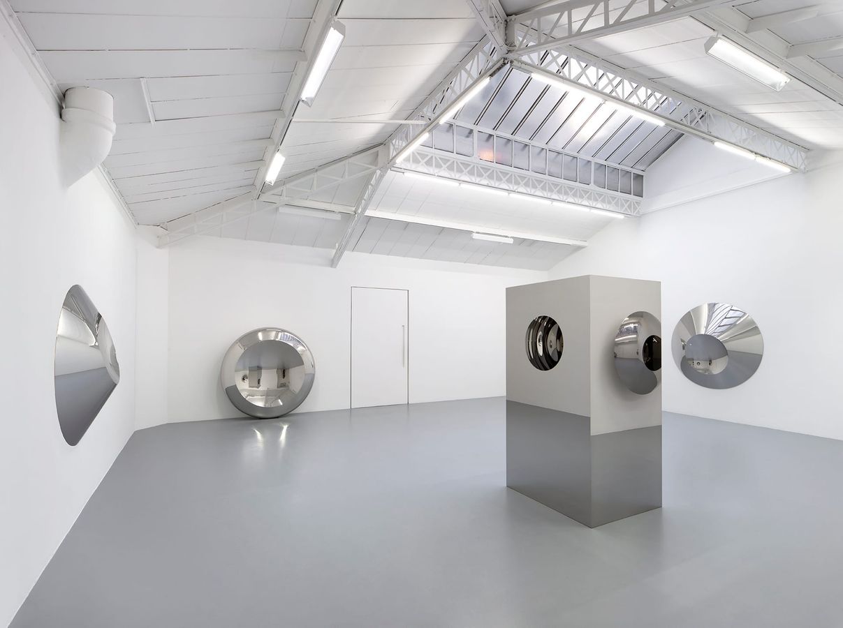
From his early sculptures covered in pigment to cavities whose depth seems endless, from blocks of marble carved to the point of translucency to his reflective surfaces, Anish Kapoor’s work relentlessly explores the instability of perception, blurring the boundaries between solid and void, surface and depth, matter and space. For his fourth solo exhibition with Mennour, Kapoor presents a group of wall-mounted and free-standing sculptures in polished stainless steel made between 1998 and 2026. The arrival of this reflective material in the mid-1990s marked a dizzying turning point in his practice. Kapoor chose polished steel less to make the metal disappear than to assert its materiality; pushed to an extreme degree, he explains, the polished surface ceases to be physical. With the mirror he was able to pursue, by other means, the investigation he had begun with the void. Where the black, pigment-covered cavities seemed to draw the eye into a depth behind the surface, the reflective works move that depth in front of them. Kapoor calls this a “present” space, which he sets against the deep space of the traditional sublime: the space of sculpture is no longer located only behind the plane of the work, but in front of it, exactly where the viewer stands. In this, Kapoor extends and radicalises a line of enquiry that runs through modern sculpture, from Brancusi to Giacometti and Germaine Richier, in which sculpture is no longer understood as a solid, autonomous form but as something that makes the surrounding space tangible. In Kapoor’s work this shift takes a paradoxical turn: the void is no longer just what lies around or between forms – it seems to penetrate the object itself, to be reflected in it, hollowed out and inverted, until the boundary between the sculpture and the space it occupies becomes eminently changeable. At first the sculptures read as autonomous forms with clear, simple contours. As one approaches, however, that autonomy breaks down. The steel visually absorbs everything around it – the architecture, the light, the other works and, finally, the person looking. The sculpture no longer simply occupies space; it contains the shifting image of that space. The mirror becomes less a surface than a spatial device. Following its curve, concave or convex, the world contracts, swells, turns upside down or vanishes. Some forms gather the space in front of them; others seem to open it up. The image can suddenly flip as the viewer passes through the optical focal point of the reflecting surface. Reality remains perfectly recognisable while at the same time becoming unthinkable. In this experience the viewer plays a central role. Before Kapoor’s early works, one could contemplate an object that seemed to recede from the gaze. With the mirrored surfaces, it is no longer possible to remain outside what one is looking at. The body enters the work as an image – but a changeable one: enlarged, fragmented, inverted and, at moments, erased altogether. If, for Marcel Duchamp, it was the lookers who made the pictures, in Kapoor’s work the viewer is fully implicated in the experience of the piece, at once the one who sees and the one who is seen, the subject of the experience as much as an integral part of the image. By drawing the gaze into the work, Kapoor makes it not only an act of perception but a physical experience of space – and of our own presence in the world.
Participants
News by Exhibo
Editorial coverage on Exhibo
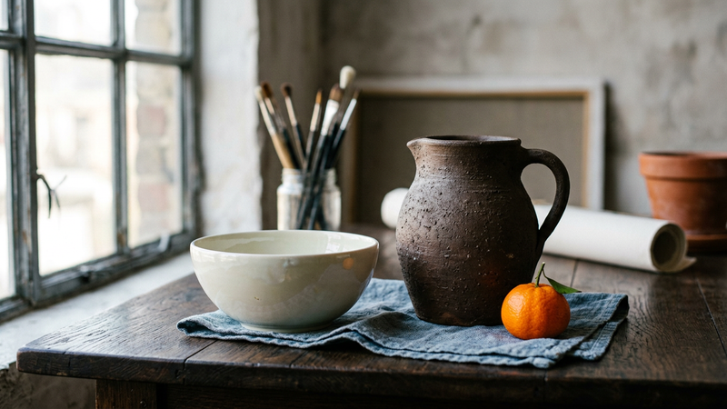
What Is Contrast in Art?
Contrast is organised difference: value, colour, texture and size, with six museum works and a way to read it on the wall.
Contrast names the planned gap between unlike parts of a work. This guide keeps that gap distinct from tonal value, from colour theory, and from chiaroscuro as a lighting method. It maps value, colour, texture and size, and reads six museum works from the Narmer Palette through to Kerry James Marshall.
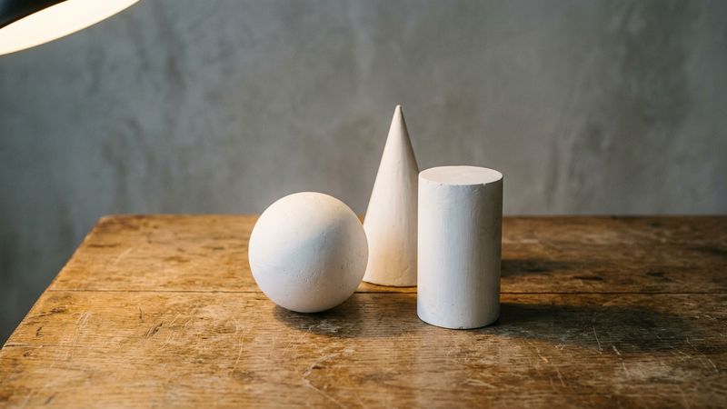
What Is Form in Art?
Three-dimensional volume in sculpture and the illusion of volume on a flat surface: how artists build, imply, and read form.
Form, as an element of art, is volume: length, width, and depth, whether carved in stone or suggested on canvas by light and shade. This guide sets the Getty and Tate senses of the word, works six named objects from a Met kouros to Whiteread’s House, and maps the mix-ups with shape, space, and “art forms.”
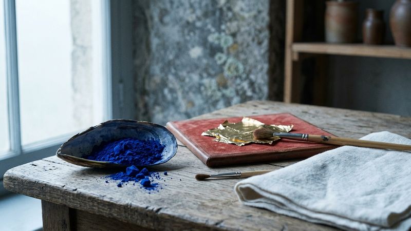
Colour Symbolism in Art History
Marian blue, imperial purple, gold ground and modernist hues as dated Western conventions you can check against named museum works.
Colour symbolism in Western art is a convention you can date: who wears the hue, which feast it marks, whether gold stands for light. This guide reads liturgical codes, Marian blue, Tyrian purple and gold ground through named museum works from San Vitale to Klein, then shows how to test a reading in front of the picture.