
Exhibo Editorial
What Is Space in Art?
Positive and negative space, overlapping and atmospheric depth as looking tools, from tomb painting to installation
Space in art is the area around, between and within the things you see, and the sense of depth a surface can imply. The Getty’s teaching definition is compact: real space is three-dimensional; in a picture, “space” names both the unused parts of the rectangle and the feeling of recession. Positive space is the area occupied by the main objects. Negative space is the area around them. Negative space has shape. Once you notice that, empty wall, sky and interval stop looking like leftovers.
This guide stays with looking vocabulary. You will practise naming overlapping, relative size, placement on the picture plane, and atmospheric (aerial) perspective: distant forms paler, cooler, less contrasted. Construction with a horizon line and vanishing points is a drawing method; it belongs with S17-03 (perspective method), not here. How painters turned outdoor scenery into a market genre is a separate history at landscape painting. How you arrange all of this on a rectangle is composition in art. Space sits among the other building blocks in Elements and Principles of Art.
What space means as an element of art
Classroom lists usually treat space as one of seven elements, alongside line, shape, form, colour, value and texture. The Getty student handout puts it plainly: space is the area between and around objects, and it can also mean the feeling of depth. California-style glossaries add “above” and “within.” Those prepositions matter. A still life occupies space within the canvas. A bronze occupies space in the room. An installation occupies space you walk through. The same word covers all three cases, which is why students mix them up.
Pictorial space is an illusion on a plane. You never enter a Giotto fresco. You read a shallow stage of overlapping bodies and a strip of sky. Actual space is physical. Rachel Whiteread’s House (1993) was a concrete cast of the interior of 193 Grove Road, Bethnal Green. Visitors stood in a park and faced a solid that had once been air. Site-specific work, from Richard Serra’s steel ellipses to James Turrell’s Skyspaces, uses the gallery, the street or the sky as material. The element does not change. The contract with your body does.
Space is not a subject. A painting of planets is still a picture of objects. A painting of an empty field is still organised by intervals, horizons and weather. Outer space as iconography belongs elsewhere. Here the question is how artists distribute occupancy and emptiness, and how they make a flat surface behave as if it had near and far.
Because space is relational, it only appears when you compare. A red disc in the centre of a white square claims positive space. Enlarge the disc and the white becomes a thin frame. Reverse the colours and the disc becomes a hole. M. C. Escher made that reversibility famous in prints, yet the same logic runs through Egyptian wall painting, Japanese woodblock cropping and Matisse’s red studio. You look for which area the artist treats as “figure” and which as “ground,” then you check whether the ground has been given a job.
How space works on a surface and in a room
Artists have a small set of cues for implying depth without building a measured perspective construction. Getty landscape teaching names overlapping (one object in front of another), atmospheric perspective (colour intensity and contrast dropping with distance, often toward blue-grey), and the conventional division of a view into foreground, middle ground and background. Size and vertical placement join those cues: forms higher on many picture planes read as farther away, especially in traditions that stack registers rather than open a window. Colour temperature and edge sharpness do similar work. Warm, hard-edged marks tend to come forward. Cool, soft-edged marks tend to recede. None of these rules is a law of physics. They are habits of looking that painters exploit and, in the twentieth century, refuse.
The table below is a looking checklist, not a ranking of skill. “Deep” does not mean better. Egyptian tomb painters organised information; they did not fail at Alberti’s window. Collections are the usual public homes of the cited works, subject to loans.
| Cue you can name | What you see | Typical effect | Anchor work | Collection |
|---|---|---|---|---|
| Positive / negative occupancy | Subject versus interval, sky, wall or cut-out | Figure/ground; isolation or crowding | Goya, He Can No Longer at the Age of 98, 1819–23 | Getty Museum, Los Angeles |
| Overlapping | One contour interrupted by another | Near/far without measured recession | Nebamun hunting in the marshes, c. 1350 BC | British Museum, London |
| Relative size | Repeated motif larger at the bottom or front | Distance by scale | Giotto, Lamentation, Arena Chapel, c. 1305 | Padua |
| Vertical placement | Farther motifs set higher in the field | Stacked depth; register reading | Chinese and Egyptian pictorial conventions; many landscapes | Multiple |
| Atmospheric (aerial) perspective | Distant forms paler, cooler, less contrasted | Haze as depth | Leonardo, The Virgin of the Rocks, about 1491/2–9 and 1506–8 | National Gallery, London |
| Shallow pictorial space | Little recession; forms pressed to the plane | Pattern, frontality, modern flattening | Matisse, The Red Studio, 1911 | Museum of Modern Art, New York |
| Ambiguous space | Planes that both recede and lock to the surface | Tension between depth and design | Cézanne, Montagne Sainte-Victoire, c. 1887 | Courtauld Gallery, London |
| Actual / cast space | Occupied volume or the air made solid | Body-scale encounter | Whiteread, House, 1993 (destroyed 1994) | Site, Grove Road, London |
Linear perspective, the system of a horizon and vanishing points described in Alberti’s De pictura (1435) and demonstrated in early fifteenth-century Florence, is one more cue among these. You may notice that a tiled floor recedes. You do not need the construction method to name space as an element. That method is fenced to S17-03.
Positive and negative space
Positive space is the occupancy: the hunter, the clock, the steel plate. Negative space is everything that is not that occupancy and still belongs to the work. Getty formal analysis uses Goya’s drawing of an ancient man: the figure and his shadow take the positive area; the surrounding paper is negative; the imbalance makes the man look isolated. The white is not leftover. It is the pressure around him.
Negative space can become the subject. Japanese design and later European modernism treat the interval as a shape you could cut from paper. Henri Matisse’s late cut-outs make that literal: the leftover coloured sheet is as designed as the leaf he kept. In The Red Studio (1911, Museum of Modern Art, New York), MoMA’s wall text notes that furniture and architecture appear as negative gaps in a Venetian-red field, while the paintings and sculptures inside the room keep local colour. The “empty” studio is the red. The artworks are the incidents.
In sculpture, negative space is the air the form displaces and the holes you look through. Henry Moore’s reclining figures and Barbara Hepworth’s pierced stones make the gap a contour. Installation goes further: the path around the object is part of the piece. When you walk a Serra ellipse, the negative space is the corridor your shoulders negotiate. Naming it keeps you from treating the steel as the only sculpture.
Overlapping, scale and atmospheric haze
Overlapping is the oldest depth cue that survives on a wall. If a reed bundle hides part of a bird, the reed is nearer. The British Museum’s Nebamun hunting fragment (late Eighteenth Dynasty, around 1350 BC, Room 61; often cited as EA37977) stacks papyrus, birds, cat and the huge figure of the scribe so that you read layers without a vanishing point. The tomb-chapel itself is lost; the Museum places the findspot in the vicinity of Dra' Abu el-Naga', not a pinpointed shaft. Hierarchical scale does other work: Nebamun is larger because he matters, not because he stands closer. You can hold both facts at once. Overlapping still tells you what sits in front of what.
Giotto’s Lamentation in the Scrovegni (Arena) Chapel, Padua, about 1305, uses overlapping bodies as a stage. Angels crowd the strip of blue. Mourners form a shallow wedge around Christ’s body. The rocky slope closes the right side like a wing. There is little measured distance into the landscape. There is a lot of “in front of.” Art-history teaching often treats this as a step toward later Italian space. For this article the useful observation is the cue itself: interruption of contour equals nearness.
Atmospheric or aerial perspective is a different cue. The National Gallery’s glossary records Leonardo’s observation that colours and tones change with distance because of the atmosphere. Distant darks go blue; contrast drops; edges soften. The Gallery notes that the oil medium suited the gradual shift, that the effect appears in early fifteenth-century Netherlandish painting, and that Alberti described the phenomenon inaccurately in De pictura while Leonardo studied it more thoroughly. Tate’s short definition is the same physics in one sentence: atmosphere looks more blue in the distance. On The Virgin of the Rocks in London (NG1093; about 1491/2–9 and 1506–8, a split campaign, not the older 1483–86 range used for the Louvre panel), the Gallery’s own commentary points to blue, hazy mountains against warm brown rock. You are looking at aerial perspective, not at a tutorial in vanishing points.
Foreground, middle ground and background remain useful labels for many landscapes, provided you treat them as zones of looking rather than as three mandatory shelves. Getty landscape pages ask students to name what sits in each zone and which cues (overlap, haze, size) produce the recession. When a Cézanne mountain locks to the picture plane, those shelves collapse. The vocabulary still helps you say what has collapsed.
The picture plane, shallow space and deep space
The picture plane is the flat surface you are actually looking at: panel, canvas, paper, wall. Every mark sits on it. Pictorial space is the imaginary volume those marks imply. When the two lock together, you speak of shallow space or of forms “on the plane.” When marks imply a long recession, you speak of deep space. Neither is a moral category. They are contracts.
A gold-ground icon keeps saints against a metal field that denies weather and mileage. Overlap of figures and a painted footstool may still give a ledge of near space. A Dutch church interior invites you down a nave. A Colour Field canvas can be almost all plane: stained colour as a shallow atmosphere with no furniture of depth. Hokusai’s wave uses both at once. The foam is a huge shape on the plane; Fuji is a distant cone in a trough.
Search queries ask for “deep space in art” and “shallow space in art” because examination mark schemes like the pair. Use it as a sliding scale, not a binary stamp. Cézanne’s Courtauld mountain sits in the middle: you can name Provence, and you can name the canvas. Matisse’s red studio sits near the shallow end even though it depicts a room. Leonardo’s grotto sits toward the deep end in the far mountains and toward the shallow end in the dark rock that cups the figures like a niche.
Closed and open space, another studio pair, describes whether forms feel boxed (a chapel, a courtyard, a grotto) or exposed (a coast, a piazza, a sky). Decorative or “plastic” space appears in older textbooks for surface pattern versus modelled volume. The related-keyword harvest even turns up “plastic space in art,” at negligible volume. You do not need that taxonomy to look well. Name the plane, name the implied depth, name whether your body could occupy the work.
Six works that make space visible
A definition stays abstract until you test it on a named object in a named room. The six readings below run from a Theban tomb chapel to a London terrace that no longer exists. They are chosen for different spatial contracts, not as a march of progress. Egyptian painters, Giotto, Leonardo, Cézanne, Matisse and Whiteread each make occupancy and emptiness do a different job. You can stand in front of five of them in public collections. The sixth survives in photographs, which is part of its meaning.
Read each work for the cue first, the story second. Iconography will pull you toward hunting, lament, the Immaculate Conception, Provence, the studio myth, housing policy. Those subjects are real. They are not the element. If you can describe the intervals with the table’s terms, you have done the looking this article trains.
Nebamun in the marshes and Giotto’s mourners
The Nebamun fragment in the British Museum shows a hunt that had to function on a tomb wall as both picture and provision for the afterlife. Reeds overlap birds. A cat, painted in a twisted combination of views, grips prey among the stems. Water is a patterned band, not a receding lake. The large standing figure of Nebamun overlaps the smaller world he dominates. Space here is informational and hierarchical. Depth exists as layering and as status. It does not exist as a measurable corridor into the wall.
That is not a deficit. Tomb painting had to keep every attribute readable: fish species, lotus, family, the pose of triumph. A unified optical space would have hidden things. Overlapping still prevents the wall from reading as a flat inventory. You feel thickness in the papyrus even while the water stays a hieroglyph of water.
Giotto, two millennia later in a different theology, still uses overlap as the engine. In the Lamentation, the dead Christ lies parallel to the picture plane. The nearest mourner turns her back, a brown mound that hides part of the group, so you know she is closer than the faces beyond her. The angels overlap one another in the sky like a flock. The setting is a shallow box with a rock wing, not an open country. Students who have been taught that “space” means Renaissance perspective often under-describe this fresco. The space is shallow, crowded and directional. It is still space.
If you visit Padua, stand far enough back to see how the blue vault and the painted chambers share a decorative system, then step in until the Lamentation fills your field. The interval between those two distances is part of how chapel programmes work. The fresco occupies wall. The implied stage occupies only a few metres of imagined depth. Naming both keeps actual architecture and pictorial recession from collapsing into one word.
Leonardo’s haze, Cézanne’s mountain, Matisse’s red
Leonardo’s London Virgin of the Rocks places four figures in a grotto that opens onto distant water and peaks. The National Gallery’s commentary is explicit: he used aerial perspective, painting far mountains blue and softening their edges, and he contrasted that cool distance with warm earth. The figures occupy a dark, damp near space of rock and plants studied with a naturalist’s attention. Behind them, colour loses saturation and contrast. You feel kilometres without counting tiles on a floor.
The same Gallery text separates this haze from sfumato, the softening of edges on flesh. Sfumato models form. Aerial perspective models distance through atmosphere. Keep the two words. They often travel together in Leonardo and they are not synonyms.
Paul Cézanne’s Montagne Sainte-Victoire of about 1887, oil on canvas in the Courtauld Gallery, London, keeps a recognisable Provençal mountain and a large pine while refusing a smooth corridor of air. Patches of colour lock the far ridge to the same surface as the branches. Overlapping still tells you the tree is nearer. Atmospheric cooling is reduced. The mountain does not melt into blue as Leonardo’s peaks do. You get a double reading: a place you could name on a map, and a construction of planes. Ambiguous space is the accurate term. Deep space would under-describe the painting. Flatness would ignore the pine’s overlap.
Henri Matisse’s The Red Studio (Issy-les-Moulineaux, autumn 1911) is a room that has almost ceased to be a room. MoMA records the Venetian red that covers wall, floor and furniture, with architecture and furnishings indicated by negative gaps, and the artist’s own paintings and sculptures retaining colour. A grandfather clock without hands sits on the central axis. Time is suspended; so is conventional recession. The table tilts. The far corner does not behave. Shallow pictorial space here is a decision about what the studio is for: a field in which artworks float, not a box you could measure for a carpenter.
These three pictures show why “creating space” is a poor classroom slogan. Leonardo creates recession by haze. Cézanne creates tension by withholding haze. Matisse creates a spatial idea by flooding occupancy until furniture becomes absence. All three are using the element. None of them is using it the same way.
How later and contemporary artists treat space as material
Twentieth- and twenty-first-century practice did not abandon the looking cues. It often made them the subject. Cubist still lifes shatter overlapping into contradictory planes so that a bottle is both in front of a table and flush with the surface. Mondrian’s grids turn positive and negative into equivalent rectangles; the white is as built as the red. American Colour Field painting can make the whole canvas a shallow coloured atmosphere with no middle ground at all.
Japanese woodblock designers had already treated the picture plane as something you crop. Katsushika Hokusai’s Under the Wave off Kanagawa (c. 1830–32), impressions in the British Museum, the Metropolitan Museum of Art and elsewhere, throws a claw of foam across the upper field so that Mount Fuji sits small in a trough. Overlapping foam, boats and distant cone give depth; the huge empty curl is negative space with a violent contour. European modernists collected such prints. The lesson they took was not “Japan invented space.” It was that interval and crop could carry as much structure as a tiled floor.
Sculpture and installation after 1960 often skip illusion and occupy the room. Richard Serra’s torqued ellipses, shown in configurations at Dia Beacon and elsewhere, are weathered steel volumes you enter. The art is the changing interval between wall and body, the lean of the plate, the sound. James Turrell’s Skyspaces cut an aperture so that the sky becomes a plane in a chamber; light is treated as a spatial filler, not as a way to model objects. You are not decoding overlapping. You are standing in the element.
Rachel Whiteread made negative space concrete. Tate’s Turner Prize notes for 1993 describe her method: casts of the spaces in, under and on everyday objects, using plaster, rubber and resin, materials associated with preparation rather than with the finished bronze. House, commissioned by Artangel, was completed on 25 October 1993 as a life-sized cast of a condemned terraced interior on Grove Road and demolished on 11 January 1994. Artangel’s account emphasises the Bow Neighbourhood votes of 23 November 1993; the earthmover arrived on 11 January. Photographs show bay windows and stairs as solid. The rooms’ air had become the sculpture. Untitled (Stairs) (2001, Tate) continues the logic at museum scale: a cast of stair-void from a former synagogue and warehouse in Bethnal Green. You look at absence given weight.
Digital and virtual work adds another contract. A game environment or a VR installation has measurable coordinates, yet you still read overlapping, scale and atmospheric fog as cues, now scripted by software. The vocabulary does not become obsolete. The maker of the fog pass is doing what landscape painters did with cooler distant hills, at a different desk.
Public museums keep changing how actual space frames pictorial space. If you want to test the difference, walk a sequence of rooms rather than studying a single jpeg. The museums directory is a practical way to find collections where wall, plinth and daylight do part of the work the paintings only imply.
How to identify space when you are looking
Start with occupancy. Name the largest positive shapes. Then name the largest negative shapes: sky, wall, tablecloth, the gap between two figures, the hole in a bronze. Ask which of those negatives has a contour you could trace. If you can trace it, the artist designed it.
Second, hunt overlaps. Every interrupted contour is a depth claim. Count a few. In a crowded history painting you will find dozens. In a Rothko you may find none, which is itself a spatial decision: stacked rectangles hovering in a shallow coloured field.
Third, test atmosphere. Compare the nearest dark with the farthest dark. If the far dark is paler, bluer or softer, aerial perspective is in play. If the far ridge is as hard as the near branch, the painter has refused that cue. Cézanne often refuses it. A Netherlandish landscape often leans on it. Leonardo’s grotto uses both: crisp plants at the figures’ feet, dissolved peaks beyond the cave mouth.
Fourth, judge shallow against deep. Can you imagine walking into the picture for more than a few steps? Saenredam’s church interiors, such as Saint Bavo, Haarlem (1634) at the Getty, invite a long walk down an aisle; Getty teaching uses that canvas as an example of labour toward the illusion of three-dimensional space. Matisse’s studio invites almost no walk. Both are spatially sophisticated. Depth is a choice.
Fifth, separate pictorial from actual. Are you looking at a representation of space, or standing in a constructed one? Whiteread, Serra and Turrell require the second sentence. A painting of a Serra would return you to the first.
Sixth, watch for mixed systems. Many pictures combine hierarchical scale with overlapping, or a flat decorative field with one overlapping still-life object that pops forward. Do not force a single label. Note the mix.
A practical museum habit: before you read the label, spend one minute only on intervals. Cover the “story” with your hand if you must. Students who jump to subject miss that a crucifixion and a picnic can share the same spatial devices. The element is portable across iconography.
Space, composition, form and landscape: neighbouring terms
Space is an element. Composition is the organisation of elements in the work. You compose with space when you decide how much margin a portrait needs, or whether a still life crowds the frame. The sibling composition article owns balance, emphasis, rhythm and the rectangle as a whole. This article owns occupancy, interval and implied depth. If you find yourself talking about the golden section or the rule of thirds, you have crossed into composition. If you are talking about overlap and haze, you are still here.
Form is the three-dimensional character of objects: volume, mass, how light turns a cylinder. Space is the medium those volumes sit in, or the illusion of that medium. A tightly modelled figure in a gold-ground panel has form and very little implied depth. A misty harbour with tiny unmodelled boats has space and little form. Leonardo often gives you both. A colour-field canvas may give you neither in the old sense, only a shallow coloured interval. Keep the sibling form for volume; keep this page for the gaps and the recession.
Landscape is a genre: outdoor scenery as the main subject, with a European market history from Dutch specialists and Roman classicists through Constable and Impressionism. That history lives at landscape painting. Landscape uses space heavily, which is why search pages conflate the two. A portrait uses space too. So does a Greek vase. So does a carpet page. Teaching “space” only through mountains trains you to miss Goya’s empty paper and Matisse’s red.
Open and closed space, deep and shallow, decorative and illusionistic: studio jargon multiplies pairs. Use them if they help a specific picture. Do not treat them as an official taxonomy with eight types you must memorise. Getty and Tate stay closer to negative space, the picture plane, and the two big families of depth cue (linear construction versus atmospheric looking). That is enough for most looking.
Common confusions and misuses
The first confusion is outer space. Search results mix astronomy illustrations with design elements. If the query is “what is space in art,” the classroom meaning is interval and depth, not NASA.
The second is treating negative space as leftover. Beginners fill every gap because emptiness feels unfinished. Goya’s drawing shows the opposite: the blank is the emotion. Graphic designers know this; painters relearn it each generation.
The third is equating space with linear perspective. Measured recession is one European toolkit, theorised in the fifteenth century and still taught in ateliers. Overlapping and aerial haze are older, wider and sufficient for naming the element. A Byzantine icon with gold ground has spatial conventions (hierarchy, overlap of haloes, a shallow ledge). It does not fail a Brunelleschi test it never sat. Construction of vanishing points is S17-03, not a definition of the element.
The fourth is “more depth is more advanced.” Modernist painting spent decades compressing space on purpose. Egyptian, medieval and many Asian systems organise meaning by register and surface. Judging them as failed windows misunderstands the job.
The fifth is mixing space with composition, form or landscape genre, as above. Markers see the words used as synonyms in essays. They are not.
The sixth is calling every pale background “atmospheric perspective.” A faded watercolour, a damaged fresco, or a white studio wall in a photograph may simply be support or loss. Aerial perspective is a gradient tied to implied distance, usually cooler and softer as forms recede. Check whether near forms are sharper and darker. If they are not, use another word.
The seventh is ignoring actual space in museums. A painting hung in a tight corridor behaves differently from the same painting on a long wall. Sculpture dumped against a skirting board loses the negative volume the artist calculated. Curators compose with real space. Viewers who only know jpegs miss that layer.
The eighth is the slogan “draw the space, not the object,” useful in studios, misleading as art history. Many traditions draw the object with complete outlines and still control intervals. The slogan is a looking exercise, not a universal law.
FAQ
What is a simple definition of space in art?
Space is the area around, between and within the components of a work, and the sense of depth a two-dimensional surface can imply. Positive space is occupied by the main forms. Negative space is the shaped emptiness around them. In sculpture and installation the same words name physical volume and the air you move through.
What are clear examples of space in art?
Nebamun’s marsh hunt (British Museum) shows overlapping without measured perspective. Giotto’s Lamentation (Padua) builds a shallow stage of bodies. Leonardo’s Virgin of the Rocks (National Gallery, London) uses aerial haze. Matisse’s The Red Studio (MoMA) turns furniture into negative gaps in red. Whiteread’s House (1993) cast a home’s interior air as solid concrete.
How do artists create a sense of space without a perspective diagram?
They overlap forms, vary size, place distant motifs higher in many traditions, cool and pale the background, soften far edges, and control how much of the field is left empty. Those are looking cues. A measured horizon and vanishing points can join them; they are not required for the element to be present.
What is the “rule of space” people mention?
Popular posts sometimes invent a single rule, often a margin around a moving figure (a cousin of composition’s “lead room” in photography). Museum teaching does not freeze one rule. The durable habits are: design negative shapes; use overlap for near and far; use atmospheric change for distance in air; decide whether the picture is a window, a shallow relief or a flat field.
Is space one of the seven elements of art?
In the widely taught school list, yes, with line, shape, form, colour, value and texture. Getty education materials include space in that list and stress negative space as shaped. Other textbooks add time or omit a term. The list is a teaching convenience. The looking skills remain: occupancy, interval, implied depth.
What is the difference between shallow space and deep space?
Deep pictorial space invites a long imagined recession: distant hills, a nave, a harbour. Shallow space keeps forms near the picture plane, as in much medieval gold-ground painting, many Japanese prints, Matisse interiors and Colour Field canvases. Both can be deliberate. Shallow is not a mistake.
How is space in sculpture different from space in painting?
Painting implies space on a plane. Sculpture occupies actual space and organises the air around and through it. Installation and site-specific work make the room, street or landscape part of the piece. Whiteread’s casts collapse the difference by turning the air of rooms into an object you walk around.
Does atmospheric perspective mean the same as linear perspective?
No. Atmospheric or aerial perspective changes colour, value and clarity with distance, as Leonardo and Netherlandish oil painters exploited. Linear perspective constructs recession with a horizon and vanishing points. Tate and the National Gallery treat them as two families. You can use haze without a tiled floor, and a tiled floor without much haze.
Related reading
Kiasma Outlines a Robust 2027 Season Featuring Major Surveys and Prize Showcase
Helsinki's Museum of Contemporary Art Kiasma unveils a comprehensive schedule balancing institutional retrospectives, immersive solo projects, and regional award programmes.
The 2027 calendar at Kiasma positions spatial experimentation and critical historiography at the forefront of Nordic contemporary practice.
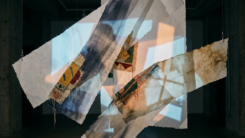
Ukrainian Museum Celebrates Half-Century With Community-Led Lobby Project
Molly Gochman transforms archive fragments into a projected collage marking five decades of cultural preservation
As the institution turns fifty, an immersive lobby installation invites locals to contribute personal artefacts, weaving private histories into a broader narrative of Ukrainian heritage and resilience.
When Defending Heritage Becomes a Crime: The Arrest of Iraqi Archaeologists
Whistleblowers targeted over corruption claims and controversial investment legislation
Detentions of leading experts raise alarms over censorship, rapid site clearance, and the future of Iraq's archaeological record.