
Exhibo Editorial
What Is Emphasis in Art?
How artists create a focal point through contrast, isolation, and subordination, with six named pictures from Leonardo to Monet.
Emphasis in art is the principle that ranks attention inside a work. An artist makes one area, figure, or colour pull first, then lets the rest of the field support that pull. The Getty’s classroom notes call emphasis the part of a design that catches the viewer’s attention, usually by making one area stand out against others in size, colour, texture, or shape. BBC Bitesize, writing for GCSE Art and Design, puts the same job in one sentence: emphasis is how an artist or designer creates a focal point. The focal point is the place. Emphasis is the ranking that puts that place first.
You meet the principle whenever a lantern, a pointing hand, or a single orange disk decides where you look before you have named the subject. Contrast is one of the tools. Composition (pending) is the whole arrangement. Visual movement is the path the eye takes after it has landed. This article sits in the elements and principles series and stays with ranking: how a picture tells you what matters first, and how that ranking can be delayed, split, or refused.
A working definition
Classroom charts list emphasis among the principles of design, beside balance, unity, variety, and rhythm. The chart is a filing cabinet, not a law. What you need in the room is a test. Close your eyes, open them on the picture, and notice the first stop. That stop is the primary focal point if the artist has built one. Watch the second stop. That is often a secondary emphasis, a supporting actor, or a trap. If the eye never settles, you may be looking at an all-over field, a decorative pattern, or a picture whose ranking has failed.
The word “emphasis” in English also names stress in speech and the highlighter in a sentence. Those senses leak into student essays. In the studio the term is visual. A writer emphasises a clause with italics. A painter emphasises a head with a slit of light, a change of scale, or an empty ring of ground. The jobs share a Latin root for pressing something forward. The methods do not transfer. Do not import paragraph advice into a formal analysis.
Museums rarely print “emphasis” on the wall. They describe what you see: a beam of light, a centred Christ, a white shirt against a dark hillside. Formal analysis translates those facts into the principle. You are not adding a slogan. You are naming the hierarchy the picture already runs.
Emphasis, focal point, dominance, and subordination
Search data treats “emphasis in art,” “focal point in art,” and “dominance in art” as close cousins. Treat them as a nested set. Emphasis is the principle: the decision to rank. A focal point is a location, a patch of the field where that ranking concentrates. A picture can emphasise a theme (martyrdom, a call, a sunrise) by concentrating looking at one place. It can also emphasise a quality (stillness, glare, isolation) across a zone rather than a pinpoint.
Dominance is the studio name for relative visual weight. The dominant area is the one that wins the first look. Graphic-design handbooks often pair dominance with hierarchy: a headline dominates a caption. In painting the same logic applies to a face, a lantern, or a red lobster on a green cloth. Dominance is the result you feel. Emphasis is the set of choices that produced it. If a homework sheet asks for “dominance in art,” answer with visual weight and a named focal area. Do not wander into social history unless the brief asks for it.
Subordination is the other half of the same job. LibreTexts, following the textbook Gateways to Art, treats subordination as the act of taking attention away from one part so another can hold it. You mute chroma, soften edges, reduce detail, or drop a figure into shadow. The ploughman in a red smock can dominate a landscape while a pair of legs in the water wait to be found. Ranking works in both directions: turn one thing up, turn other things down.
A picture can carry more than one focal point. Hiroshige’s print of Kyōbashi, discussed below, offers three. Secondary points keep the eye circulating. They become a problem only when they compete at the same volume as the primary stop, so the ranking collapses into noise. All-over painting, from late Monet water-lilies to Jackson Pollock’s drip canvases, often refuses a single stop on purpose. Refusal is still a ranking decision. The field is the subject.
How emphasis is built
The BBC’s five methods (contrast, placement, isolation, convergence, and “the unusual”) are a useful kit for GCSE work. They overlap, and artists stack them. Goya lights a white shirt (contrast), places the victim against a hillside (placement), and aims a row of barrels at him (convergence). One method is enough for a thumbnail. Finished pictures usually run two or three at once.
Those methods act on the elements of art: line, shape, colour, value, texture, form, and space. You do not “add emphasis” after the drawing. You change an element and the ranking shifts. Darken a wall and a face comes forward. Crop a group and the leftover figure becomes an isolate. The technical work is local and physical.
Contrast of value, hue, and edge
Value contrast is the fastest grab. A light shape on a dark field, or the reverse, pulls before you have read the story. Caravaggio’s tenebrism (from Italian tenebroso, dark) is this method at full volume: most of the canvas stays in brown-black, a few planes take a hard raking light. The Getty’s definition already flags size, colour, texture, and shape as other axes of difference. Hue contrast can work even when values match. Margaret Livingstone, in Vision and Art: The Biology of Seeing, notes that the orange disk of Monet’s Impression, Sunrise sits close in luminance to the surrounding greys. The sun still pops because warm chroma sits in a cool field. Students who equate contrast with black-versus-white miss that case. The sibling article on contrast in art treats those axes in full. Here the point is narrower: contrast is a means of emphasis, not the principle itself. You can contrast two halves of a picture and still lack a focal point if both halves shout.
Edge quality ranks as well. A sharp contour against a soft ground behaves like a loud voice in a murmur. Painters reserve their hardest edges and highest chroma for the stop they want. Backgrounds go atmospheric. That is subordination by edge, not laziness.
Placement, isolation, and scale
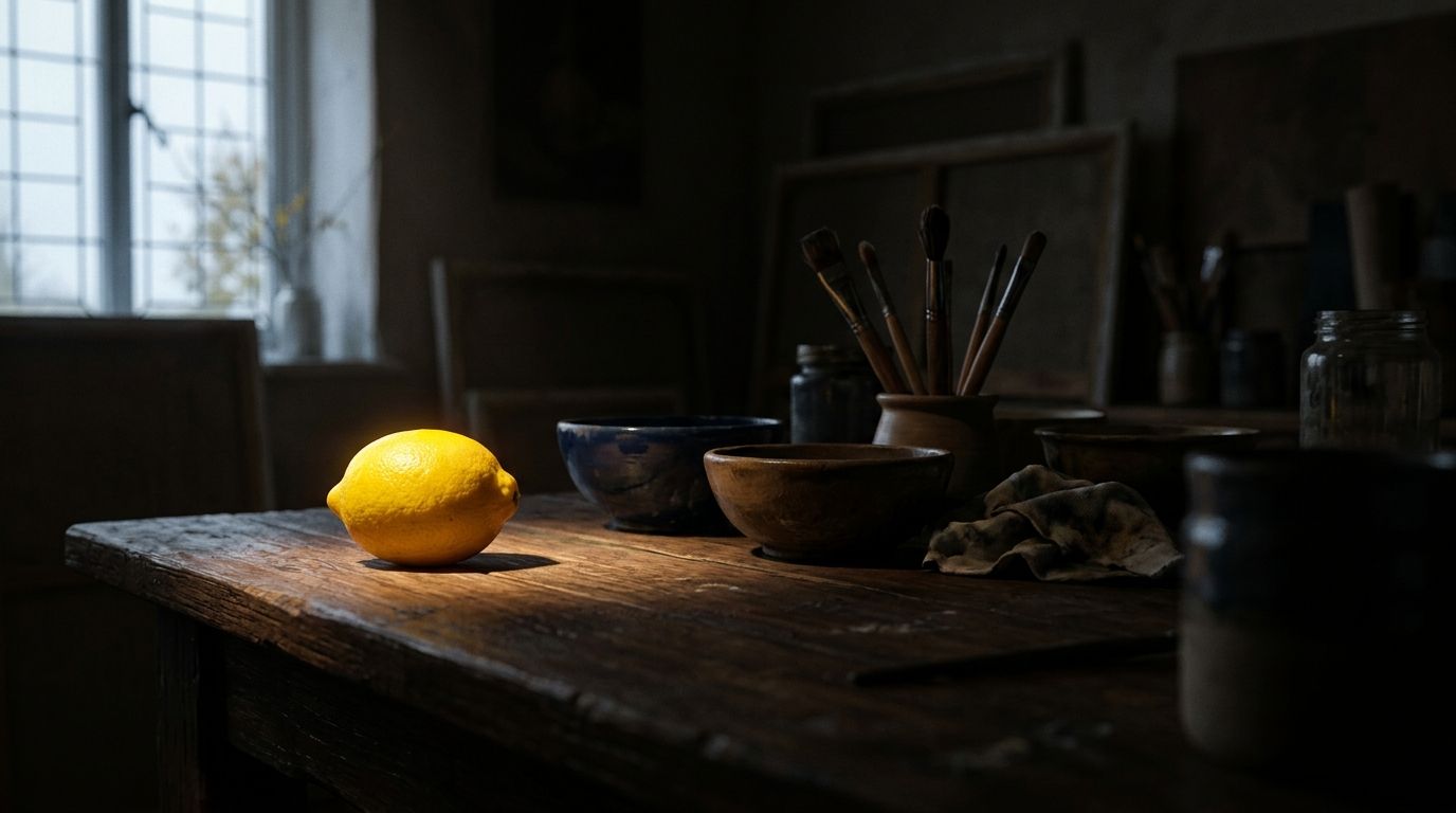
A form near the centre of a rectangle, or at a strong intersection of a thirds grid, already carries extra weight. Leonardo puts Christ on the midline of the refectory wall and parks the vanishing point at his head. Placement alone would almost suffice. Isolation does different work: a single tree in an empty field, a figure left of a crowd, a lemon on a dark table. Scale can isolate without emptiness. A head that fills the frame, as in many Baroque close-ups, dominates because it occupies more of the support than anything else.
The “rule of thirds” is a placement habit, not a requirement. Icons, frontal portraits, and Last Suppers often want the centre. Off-centre placement is a tool for landscapes and snapshots. If a teacher marks you down for a centred focal point, ask whether the picture’s job was calm monumentality. Centred emphasis is a type, not a fault.
Convergence, pattern breaks, and the odd thing
Convergence is a set of directions that meet. Guns, orthogonals, pointing fingers, and gazes can all aim at one head. The method overlaps visual movement: lines carry the eye. The distinction is the destination. Movement names the path. Emphasis names the stop the path is built to reach. Keep the two words apart in notes so movement keeps the path and this page keeps the stop.
A break in a pattern is emphasis by exception: nine identical windows and a tenth that is lit, a grid of dots with one colour change. BBC Bitesize’s fifth method, “the unusual,” covers the same instinct. A lobster on a green table, a pair of legs in a harbour, a sun disk in fog: the eye goes to what does not belong to the local average. Use the method with care in analysis. Calling a motif “unusual” is not an argument until you say unusual relative to what (the rest of the picture, the genre, the period).
A kit of methods, with named checks
The table below is a looking kit, not a scoring rubric. One row is enough to start an essay. Two or three rows together is what most museum pictures do. Dates and locations match the works used as checks in the next section.
| Method | What you change | What the eye does | Named check | Collection |
|---|---|---|---|---|
| Value contrast | Light against dark (or reverse) | Lands on the lit plane first | Goya, The Third of May 1808, 1814 | Museo del Prado, Madrid |
| Hue contrast | Saturated or complementary colour in a duller field | Lands on the colour even if values match | Monet, Impression, Sunrise, 1872 | Musée Marmottan Monet, Paris |
| Placement | Centre, thirds intersection, or high in the field | Treats that zone as the “subject” | Leonardo, Last Supper, c.1495–98 | Santa Maria delle Grazie, Milan |
| Isolation | Empty ground or a gap around one form | Treats the isolate as a figure | Hiroshige, boat under Kyōbashi, 1857 | Honolulu Museum of Art |
| Convergence | Lines, barrels, gazes, orthogonals meeting | Follows the bundle to the meeting | Caravaggio, Calling of Saint Matthew, 1599–1600 | San Luigi dei Francesi, Rome |
| Directional limbs | Repeated arms or tools aiming inward | Reads the knot of limbs as the event | Artemisia Gentileschi, Judith Slaying Holofernes, c.1620 | Galleria degli Uffizi, Florence |
| Subordination | Mute chroma, detail, or illumination elsewhere | Discovers the “subject” late, or second | Brussels Landscape with the Fall of Icarus (composition after Bruegel) | Royal Museums of Fine Arts of Belgium |
| Pattern break | One unit that does not match a repeat | Snaps to the exception | A lit window in a facade of dark ones (studio exercise) | Classroom, not a named masterpiece |
Walk the rooms through the museums directory when you can. Reproduction crops often trim the empty ground that isolation needs, or clip the barrels that make Goya’s convergence.
Six pictures, six rankings
Close looking beats a longer list of slogans. The six works below sit in different centuries and formats: a refectory mural, a chapel canvas, a Florentine oil, a history painting, a small harbour sketch, a woodblock print. Each one shows a distinct ranking idea: geometry that meets at a head, a beam that names a man, a knot of arms, a lantern and a white shirt, a warm disk in cool fog, a circuit of three stops. Linear perspective appears only where Leonardo uses it as a meeting of lines. The construction of vanishing points as a drawing method belongs to a later technique article.
You can test these readings on museum images, then in rooms listed through the museums directory. A textbook that trims the dark around Caravaggio’s table or the hillside behind Goya’s victim changes the ranking you think you are studying. Stand far enough that the whole field is visible; a crop is already a new composition.
Leonardo, Last Supper, Santa Maria delle Grazie, Milan, c.1495–98
Leonardo painted the mural in the Dominican refectory on a dry wall, in tempera and oil on gesso rather than true fresco. The Cenacolo Vinciano museum dates the campaign from 1495 into the beginning of 1498. The field is huge, about 460 by 880 centimetres. Christ sits on the midline. His body reads as a stable triangle. The coffered ceiling and the tapestries on the side walls run as orthogonals toward his head. Writers on the mural, including the Italian Renaissance.org close look and later conservation notes, place the vanishing point at Christ’s head (often specified as the right temple). Three windows behind him isolate the figure with daylight. Judas is not sent to the near side of the table, the older habit. He leans into shadow among the twelve. Subordination by value does the moral work that an isolated seat used to do.
The ranking is architectural and theological at once. Monks eating in the real room faced a painted room that continued their own. Christ is the stop because geometry, light, and empty space around the triangle all agree. Secondary emphases live in the four groups of three apostles: hands, open mouths, a knocked salt cellar in some readings. Those groups are loud. They remain satellites because none of them sits on the vanishing point.
Caravaggio, The Calling of Saint Matthew, Contarelli Chapel, Rome, 1599–1600
The commission for the two lateral canvases in San Luigi dei Francesi is dated July 1599, with final payment in July 1600. The Calling hangs on the left wall of the chapel, oil on canvas, on the order of 322 by 340 centimetres. Christ and Peter have entered a customs room. Five men sit at a table over coins. A beam of light, aligned with the chapel’s actual window in many accounts of the hang, cuts from upper right across the faces. Christ’s pointing hand, a quotation of Michelangelo’s Adam in reverse, aims with the beam. Matthew’s answering gesture (the bearded man who points to his own chest in the usual identification) closes the circuit.
Smarthistory’s walk-through in the chapel stresses conversion as a Baroque subject: the instant of being named. Emphasis is how that instant is staged. Most of the room stays brown. The light picks faces, sleeves, and the hand. Convergence of gesture and illumination does more than a centred throne would. Viewers still argue which seated man is Matthew. The ranking of the picture does not depend on settling that art-historical dispute. The stop is the zone where light, finger, and surprise meet.
Artemisia Gentileschi, Judith Slaying Holofernes, Uffizi, Florence, c.1620
The Uffizi canvas measures about 199 by 162 centimetres. Esperança Camara’s Smarthistory essay tracks the five bare arms that lock on Holofernes’s head and the blood that continues the directional lines. Bright value on flesh against a dark ground supplies Caravaggio’s lesson. The emphasis is not a quiet face. It is a knot of labour. Judith and the maidservant share the work, so the focal area is an action rather than a single portrait.
Classroom sheets that demand “one focal point” struggle here. You can name the head as the geometric meeting. You can also say the picture emphasises the physical fact of the killing, distributed across arms, cloth, and jet of blood. Both descriptions are formal. The second refuses to shrink emphasis to a sticker on a nose.
Goya, The Third of May 1808, Prado, Madrid, 1814
The Prado encyclopaedia entry for P000749 records the oil as 268 by 347 centimetres (older catalogues and some teaching sites give 266 by 345.1 cm). Goya painted it in 1814, with its companion The Second of May 1808, after the restoration government commissioned commemorations of the Madrid rising against Napoleonic troops. The stop is the kneeling man in the white shirt, arms open, a lantern at his knees. The hillside behind him traps the group. The firing squad on the right is a dark, faceless machine. Barrels converge on the shirt. The lantern, the only visible light source, repeats the yellow-white of the clothes.
Beth Harris and Steven Zucker, in their Prado conversation, treat the white figure as stage direction: the artist tells you where to look. Iconography then loads that look. Outstretched arms recall a crucifixion; a wound-like mark on a hand has been read as a stigmata echo. Formal ranking and meaning travel together. If you describe only the martyr type, you skip the lantern. If you describe only the lantern, you skip why that particular stop was chosen for a massacre picture.
Monet, Impression, Sunrise, Musée Marmottan Monet, Paris, 1872
The Marmottan notice places Monet at the Hôtel Amirauté in Le Havre around November 1872, painting the outer harbour from a window. The canvas is small: the Marmottan notice lists 50 by 65 centimetres without frame (48 by 63 cm is the older sight-size figure). Cranes, masts, and smoke sit in grey-blue vapour. The orange disk and its reflection were added late, the museum says, as Monet finished. Louis Leroy’s 1874 Charivari review of the first Impressionist exhibition mocked the title Impression and named the group. Colour emphasis is the formal fact underneath that anecdote.
The sun is not the lightest patch in a value photograph of the picture. Complementary contrast (orange in a blue-grey field) does the ranking. Dark boats in the foreground give a second stop and a sense of scale. Students who have only been taught “lightest = focal point” misread the canvas. Hue can dominate luminance. That is why this picture earns a row in the table rather than another Caravaggio.
Hiroshige, “Riverside Bamboo Market, Kyōbashi,” from One Hundred Famous Views of Edo, 1857
The Honolulu Museum of Art holds a print from this 1857 series in the James A. Michener Collection, about 38 by 26 centimetres in the ōban format. Gateways to Art uses it to teach multiple foci: the large geometry of the bridge, the pale disk of the moon, and the small boat with a hard outline against flat water. Distances between those three shapes create a rhythm. No single method owns the sheet. Placement, isolation, and value each take a turn.
The print is a warning against the homework sentence “every good artwork has one focal point.” Ukiyo-e landscapes often split attention on purpose. The ranking is a circuit, not a throne. If you need a primary stop, the bridge’s scale usually wins first glance. The moon and the boat keep you from leaving.
How living artists still rank attention
Contemporary practice did not retire the principle. It changed the supports. Painters still isolate heads and punch chroma. Installation and photography add real light, scale in a room, and duration.
Kehinde Wiley’s portraits, including Napoleon Leading the Army over the Alps (2005, Brooklyn Museum), drop a Black sitter into a field of ornamental pattern quoted from older European painting. The figure is large, high-chroma, and centred. The pattern is busy enough to threaten the ranking. Wiley’s bet is that a face and a horse still win. The tension is the subject: can a person hold against a decorative field that once swallowed anonymous sitters?
Kerry James Marshall has spent decades painting Black figures with a range of blacks that refuse to drop into a brown-black void. Emphasis here is a political-formal problem. If academic painting used dark ground to make pale flesh glow, Marshall inverts the recipe so dark skin holds as figure, not as hole. Look for the small high-chroma notes (a badge, a balloon, a stripe) that act as secondary stops without bleaching the people.
Olafur Eliasson’s The Weather Project (Tate Modern Turbine Hall, 2003) built a sun: a semicircular disk of lamps behind mist, mirrored in the ceiling. Visitors lay on the floor. The ranking was environmental. You could not miss the disk. Subordination was the hall itself, dimmed and hazed. James Turrell’s skyspaces do the reverse isolation: a sharp aperture, a sitting, a wait until the rectangle of sky becomes the only event. Neither artist is “using the rule of thirds.” Both are running emphasis with architecture and time.
Photography still teaches the old kit. A single figure in a large grey square, a red coat on a wet pavement, a face in a slit of available light: isolation, hue, value. Steve McCurry’s work appears on the BBC Bitesize sheet for that reason. Treat those magazine examples as method checks, not as a canon.
All-over and anti-focal work remains a live option. A grid painting, a colour-field canvas, or a Kusama infinity room can flatten hierarchy until the body of the viewer is the only remaining “stop.” Name that as a refusal of emphasis, or as emphasis relocated onto the room. Do not force a hidden focal point to satisfy a worksheet.
How to identify emphasis when you look
Stand at a normal viewing distance, not with your nose on the varnish. Cover the picture with a hand, uncover it, and note the first landing. Squint until colour drops and see whether the landing survives as a value contrast. If it vanishes when you squint, the ranking may be hue, as in Monet’s sun. If it survives, value is doing the heavy work.
Trace directions with a finger in the air: barrels, gazes, roads, pointing hands, orthogonals. Ask where they meet. That meeting is a candidate stop even if it is not the brightest patch. Then look for what has been quieted: blurred landscape, brown shadow, repeated pattern. Subordination is easier to miss because it is the absence of shout.
Name the stop in plain nouns before you name the principle. “The white shirt, the lantern, the line of guns” is a better sentence than “Goya used emphasis.” Once the nouns are on the page, add the method: value contrast plus convergence. If you cannot point to a patch of the surface, you do not yet have a focal point. You may have a theme.
Secondary stops deserve a second paragraph. List them. Decide whether they support the primary ranking (apostle groups around Christ) or split it (Hiroshige’s three). A split is not a failure. It is a different structure. Write that structure down so you do not pretend every picture is a Last Supper.
Sculpture and installation ask for a walk. Walk until the form occludes, then walk until a silhouette reads. The emphasis may change with viewpoint. Photographers of sculpture often choose the viewpoint that maximises a silhouette. Your job in the room is to notice that the ranking is mobile.
Common confusions and misuses
Contrast is a tool. Emphasis is the ranking. A high-contrast picture can still be a stalemate if two masses fight. Link out to the contrast guide when your essay turns into a list of complementary pairs with no destination.
Visual movement is the path. Emphasis is the stop. A spiral of drapery can carry the eye without creating a focal point if it never arrives. The movement article owns that path. Do not spend this essay on Futurist “lines of force” or on Cubism as an art-historical movement. Those are different uses of the English word.
Composition is the whole organisation of the field, treated in the sibling composition piece. Emphasis is one outcome of that organisation. A centred pyramid, an off-centre crop, and an all-over grid are compositional types. Only some of them produce a single focal point.
Rhetorical emphasis (stress in a sentence, a bold word, a preacher’s repetition) is out of bounds here. If a search snippet offers writing tips, you have left the fence.
Dominance as a social keyword (colonial dominance, male gaze as power) can be a fair interpretation after the formal description. It is a misuse when it replaces looking. “The soldier group dominates” in Goya is true as visual weight. “Dominance in art” as a search phrase is, in US data, a small informational query that still wants the studio meaning first.
The myth that every successful work has exactly one focal point fails on Hiroshige, on decorative arts, and on much abstraction. The myth that the focal point must sit on a thirds intersection fails on Leonardo. The myth that the lightest area is always the stop fails on Monet. Three myths, three counterexamples. That is enough.
Bruegel’s Landscape with the Fall of Icarus in Brussels is the textbook case of subordination: a red ploughman first, Icarus’s legs later. Attribution is contested. The Royal Museums have long said the composition is Bruegel’s while execution is doubtful. Technical work by KIK/IRPA (Christina Currie and Dominique Allart) has treated the canvas as a copy after a lost original; radiocarbon on support fibres has been cited against Pieter Bruegel the Elder (died 1569). Use the picture to teach delayed ranking. Do not hang an unhedged “Bruegel, 1558” on it.
FAQ
What is emphasis in art?
Emphasis is the principle of ranking attention so one area of a work pulls first. Artists build that ranking by changing elements (value, colour, size, placement, isolation) and by quieting the rest. BBC Bitesize calls the result a focal point. The Getty calls it the part of the design that catches the eye.
What is a focal point in art, and how does it differ from emphasis?
A focal point is a location on the surface or in the room. Emphasis is the ranking that makes that location first. You can emphasise a zone (a knot of arms, a band of light) without a pinpoint. You can also run several focal points in a circuit, as Hiroshige does with bridge, moon, and boat.
How do you create emphasis in a picture?
Stack methods rather than hunting for a secret. Light a plane and darken its neighbours. Place the subject on a midline or isolate it in empty ground. Aim gazes and edges at one meeting. Break a repeat. Mute detail everywhere else. Thumbnail sketches in three values will tell you whether the ranking reads at six feet.
What is the difference between emphasis and contrast?
Contrast is difference (light/dark, warm/cool, sharp/soft). Emphasis is what you do with difference: send the eye to a stop. Two contrasting halves can cancel. Goya’s white shirt works because the contrast is local and the guns agree on the same target. For the types of contrast, use the sibling contrast article.
Can a work of art have more than one focal point?
Yes. Secondary stops are normal. Multiple primaries are a structure, common in landscape prints and in busy genre scenes. Problems start when several areas shout at the same volume with no circuit between them. All-over painting may refuse a focal point on purpose.
What does dominance mean in art class?
Dominance means visual weight: the area that wins the first look. It is the felt result of emphasis. Keep it on the picture. If an essay prompt wants political dominance, the prompt will say so. The search phrase “dominance in art” still maps, in keyword data, to this studio sense more than to theory jargon.
Is the centre of the canvas always the focal point?
No. Centre is a strong default, which is why Leonardo uses it. Off-centre placement, isolation at an edge, and colour accents away from the middle are standard. Icons and altarpieces often want the middle because the job is address, not anecdote.
Why does Monet’s sun stand out if it is not much lighter than the sky?
Hue. An orange disk in a blue-grey harbour is a complementary contrast. Livingstone’s account of luminance in Impression, Sunrise is the standard caution against equating “bright” in the colloquial sense with “high value” in the tonal sense. Squint. If the sun nearly disappears, colour was doing the ranking.
Emphasis is a ranking you can point at. Name the patch, name the method, name what was quieted. Then stop. The series hub gathers the neighbouring terms so each one keeps a distinct job.
Related reading
Kiasma Outlines a Robust 2027 Season Featuring Major Surveys and Prize Showcase
Helsinki's Museum of Contemporary Art Kiasma unveils a comprehensive schedule balancing institutional retrospectives, immersive solo projects, and regional award programmes.
The 2027 calendar at Kiasma positions spatial experimentation and critical historiography at the forefront of Nordic contemporary practice.
Ukrainian Museum Celebrates Half-Century With Community-Led Lobby Project
Molly Gochman transforms archive fragments into a projected collage marking five decades of cultural preservation
As the institution turns fifty, an immersive lobby installation invites locals to contribute personal artefacts, weaving private histories into a broader narrative of Ukrainian heritage and resilience.
When Defending Heritage Becomes a Crime: The Arrest of Iraqi Archaeologists
Whistleblowers targeted over corruption claims and controversial investment legislation
Detentions of leading experts raise alarms over censorship, rapid site clearance, and the future of Iraq's archaeological record.