
Exhibo Editorial
How to Photograph Your Artwork
Straight-on lighting, colour control and file specs so application and portfolio images match the work on your wall
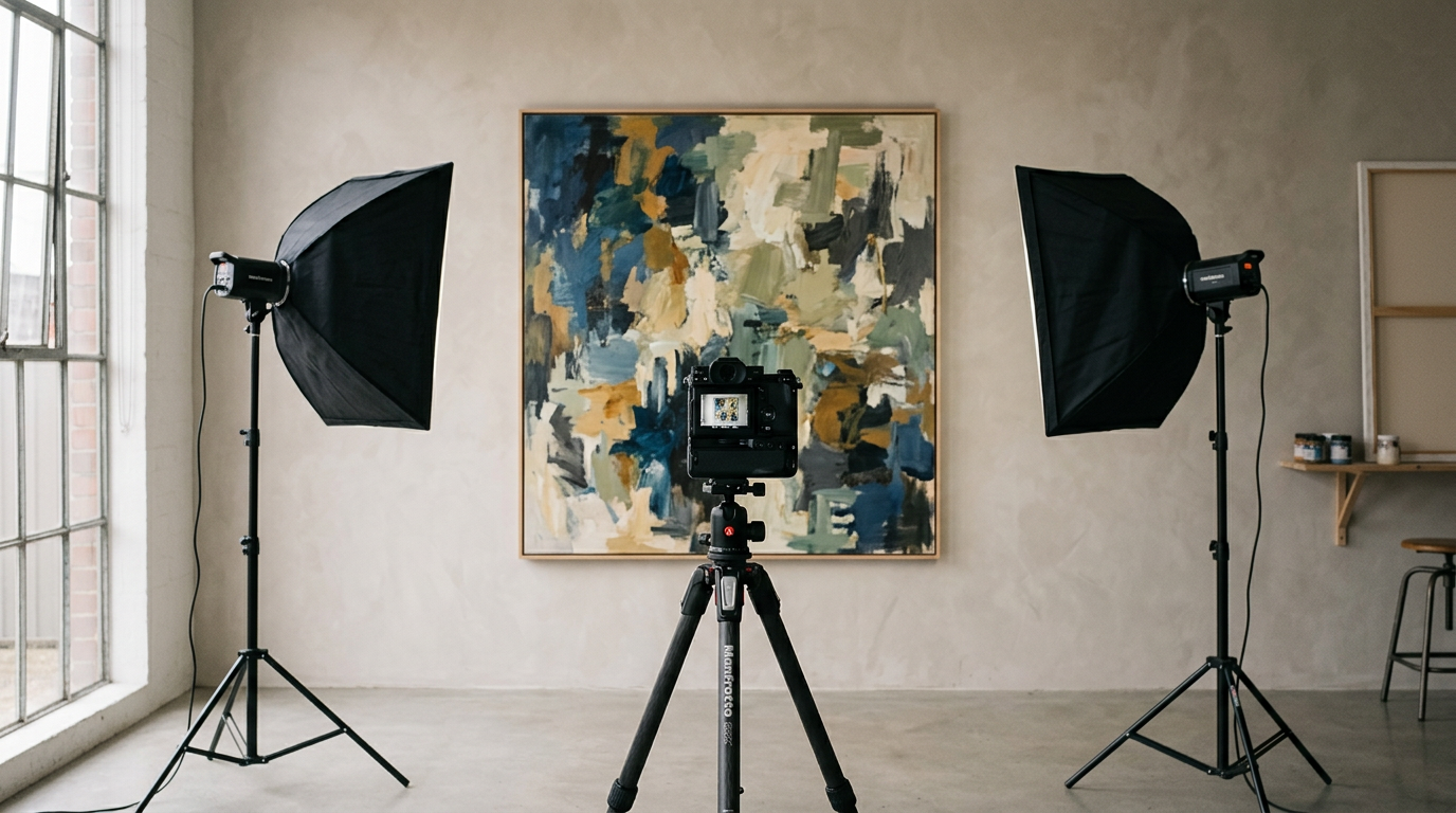
Photograph your artwork so the file matches what a viewer would see in even, neutral light: square edges, balanced illumination, accurate colour, sharp focus and a crop that shows the work rather than the room. Hang or place the piece on a level support against a plain background. Put the camera sensor parallel to the surface, centred on the work. Use overcast daylight or two matching lights at about 45 degrees. Shoot RAW if you can, set white balance from a grey card or colour target in one reference frame, then export JPEG or TIFF to the pixel and file-size limits the application names. Remove glass before you shoot whenever the work allows it.
This guide stays inside documentation photography for applications, open calls and portfolio images: lighting, colour, cropping and file specs. Assembly of the portfolio itself belongs with artist portfolio (pending). The wider career series sits at artist career guide. For how museums present and image collections at institutional standard, browse museums.
Why Documentation Photographs Decide Outcomes
Grant panels, residency jurors and gallery submission readers score from files on a screen more often than from the object in a room. Arts Midwest’s artist documentation guidance states the same blunt rule: panelists must judge quality from images alone, and poor documentation misrepresents strong work. CaFÉ’s jurying guidance for artists makes the parallel point for competitions: a skewed, glare-struck or blurry file pulls attention onto the photograph instead of the piece. Virtual exhibitions often reuse the same upload, so the file you send becomes the public face of the work.
Admissions pages at art schools say the same in shorter form. Maryland Institute College of Art asks for clear, well-lit images against a neutral background. Montserrat College of Art tells applicants that documentation quality signals care and maturity, and that colour and value accuracy matter as much as sharpness. University of North Carolina School of the Arts tells high-school applicants that 3D work needs even natural light and a neutral ground, with cropping to the work and only minor brightness or colour matching edits. Those instructions are not aesthetic preferences. They are the conditions under which strangers can see your decisions about surface, proportion and craft.
The same file set travels across contexts you may not plan in one sitting. A residency panel, a teaching application, a dealer inquiry and a print-on-demand proof can all draw from one capture session if you keep a master and export derivatives to each brief. Artists who photograph once under mixed lamps and once under a window then wonder why a series looks like two different makers. Consistency is part of the artwork’s public identity once the object leaves the studio.
Documentation also builds the archive you need after a sale, a temporary install or a material that will change. A master file that still matches the object under controlled light is the record you reopen for reprints, insurance, catalogues and later applications. The American Institute for Conservation’s digital photography guidance for conservation documentation treats consistency, colour targets, naming and backup as part of professional record-keeping. Artists work at a lighter scale, but the same habits stop you from guessing colour six months later when the work has left the studio. AIC-endorsed tools such as photo-documentation targets (colour and grey scales plus a size reference) show how institutions keep frames comparable over time; a grey card and a tape measure give you a workable studio version of that discipline.
Bad light and bad geometry create the failures jurors notice first. Direct sun throws hot spots and deep shadows across a flat plane. Mixed tungsten and daylight tints whites yellow or blue. An angled camera turns a rectangle into a trapezoid. Glass and gloss throw specular highlights that hide brushwork. Over-editing that “improves” saturation invents a different painting. Each failure is technical and fixable if you treat photography as a repeatable studio task rather than a phone snap between meetings.
Method: Set Up, Light, Align and Shoot
Build one session in which you photograph every piece destined for the same application batch. Consistency across a set reads as professionalism; a mix of window light, desk-lamp light and outdoor shade reads as accidental. Turn off overhead room lights so they cannot cast a second colour temperature into the frame. Clear the wall or table of posters, cables and patterned fabric. Hang two-dimensional work level and flat. For small works, a clean floor or table with a downshoot works if the camera stays parallel to the surface. Pennsylvania Academy of the Fine Arts (PAFA) media-lab guidance for students stresses the same geometry: centre the camera and keep it parallel for 2D work, and reserve dramatic, uneven light for sculpture when you want form rather than flat copy. Treat the room as a temporary imaging bay: one clean wall, marked light positions, and a laptop for review keep the session from drifting into casual snapshots.
Decide the purpose of each frame before you press the shutter. Most applications want a full, frontal documentation shot cropped to the edges of the work. Many also accept or request a detail that shows surface. Sculpture and installation need multiple angles. Keep titles and captions out of the image file; platforms such as Yale School of Art’s portfolio system warn that embedded text shrinks the viewable area and that presentation formats such as PowerPoint or multi-page PDF often fail in their viewer. Put titles in the form fields the portal provides, and keep a caption spreadsheet beside your export folder so you do not retype dimensions from memory.
Before the first exposure, run a short checklist out loud: path clear, work level, lights matched, camera height marked, grey card ready, memory card formatted, RAW enabled. PAFA’s shared-lab notes remind students to format the card at the start of a session so a half-full card does not stop the shoot mid-series. Check the first three frames on a laptop or large phone screen, not only on the camera’s rear LCD. Small screens hide soft focus and uneven light that jurors will see at full size.
Natural light and the two-light studio setup
Overcast daylight remains the cheapest balanced source for flat work. Shoreline Arts Alliance’s documenting tips and CaFÉ’s jury guide both favour cloudy outdoor conditions or diffused window light indoors. Place the work near a large window, turn off room lamps, and bounce light back with white foam board if one side falls dark. Avoid direct sun: it creates hard edges of brightness that no honest crop can fix. Deep shade outdoors can cool the colour toward blue; if you must shoot there, include a grey card and correct white balance later. North-facing windows in the northern hemisphere give longer periods of soft light; south-facing rooms need a sheer curtain or a move away from the bright patch on the floor.
When you need repeatable results after dark or across seasons, use two matching lights. Place one on each side of the work at about 45 degrees from the surface so specular reflection misses the lens. Arts Midwest, Amateur Photographer’s copy-work tutorial and PAFA’s lab tip sheet all converge on that geometry. Keep both lights the same brand and model so colour output matches. Softboxes or shoot-through umbrellas enlarge the source and fill the field without hard fall-off. If the centre looks darker than the edges on a large painting, move the lights farther back and raise power; light fall-off is steeper when sources sit close to the plane. PAFA also notes that strobes can help oil paintings because bounced flash reduces continuous glare compared with hot lights aimed straight at varnish. Hot lights still appear in some teaching labs; treat heat as a hazard near varnish, paper and people, and prefer LED or flash when you have the choice.
Wear dark clothing if you stand near the camera; light clothing reflects into glossy paint and glass. Remove glazing when the work allows it. If the frame must stay closed, swing the lights farther toward the plane of the wall until the reflection leaves the lens, or add polarising control as described later under edge cases. Measure both light-to-work distances so the pair stays symmetric; a five-centimetre error on one side is enough to show as a soft gradient across pale grounds.
Camera position, focus and exposure
Match the height of the lens centre to the centre of the artwork with a tape measure. Keep the sensor parallel so vertical and horizontal edges stay square in the viewfinder grid. Leave a small margin around the work for cropping, then fill most of the frame so you keep resolution. A normal to short telephoto prime (around 50–105mm on full frame, or the equivalent on crop sensors) reduces the barrel distortion wide angles introduce. Use a tripod. Fire the shutter with a two-second timer or remote release so your finger does not jog the camera. On DSLRs, mirror lock-up for the final frame removes another source of vibration when shutter speeds drop under continuous light.
For flat work, aperture around f/8 to f/11 keeps the plane sharp without pushing into diffraction on many lenses; PAFA suggests f/8 to f/16 for 2D and closer to f/16 when you need depth on 3D objects. Hold ISO as low as the light allows (often 100–400). In manual or aperture-priority mode, check the histogram for clipped whites and blocked blacks. Turn flash on the camera body off. Autofocus on a high-contrast area of the work, then switch to manual focus if the camera hunts. Zoom the playback to confirm focus before you dismantle the set. Amateur Photographer’s stock flash starting point (ISO 100, f/8, 1/200 sec, then match flash power on both heads) is a useful scaffold when you shoot with strobes; with continuous LEDs, fix ISO and aperture, then change shutter speed and watch for blur.
Smartphones can deliver usable documentation if you treat them like cameras. Use the rear lens, enable the grid, clean the glass, tap to focus on the work, and avoid digital zoom. CaFÉ advises iPhone users to choose the most-compatible JPEG setting rather than HEIC when portals demand JPEG. Brace the phone on a tripod or a stable stack of books. A manual camera app that locks exposure and white balance reduces the phone’s habit of shifting mid-shoot when a cloud passes. If the phone still warms highlights on pale grounds, lower exposure compensation a third of a stop and recheck against the physical work.
Colour Accuracy, Cropping and File Specs
Colour is the part of documentation that fails without drama. A painting can look sharp and square while the blues lean cyan and the whites look warm. Jurors may not name the fault, yet they downgrade work that feels “off” next to better-matched entries in the same slideshow. Start colour control at capture, not in a late edit pass after you have already deleted the RAW files.
The subsections below split capture reference from export rules. Keep both in mind when one portal wants a 5MB JPEG and another wants a print-ready file from the same painting.
White balance, targets and honest editing
Shoot RAW when the camera or phone app allows it; RAW keeps white-balance and tone decisions editable without baking compression into the master. Include one reference frame with a grey card or a colour-checker chart under the same lights as the work. Amateur Photographer’s artwork tutorial and cultural-heritage colour-management practice both treat that reference shot as the basis for a custom profile or a white-balance eyedropper fix you sync across the batch. Place the card in the light that hits the painting, not in a shadow beside the easel. If you change lights, lenses or rooms, shoot a new reference.
Edit with the physical work beside the screen when you still have it. Match, do not improve. Raise or lower exposure so the lightest lights and darkest darks in the piece sit where they sit on the wall. Adjust temperature and tint until neutrals look neutral. Resist saturation boosts that make the file louder than the object. Calibrate the monitor if you edit colour for print reproduction or for clients who will reject a mismatch; a laptop on “vivid” presets will lie to you. Cracchiola’s Getty studio advice, summarised in Art & Object, still ends on the same test: if the object and the photograph disagree to the naked eye, the photograph loses.
Crops, colour spaces and portal limits
Crop to the edges of the artwork for standard 2D documentation unless the brief asks for a framed install view. Straighten before you crop if a slight keystone remains. Photoshop’s perspective crop or equivalent tools in Lightroom and free editors can square a near-miss, but reshooting parallel is cleaner and preserves more of the image. Do not add borders, logos or title text inside the picture. Keep an uncropped master if you later need an install shot that shows scale against a wall. UNCSA’s portfolio rules for photographed 3D work allow only minor brightness and colour-matching edits; treat that as a useful ethic for 2D as well.
Export to the rules printed in the call. Common patterns across open-call and school portals include JPEG in the sRGB colour space, longest edge around 1,200–2,000 pixels for screen review, and a maximum file size such as 5MB on CaFÉ. Print and archive masters often live as TIFF or high-quality JPEG at higher pixel counts; museum imaging notes such as those summarised from V&A practice favour RAW capture, TIFF masters and Adobe RGB for archival studio files, with JPEG derivatives for the web. FADGI’s cultural-heritage guidelines push institutions toward measured uniformity and colour difference tolerances that DIY setups will not hit; use them as a reminder that “good enough for a jury” and “preservation master” are different jobs. For applications, follow the portal first. Keep your own master larger. Name files so you can find them: Surname_Title_Year_Full.jpg and Surname_Title_Year_Detail.jpg beat IMG_4582.jpg when a form asks for captions later.
Store at least two copies of masters: working drive and a separate backup (external disk or reputable cloud). Arts Midwest’s documentation article treats backup as part of the craft because every drive fails. Folders by year and project beat a single camera dump. Write the capture date, lighting note (window / LED pair / strobe) and colour-space of the master into a plain text sidecar or spreadsheet so future-you can rebuild the set when a gallery asks for a reprint.
Kit Table and Failure Modes
You can start with a phone, a window and a clean wall. The table below lists a documentation kit that scales from that baseline toward a small studio setup without requiring museum strobe rooms.
| Item | Role in documentation | Typical use | Common failure if misused | Approximate UK retail range (check current prices) |
|---|---|---|---|---|
| Smartphone or mirrorless/DSLR | Capture | Full and detail frames | Digital zoom; HEIC when JPEG required; dirty lens | £0 (phone you own)–£1,200+ / camera body |
| Tripod or stable shelf stack | Keep camera still and square | All low-ISO shots | Soft front legs; phone clamp that droops | £25–£150 |
| Two matching LED panels or speedlights | Even artificial light | 45° each side of flat work | Mixed brands; one lamp only; lights too close | £80–£400 for a basic pair |
| Softboxes or white umbrellas | Diffuse and enlarge sources | Flat copy and low glare | Yellowed fabric tinting colour | £40–£200 |
| White foam board | Bounce fill; block stray light | Window-light sets | Coloured board reflecting into paint | £5–£20 |
| Grey card or colour-checker passport | White balance and colour reference | One frame per lighting setup | Card in different light from the work | £15–£120 |
| Seamless paper or plain wall | Neutral ground | 2D crop and 3D object shots | Patterned sheets; coloured walls bouncing cast | £0 (wall)–£40 per roll |
| Circular polariser (+ sheets for cross-pol) | Cut glare on gloss and glass | Oils, acrylics, glazed frames | Over-rotation killing texture; colour shift | £30–£150 (+ sheets) |
| Tape measure and spirit level | Align camera height and hang | Every 2D setup | Eyeballing large works | £5–£25 |
| Editing software (Lightroom, Darktable, etc.) | Crop, white balance, export | Batch after shoot | Over-saturating; editing without the work present | £0 (Darktable)–subscription |
| External drive or cloud backup | Protect masters | After every session | Single copy on laptop only | £40–£150 |
Skip on-camera flash aimed at the work, mixed household bulbs, photographing through dirty glass because “it is already framed,” and filters that add fake film grain. Skip embedding your name in the image. Skip deleting RAW files after the first JPEG export; you will need them when a second portal asks for different dimensions.
Edge Cases: Gloss, Glass, Sculpture and Large Work
Flat matte gouache on paper under window light is the easy case. Most studios also hold varnish, metal leaf, deep impasto, works under glass, freestanding objects and pieces too large for a spare bedroom wall. Each of those breaks the default 45-degree copy setup in a different way. Plan the exception before you book the only overcast afternoon in the week.
Read the subsections below when the first test shot shows a white hot-spot, when the object has volume you must describe, or when you cannot get the camera far enough back without including the room.
Gloss, glass and polarisation
Remove glass and acrylic glazing when conservation and framing allow it. CaFÉ and Arts Midwest both treat glazing as a glare source you should eliminate at the object, not in software. If the work must stay glazed, light from steeper angles so reflections miss the lens, hang black cloth behind the camera so the glass mirrors darkness rather than a bright shirt, and take test shots until the worst highlight leaves the picture area.
When varnish or glossy acrylic still throws specular bands, add polarisation. A circular polariser on the lens reduces some reflections. Cross-polarisation, used in cultural-heritage studios, places polarising film over the lights and a polariser on the lens, rotated toward extinction of the glare. Tahnee Louise Cracchiola of the J. Paul Getty Trust’s Villa Imaging Studios describes cross-polarisation as a standard tool for marble, bronze, pottery and other high-gloss materials, while warning that the process can raise saturation and contrast, so the photographer must still judge the result against the object by eye. Amateur Photographer’s tutorial shows the same light-plus-lens polariser method for paintings. Use a colour target in the set, because polarisers can shift colour. Do not cross-polarise so hard that brush texture disappears if texture is part of the work’s meaning.
Sculpture, installation and oversized painting
Three-dimensional work needs form. PAFA’s student guide allows uneven light for sculpture to show volume; Arts Midwest starts with one key and one fill, then adjusts until shadows describe the object without hiding it. Shoot multiple angles and at least one detail. Place the object on a seamless sweep of paper or cloth so the ground does not compete. Chris Ciccone of the North Carolina Museum of Art, quoted in Art & Object, prefers neutral white, grey or black grounds chosen for contrast with the object. Small reflective pieces can sit inside a foam-core enclosure that bounces soft light, a method PAFA offers via its “studio in a box.”
Installations need wider frames that show the relationship between parts and the room. Match the colour temperature of any lights you add to the lights already in the space, as PAFA advises, or turn gallery lights into your only source and expose for them. Include a person or a known doorway in one frame only when the brief asks for scale; many open calls want clean object photography without visitors. Record a short walk-through video only if the portal accepts time-based media; stills remain the default currency for most visual-art juries.
Oversized paintings may force stitching or section shots. Keep the camera on a track-parallel path, overlap frames, and stitch in software only if edges align; otherwise hire a photographer with a studio that fits the work. Never stand on unstable furniture to “get higher.” Move the work, move the camera support, or book a space. For works with extreme impasto, add one raking-light detail after the flat copy shot so texture reads without contaminating the colour-accurate frontal file.
What Professionals Do in the Studio
Museum and auction photographers treat documentation as measured craft with judgment. Victoria Martens of Bonhams, speaking to Art & Object, puts technician priorities first: colour, texture and detail must match the object before anyone chases a stylish frame. Getty imaging staff bring curators into the studio to choose the “main view” of a sculpture so the photograph carries the object’s narrative stance, not only its silhouette. They use ColorChecker targets under the same light as the object, then still trust the eye for final acceptance. Conservation photographers working to AIC documentation practice include colour and grey scales, measurement scales and consistent lighting records so before-and-after treatment images can be compared. FADGI and Metamorfoze guidelines for cultural-heritage digitisation set quantitative tolerances for uniformity and colour difference that sit far above what an open call requires, yet they explain why professionals obsess over balanced fields and calibrated colour.
Professionals also control spill, flare and environment. Lens hoods or flags stop acute-angle lights from washing the image. Neutral rooms prevent pink walls from tinting the fill. Matching light modifiers avoid one cool and one warm side. They shoot tethered to a calibrated screen, correct on the spot, and refuse to dismantle the set until the histogram and the object agree. For reflective masterworks they own the polarising sheets and the time to rotate them. For editions and catalogues they deliver TIFF masters and web derivatives from one capture session, with naming and metadata already attached. Ciccone notes that artist agreements can forbid cropping or text overlays; professionals read those constraints before the shutter opens.
You do not need a museum studio to borrow the discipline. Parallel geometry, matched lights, a reference target, RAW masters and a refusal to over-edit already separate application-ready files from social-media snapshots. Hire the specialist when the object exceeds your space, when gloss defeats your polariser budget, or when a catalogue fee makes a mismatch expensive.
Costs and When to Hire Someone
DIY documentation costs time and a small kit. A usable path for many early-career artists is: phone or existing camera, £25–£80 tripod, foam board, and a grey card, plus free software such as Darktable. Adding two matched LED panels with stands and diffusion often lands between £80 and £400 depending on brand. A colour-checker passport and circular polariser add tens to low hundreds of pounds. Seamless paper and clamps remain cheap. Shared university media labs (PAFA’s model is one example among many art schools) can cut kit cost if you are enrolled or hold community access; book the room, arrive with work already dry and frames already decided, and leave with RAW cards copied before you exit.
The large recurring cost is hours: hanging, levelling, shooting reference frames, editing and exporting to each portal’s limits. Budget a first full session at half a day for a small body of 2D work if you are still learning the geometry. Later batches go faster once lights stay marked on the floor with tape and camera height is written on a wall note.
Hiring a photographer who specialises in artwork usually prices by piece, by half-day, or by studio session. Figures vary by city and by whether the shoot happens in their studio or yours. As a planning band for the UK and comparable markets, expect about £50–£150 per artwork for straightforward 2D copy in a batch, or £250–£600+ for a half-day that covers setup, multiple works and basic retouching; complex sculpture, glossy varnish, location installs and catalogue-grade colour management climb from there. Always get a written quote that states deliverables: colour space, longest edge, file format, number of angles and whether RAW files are included. Ask for a sample of flat artwork shot for another artist, not only portraits or events. Confirm who owns usage rights for the files; most artist commissions transfer a licence for portfolio and application use, but catalogue publication may need a separate line.
Hire help when any of the following is true. The work is larger than you can light in a balanced way in your space. Varnish or metal leaf still glares after you have moved lights and tried a polariser. A single rejected application season would cost more than a session fee. A gallery or publisher needs print-ready files with tight colour matching. You are documenting an installation with complex sightlines. You need focus-stacked macro detail beyond what your lens and patience can hold. Keep DIY for matte works, studies and updates between professional sessions.
FAQ
Do I need a DSLR, or will a phone work for applications?
A recent smartphone produces acceptable documentation for many open calls and school portfolios if you lock exposure, use the rear camera, brace the phone, light the work in a balanced way and export JPEG at the required size. Manual cameras still win when you need low noise at low ISO on large works, interchangeable primes that avoid wide-angle distortion, and easy RAW workflows. Follow the portal’s minimum pixel count either way. If a school or residency names a minimum longest edge (for example 1,200 pixels), check the export on a computer before upload; phone “share” pipelines sometimes downscale without warning.
Should I photograph paintings under glass?
Remove glass or acrylic when you can do so without risking the work. Glazing reflects lights, windows and clothing into the image and hides surface. If the frame must stay closed, steepen the light angle, darken what the glass can reflect, and consider a polariser. Conservators should advise before you unframe anything fragile or valuable. Never force clips or old points; a cracked glaze or a tear at the rebate costs more than a delayed shoot.
What colour space and resolution should I use?
For on-screen jurying, sRGB JPEG is the usual request, often with a longest edge near 1,200–2,000 pixels and a file-size cap such as 5MB. Keep a larger master (TIFF or high-quality JPEG from RAW) for print and future portals. Archive-oriented studios may work in Adobe RGB for masters; convert a derivative to sRGB when the application asks for it. If a portal is silent on colour space, sRGB remains the safe screen default.
How do I stop the “trapezoid” look?
Raise or lower the camera until the lens aims at the centre of the work, and keep the sensor parallel to the picture plane. Use the grid. Measure heights. A slight error can be corrected with perspective crop, but a large angle wastes resolution and still looks forced. Leaning the work and tilting the camera to “match” makes geometry worse in most rooms. CaFÉ’s setup notes call this the trapezoid effect for a reason: jurors see it at once.
Is natural light better than studio lights?
Overcast daylight is excellent for soft, balanced illumination and costs nothing. Studio lights win when you need the same colour and level every evening, when weather is unreliable, or when you batch many works. Mixed light (window plus warm ceiling bulbs) is worse than either source alone. Pick one and turn the other off.
When is cross-polarisation worth buying?
Buy or hire polarising sheets and a lens polariser when gloss, varnish or unavoidable glazing still hide brushwork after you have moved two lights to steep angles. Expect extra setup time and a colour check against the object. For matte works, standard 45-degree lighting is enough.
Can I use the same files for Instagram and for applications?
Keep the application master honest and full-frame. Social crops, filters and heavy sharpening belong on derivative exports. A square crop that truncates a painting’s edge may suit a feed and fail a jury that expects the whole work. Export twice from the same RAW rather than rephotograph under “content” lighting.
Galleries mentioned
Exhibitions mentioned
Artworks mentioned
Related reading
Monet's Monumental 'Iris' Commands €50m in Paris
A landmark auction results in a new domestic benchmark for Impressionist masterworks
Anselm Kiefer's Monumental Canvas Finally Leaves Storage with Bespoke Chipperfield Pavilion
A dedicated architectural intervention brings the artist's largest works into public view
Quebec Museum Unveils Dedicated Pavilion for Jean Paul Riopelle
A major architectural addition dedicates space to Canada's most celebrated modernist painter