
Exhibo Editorial
Types of Printmaking, Explained
Relief, intaglio, lithography, screenprint and monotype: how each matrix transfers ink, where it fails, and museum examples from Dürer to Warhol
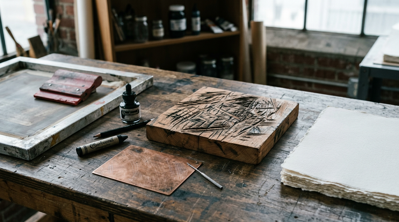
Printmaking is the transfer of an image from a prepared surface, called a matrix, onto paper, fabric or another support, usually with ink and pressure. A wood block, a copper plate, a limestone slab or a mesh screen can all serve as the matrix. The artist prepares that surface once, then pulls many impressions from it. Each impression in a numbered run is an original print, not a photograph of a painting. The types of printmaking differ by where the ink sits on the matrix and how it reaches the sheet.
Museums sort the field into a handful of families. Relief methods ink the raised parts and cut away the rest. Intaglio methods hold ink in grooves and polished plate areas stay clean. Planographic lithography keeps image and non-image areas on the same flat plane, separated by chemistry rather than height. Stencil methods push ink through open mesh. Monotype sits slightly apart: the artist paints on a smooth plate and pulls one impression before most of the image is gone. The cluster that contains this page sits at the Art Techniques and Materials series hub. Inkjet and giclée reproduction belong with what is a giclée print (S2-04). A full chronology from woodcut to digital belongs with printmaking history (S18-11, pending). Buying, framing and edition logic for collectors belongs with print collecting (E07, pending). Collection pages for the museums named below sit in the museums directory.
What printmaking is, and what it is not
Getty’s teacher materials define printmaking as art “made by transferring ink from a matrix to a material like paper or fabric.” Tate’s glossary adds the edition idea: multiple impressions pulled from one prepared surface. Both stress that the matrix is the source. The print is not a copy of a unique painting hanging elsewhere, though artists often adapt drawings into plates or blocks.
That distinction matters in a gallery. When a label reads “woodcut on laid paper,” you are looking at a sheet that passed through a press with a carved block. When it reads “giclée” or “archival pigment print,” you are in reproductive print territory, even if the file came from the artist’s studio. This article stays with matrix-based processes. For the inkjet side, follow the giclée sibling.
Printmaking also overlaps with commercial printing. Letterpress, offset lithography and risograph all descend from the same physics. Fine-art printmaking keeps the matrix in the studio or at a specialist workshop, limits the edition, and often records the number on the sheet. The chemistry and the press types cross over. The economic model and the status of the object do not always.
Four families: how ink moves from matrix to paper
Every process type answers one question: where does the ink live before the press or the hand burnishes the paper? The Metropolitan Museum of Art’s materials pages group traditional techniques under relief, intaglio, planographic and stencil categories. Wikipedia and most university studio syllabi use the same four-way split. Some teachers add a fifth bucket for viscosity prints (silk aquatint, carborundum) or for digital matrices. Those are real, but they still obey the same ink-transfer logic.
Relief prints ink what stands up. You carve, cut or gouge away the parts that should stay white, roll ink onto the remaining ridges, lay damp paper on top, and apply pressure. Woodcut and linocut are the classroom examples.
Intaglio prints ink what goes down. You incise, etch or roughen a metal or plastic plate, force ink into the recesses, wipe the surface clean, and run the plate through a high-pressure roller press so the paper is pushed into the grooves. Engraving, etching and aquatint belong here.
Planographic prints keep the matrix flat. Lithography relies on grease and water repelling each other on a stone or metal plate. Screen printing is sometimes filed under stencil rather than planographic; both share the idea that image and non-image areas are on one plane, separated by a barrier (chemistry or blocked mesh) rather than by carving depth.
Stencil prints push pigment through openings. Serigraphy, the fine-art name for screen printing, uses a taut mesh and a squeegee. Paper stencils and cut Mylar do the same job at kitchen-table scale.
The table below compares the six processes this article treats in depth. Use it as a studio map, not as a ranking of difficulty.
| Process | Matrix material | Where ink sits | Typical press | Edition potential | Common failure mode | Museum example |
|---|---|---|---|---|---|---|
| Woodcut | Side-grain wood (often pear, cherry, lime) | Raised surface after gouging | Relief press or hand baren | High; block wears with long runs | Splintering grain; uneven inking on large flats | Katsushika Hokusai, Under the Wave off Kanagawa, c. 1830-32, woodblock (Metropolitan Museum of Art) |
| Linocut | Linoleum on board | Raised surface after gouging | Relief press or baren | High; soft block dulls fine detail | Crumbling edges on thin cuts; plate warping in heat | Pablo Picasso, Still Life with Glass Under the Lamp, 1962, linocut (Museum of Modern Art, New York) |
| Engraving | Copper or steel plate | Incised grooves cut with burin | Intaglio roller press | High; plate is hard | Burin slip; cold metal resists fluid line | Albrecht Dürer, Adam and Eve, 1504, engraving (Metropolitan Museum of Art) |
| Etching | Copper, zinc or steel plate | Grooves bitten by acid after drawing through ground | Intaglio roller press | High; plate can be re-bitten | Over-biting; foul biting from grease on ground | Rembrandt van Rijn, Christ Preaching (La Petite Tombe), c. 1652, etching and drypoint (Rijksmuseum, Amsterdam) |
| Lithography | Limestone or grained aluminium | Greasy drawn areas accept ink; wet non-image areas repel it | Lithographic press | Medium to high; stone grinds away | Scumming (ink on non-image); wrong gum ratio | Honoré Daumier, Rue Transnonain, le 15 avril 1834, 1834, lithograph (Bibliothèque nationale de France; impressions in British Museum) |
| Screenprint (serigraphy) | Polyester or nylon mesh on frame | Open stencil areas | Squeegee, flat bed | Very high for stable stencils | Pinholes in emulsion; ink drying in mesh | Andy Warhol, Marilyn Diptych, 1962, screenprint and oil (Tate, London) |
| Monotype | Polished metal, glass or acrylic | Painted or rolled temporary image | Hand pressure or etching press | One strong impression; ghost optional | Ink too dry before printing; paper shift | Edgar Degas, Autumn Landscape, c. 1890, monotype (Museum of Fine Arts, Boston) |
Monotype breaks the edition rule on purpose. Treat it as a seventh row in your head even though the table lists six repeatable processes plus monotype as the outlier.
Relief printmaking
Relief is the oldest fine-art print family in Europe and one of the most direct to read. You see what will print as the uncut surface. You see what will stay white as the valleys your tool removed. Chinese woodblock printing on paper predates European adoption by centuries; Buddhist sutras and later illustrated books used the same raised-surface logic. In the West, single-leaf woodcuts appear by the early fifteenth century, and Albrecht Dürer’s generation turned the woodcut into a vehicle for dense narrative and fine line.
Relief suits bold contrast and repeatable colour passes. Japanese ukiyo-e publishers cut separate blocks for each hue and registered them with kento marks in the corner of the sheet. European chiaroscuro woodcuts added tone blocks. Modern artists still choose relief when they want a graphic silhouette, a visible tool mark, or a process they can proof without an expensive intaglio press.
Woodcut
The artist draws on the plank face of a block, often side-grain lime, pear or cherry. Gouges and knives remove wood around the lines. What remains standing receives a thin roll of printing ink. Dampened paper goes on top. A press or a hand baren applies even pressure. The first proofs reveal whether the line is too fragile, whether the grain tore, and whether the ink is too stiff for the paper.
Woodcut line has a particular snap because the tool follows or fights the grain. Long curves can break into stepped edges. Printmakers compensate by cutting across the grain for outlines and by keeping shading as parallel hatching rather than as smooth wash. Dürer’s Four Horsemen of the Apocalypse (1497-98, woodcut; impressions in the Metropolitan Museum of Art, the British Museum and elsewhere) shows how far a disciplined cutter could push the medium before the block surrendered fine detail. The Metropolitan’s collection holds multiple impressions; states differ in line wear and paper tone.
Colour woodcut in the Japanese manner depends on registration. Each block carries one pigment. The printer aligns the paper using fixed corner notches. A mis-cut kento shows up immediately as a halo around the key block line. Hokusai’s Under the Wave off Kanagawa (c. 1830-32, polychrome woodblock print; impressions in the Metropolitan Museum of Art, the British Museum, the Museum of Fine Arts Boston and many other collections) is the standard classroom example because the line block, the flat colour blocks and the Prussian blue of later impressions are all visible once you know what to look for. The Met’s catalogue entry dates the design to the Thirty-six Views of Mount Fuji series and notes that later states used imported blue pigment alongside traditional indigo.
Failure modes are physical. Split blocks, worm tracks in old timber, and crushed fine lines after a long edition are common. Conservators watch for woodworm in historic blocks and for iron-gall ink corrosion where hand-colouring was added later.
Linocut
Linocut replaces wood with a sheet of linoleum, usually mounted on plywood. The surface has no directional grain. A gouge moves equally in every direction, which makes linocut the usual teaching relief once students have grasped the concept on wood. The trade-off is softness. A linoleum edge dulls faster than end-grain boxwood in a wood engraving, and very fine lines can crumble under press pressure.
Artists who want poster-flat colour often choose linocut for that predictability. Picasso’s late linocuts, including still lifes and portraits from the 1950s and 1960s, exploit the medium’s bold shapes. MoMA holds Still Life with Glass Under the Lamp (1962), a colour linocut built from simplified planes. The reduction method, where the same block is cut away between each colour pass, is associated with linocut teaching because the registration stays fixed on one plate.
Common failures include cutting too deep (the surrounding field collapses), using linoleum that was stored in heat (it warps off the board), and rolling too much ink (fine white lines fill in). Studio fix: shallow cuts, sharp tools, and a thin ink film.
Intaglio printmaking
Intaglio reverses the relief logic. Ink lives in lines and pits. The plate surface is wiped almost clean. Damp paper, soft enough to mould into the grooves, is forced through a roller press under enormous pressure. The plate leaves a platemark: a rectangular emboss where the paper was squeezed around the metal. That emboss is not decoration. It is evidence of process.
European artists from the fifteenth century onward treated the copper plate as a drawing surface that could be editioned. Engravers cut directly. Etchers drew with a needle through wax and let acid do the cutting. Later specialists added aquatint for tonal fields and drypoint for burr-rich lines. Rembrandt moved between these methods on a single sheet, which is why his prints survive in many states.
Engraving
Engraving cuts a V-shaped groove with a burin, a steel tool with a mushroom handle. The engraver pushes away from the body, rotating the plate on a cushion. Lines can taper because the burin enters and exits at angles. Cross-hatching builds tone. No acid is required. The skill is muscular and unforgiving: a slip shows as a white scratch that cannot be erased, only incorporated.
Dürer’s Adam and Eve (1504, engraving; Metropolitan Museum of Art, accession 19.73.1) is the standard reference for Northern Renaissance line. The Met’s object page notes the paired figures, the cat and mouse allegory at their feet, and the date in the tablet. Engraving’s hardness suited Dürer’s ambition to rival manuscript precision. Later artists sometimes preferred etching because acid could bite long fluid lines the burin resisted.
Plate wear appears first in the finest hatching. Early impressions look crisp; late impressions look grey and tired. Collectors and cataloguers record impression quality; this article does not price them. For market context, see print collecting (E07).
Etching
Etching begins with a ground: a dark wax or acrylic coating on the plate. The artist draws with a needle, exposing metal. The plate goes into an acid bath. Bitten lines hold ink. Ground is removed, plate is inked and wiped, paper is printed. Because the hand moves freely like a pencil, etching attracted draftsmen who hated the burin’s resistance.
Rembrandt’s etchings are the textbook case for state changes. He returned to plates, added drypoint lines that throw a soft burr, and reprinted. Christ Preaching (La Petite Tombe) (c. 1652, etching, drypoint and engraving; Rijksmuseum, RP-P-OB-37.383) survives in impressions that differ in line richness. The Rijksmuseum’s catalogue describes the crowded biblical scene and the combination of techniques. The Three Crosses (1653, drypoint printed on vellum in some impressions; British Museum and other collections) shows how far he would push reworking: figures change position between states.
Failures include under-biting (pale lines), over-biting (lines widen and blur), and foul biting where grease on the plate pits areas that should stay white. Ground can crack in heat. Acid strength must match the metal: Dutch printers traditionally used mordants suited to copper; zinc etches faster and needs shorter baths.
Aquatint
Aquatint creates tonal areas rather than linear hatching. The plate is dusted with rosin, heated so the grains adhere, then bitten around the rosin to produce a field of tiny pits. Longer acid exposure darkens the tone. Francisco Goya’s Los Caprichos (1799, etching and aquatint; impressions in the Prado, the British Museum and elsewhere) exploited aquatint for night skies and shadow masses that engraving would labour to achieve.
Aquatint failure often means uneven rosin (blotchy tone) or a stopped-out area that was too thin (unwanted grey). Contemporary artists still use aquatint on copper and on polymer plates. Mezzotint, where the entire plate is roughened then smoothed to create lights, sits beside aquatint in the tonal intaglio family; this article names it for completeness but does not walk through the rocker step by step.
Lithography
Alois Senefelder patented lithography in Munich around 1798-99 after discovering that greasy crayon marks on limestone accepted ink while wet, non-image areas repelled it. The matrix stayed flat. No carving depth was required. That made lithography the bridge between fine-art print and commercial job printing for posters, newspapers and music scores.
The classic workflow: grind a Bavarian limestone slab to a fine tooth; draw with lithographic crayon or tusche; treat with gum arabic and acid to fix the image; wet the stone; roll oily ink; print on a lithographic press. Modern workshops often use grained aluminium plates instead of stone, but the chemistry is the same. Ink adheres to grease; water keeps the blank areas clean.
Lithography suits crayon-like marks, wash effects and large flat editions. Honoré Daumier’s Rue Transnonain, le 15 avril 1834 (1834, lithograph; impressions in the Bibliothèque nationale de France and the British Museum) turned the medium toward reportage. Toulouse-Lautrec’s cabaret posters depended on lithography’s speed and flat colour. Henri de Toulouse-Lautrec’s Moulin Rouge: La Goulue (1891, colour lithograph; impressions in MoMA, the Art Institute of Chicago and other collections) shows how multiple stones or zinc plates layered colour for advertising.
Failure modes are chemical. Scumming prints grey in areas that should stay white. An under-gummed stone picks up ink across the field. Drawing with the wrong grease contaminates the slab. Stones are heavy and break if dropped; aluminium is lighter but scratches if mishandled.
Screen printing and serigraphy
Screen printing forces ink through a mesh screen where stencil material blocks the rest. Early twentieth-century commercial shops used silk mesh; fine art adopted the process and renamed it serigraphy to mark the studio context. Andy Warhol’s Factory workflow is the famous example: photographic stencils on screens, repeated pulls, factory assistants, edition sizes that intaglio engravers would never attempt.
The steps: stretch synthetic mesh on a frame; coat with photo emulsion or cut a paper stencil; wash out or peel away areas that should print; lay the screen on paper; pull a rubber squeegee across the frame so ink passes through open mesh. Each colour needs its own screen and a registration system, much like Japanese colour woodcut.
Warhol’s Marilyn Diptych (1962, screenprint and oil on canvas; Tate, T03093) uses screen printing within a painting format. Tate’s catalogue notes the fifty-panel repetition and the shift from bright colour to monochrome. Campbell’s Soup Cans (1962, casein and synthetic polymer paint on canvas; MoMA) is painting, but Warhol’s concurrent soup-can screenprints (MoMA holds examples from the portfolio) show how the same image migrated between canvas and ink on paper. For pure serigraphy, his Marilyn Monroe (Marilyn) portfolio (1967, screenprint; impressions in MoMA and many collections) keeps the process visible: flat colour fields, misregistration tolerated as part of the look, edition numbering on the sheet.
Failures include dried ink clogging mesh, pinholes in emulsion that speckle the ground, and off-register colour that shifts the image. Screen printing tolerates large editions if the stencil holds. Fine-art studios still cap runs and destroy screens when the edition closes.
Monotype and the one-off print
Monotype is the odd sibling. The artist paints, rolls or wipes ink on a smooth plate, often copper or Plexiglas, then prints before the image dries. Most of the pigment transfers in the first pull. A second, paler “ghost” impression is sometimes taken from the residue. There is no durable matrix in the sense of a carved block or bitten plate. Each monotype is unique, though related ghosts can form a small family.
Edgar Degas pushed monotype furthest in the nineteenth century. His landscape monotypes, including Autumn Landscape (c. 1890; Museum of Fine Arts, Boston) use thinned ink and rag wiping to get atmospheric tone that etching would need many lines to imitate. Contemporary artists combine monotype with chine collé, drawing on the print after pulling, or photography. The process sits between print and painting. Cataloguers still call it printmaking because the press transfers the image.
Failure is often timing. Too wet and the ink smears. Too dry and the paper picks up nothing. Paper slip during hand rubbing blurs the image. Because there is no edition matrix, monotype suits study and improvisation rather than large runs.
Editions, matrices and reading a label
A print label should tell you process, paper, date, edition size and impression number if the work is multiply pulled. “Woodcut on laid paper, edition of 50, 12/50” means the twelfth pull from a block intended for fifty good sheets. “Monotype, unique” means no numbered edition. “Artist’s proof” (AP) marks impressions outside the numbered run; tradition varies by workshop.
States differ from editions. In etching, an artist may alter the plate and print again; cataloguers call those states I, II, III. Rembrandt’s market value ties partly to early states with rich drypoint burr; again, see print collecting (E07) for buying context, not this page.
Matrices themselves have afterlives. Museums sometimes hold Dürer’s woodblocks. Copper plates survive in print rooms. Warhol’s screens were destroyed or archived depending on the publisher. Japanese publishers reused blocks until they wore out, which is one reason Hokusai impressions differ in colour and line sharpness.
When you stand in a print room, compare two impressions of the same plate if the vitrine allows. Paper tone, ink saturation and plate wear tell the story the label abbreviates.
Four masters, four processes
The four artists below are not a timeline of printmaking. They are four fixed points you can visit in major collections, each demonstrating a different ink-transfer logic. For how printmaking spread from China to Europe, through Japanese colour woodcut and into twentieth-century factories, see printmaking history (S18-11).
Albrecht Dürer and the burin
Dürer (1471-1528) treated print as an independent art form, not as a poor substitute for panel painting. His engravings carried religious narrative and classical proportion to buyers who would never enter a church altarpiece commission. Adam and Eve (1504, engraving) at the Metropolitan Museum shows parallel hatching that models knees, ribs and foliage without colour. His woodcuts, including the Apocalypse series, pushed side-grain wood to a fineness that later cutters struggled to match.
Look for the date and monogram cut into the plate. Look for paper watermarks that help place impressions. The British Museum’s collection holds broad coverage of Dürer prints for comparison across techniques.
Rembrandt and the reworked plate
Rembrandt van Rijn (1606-1669) treated the etching plate like a sketchbook he could revise for decades. He combined etching, drypoint and engraving on one sheet, reprinted after altering figures, and experimented with vellum and oriental papers. The Rijksmuseum in Amsterdam holds one of the deepest Rembrandt print collections in the world; the British Museum and the Metropolitan Museum are close seconds for visitors elsewhere.
Stand in front of a biblical crowd scene and trace how white space is earned by line density rather than by outline. Rembrandt’s failures, when they appear, are usually over-worked plates where lines blur. His successes show ink tone as light.
Hokusai and the colour block
Katsushika Hokusai (1760-1849) worked inside a publishing industry, not a solitary studio. Designers drew; block cutters carved; printers pulled editions for urban buyers. Under the Wave off Kanagawa compresses line, flat colour and compositional daring into a sheet small enough to hold in two hands. The wave’s claw is a shape before it is water; Fuji is a triangle before it is a mountain.
Multiple museums own impressions; colour varies with edition and preservation. The Metropolitan Museum’s impression is the usual North American reference. Compare it to European impressions if you can: paper and pigment differ.
Andy Warhol and the factory screen
Andy Warhol (1928-1987) inverted the craft romance of the burin. Screens, photo stencils and assistants turned celebrity images into repeatable commodities. Marilyn Diptych at Tate pairs colour panels with a fading black run, commenting on mass media through the same process that mass media used for posters.
Warhol’s screenprints belong in museums beside earlier portfolios because the matrix logic is identical: open mesh passes ink; blocked mesh does not. The scale and the subject matter changed. The physics did not.
How prints age, fail and are stored
Prints fail on paper, in ink and in handling. Laid paper from the fifteenth to eighteenth centuries shows chain lines and deckle edges; later wove paper is smoother. Light fades some organic pigments; alkaline mats and UV-filtering glazing slow that loss. Foxing (brown mould spots) comes from humidity and iron in the paper. Intaglio ink can crack if the paper was too dry at printing or if storage fluctuates wildly.
Relief prints suffer from crushed paper fibres along heavy ink areas. Screenprints can stick to glass if framed without a spacer. Lithographs with greasy inks can offset onto interleaving if stacked while fresh. Monotypes, often with thin ink films, scuff easily.
Museums store prints flat in solander boxes or in vertical drawers with minimal handling. Collectors who frame a sheet should use archival mount board, hinge at the top edge rather than tape all round, and keep the work out of direct sun. Conservation treatment for prints belongs with the S23 conservation cluster; this page only names the risks so you know why print rooms keep light low.
What printmaking costs to do today
Costs split into workshop access, materials and edition size. Community print studios rent press time by the hour: relief and lithography presses often cost less per session than intaglio roller presses because the latter need more maintenance and stronger floors. A beginning linocut kit (block, gouges, water-based ink, baren) can stay under the price of a mid-range tube of oil paint. Copper plate, etching ground, acid disposal and intaglio inks run higher; many cities require safe mordant handling.
Professional collaborative printshops charge artists for plate preparation, proofing and editioning by the day. A small etching edition of twenty-five might cost several thousand pounds including master printer time. Screen printing scales cheaply per sheet once screens exist, which is why artists’ editions of serigraphs can be large without matching intaglio labour.
Digital inkjet prints and giclées shift cost toward file preparation and paper; they are not matrix editions in the sense above. Compare processes and papers in the giclée sibling (S2-04). This article stops at the physical matrix families.
FAQ
What are the four main types of printmaking?
Relief (ink on raised surfaces, e.g. woodcut and linocut), intaglio (ink in grooves, e.g. engraving and etching), planographic (flat matrix, mainly lithography) and stencil (ink through open mesh, e.g. screen printing). Monotype is often taught as a separate category because it yields one primary impression from a temporary painted plate.
What is the difference between engraving and etching?
Engraving cuts lines directly into metal with a burin. Etching draws through a ground and uses acid to bite exposed metal. Engraved lines tend to be crisp and taper cleanly; etched lines can be looser because the hand moves like drawing. Many plates, including Rembrandt’s, combine both.
What is the difference between a woodcut and a linocut?
Both are relief processes: the artist cuts away non-printing areas and rolls ink on what remains. Woodcut uses plank-grain timber and shows grain in the mark. Linocut uses linoleum without grain, which suits bold curves but wears faster on fine detail.
Is screen printing the same as serigraphy?
Yes in process. Serigraphy is the term fine-art printers use for screen printing on paper or canvas in numbered editions. Commercial screen printing uses the same mesh-and-squeegee method for posters and textiles.
What is a monotype versus a monoprint?
A monotype produces a unique impression from a painted plate with no lasting matrix. A monoprint starts from a repeatable matrix but is altered by hand so each impression differs. Usage varies by workshop; read the label.
Can prints be original art?
Yes. Original prints are pulled from an artist-prepared matrix in a limited edition. They are not reproductions of a painting unless the label says otherwise. Giclées and poster offsets are a different category; see the giclée article for inkjet work.
Where can I see famous printmaking examples in museums?
The Metropolitan Museum of Art (New York), the British Museum (London), the Rijksmuseum (Amsterdam), Tate (London), MoMA (New York) and the Museum of Fine Arts Boston all hold strong print collections. Use the museums directory to find current exhibitions and print rooms.
Does this page cover printmaking history?
Only in passing. Chronology from early woodcut through Japanese colour print, lithographic posters and twentieth-century screen printing is handled in printmaking history (S18-11, pending).
Related reading
Curating Tomorrow's Archive: Hamburger Kunsthalle Seeks Contemporary Collections Lead
A new permanent appointment will steer the museum's post-1960 holdings across paper, photography, and media formats.
The Hamburger Kunsthalle is inviting applications for a senior curatorial position focused on contemporary acquisitions, exhibition strategy, and digital collection management. Applications close October 2026 for a January 2027 start.
Whilst We Are Savages: Colonial Constructs and Atlantic Dialogues
A critical survey at TEA Tenerife exploring how colonial frameworks shaped identity, territory, and knowledge across Europe, Africa, and Latin America.
William Morris Gallery Reopens With Intimate Restoration and New Focus
A comprehensive overhaul at the Walthamstow venue explores the designer's contradictions through newly displayed archives and a domestic curatorial approach.