
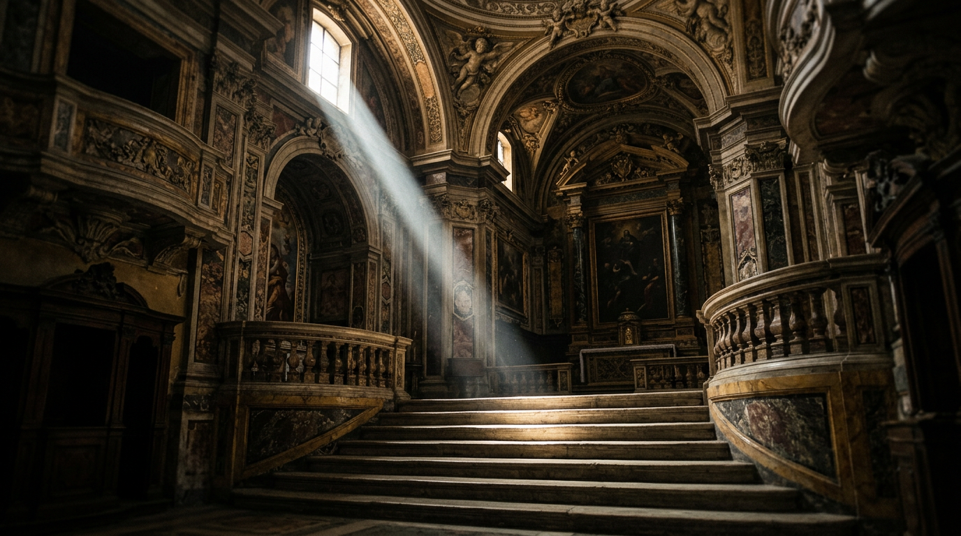
Exhibo Editorial
Baroque Art, Explained
Rome, Antwerp, Madrid and Amsterdam: the seventeenth-century visual language built to move bodies, faith and courts.
Baroque art is the dominant visual language of seventeenth-century Europe: painting, sculpture, and architecture built to move you rather than leave you calm. Artists and patrons in Rome, Antwerp, Madrid, Paris, and the Dutch Republic pushed figures into your space, stacked diagonals across the surface, and staged light so bodies and faces arrive with the force of events, not illustrations.
The style grew from Counter-Reformation church policy, papal urban rebuilding, and court display after the late Renaissance. This guide sets out the conditions that produced it, how scholars define its look, who drove it, four works worth reading at length, how regional schools mutated the idiom, how critics used the word, and what the Baroque left for later centuries. For the earlier period against which so many writers still measure it, see Renaissance Art, Explained. Broader period context sits in the Periods of Art History series.
The conditions that produced Baroque art
By the late sixteenth century, Catholic Europe faced a crisis of persuasion. Protestant reformers had attacked the cult of saints and the use of images in worship. Iconoclastic riots in the Low Countries and elsewhere left empty niches and whitewashed walls where altarpieces had stood. At its Twenty-Fifth Session in December 1563, the Council of Trent answered by defending sacred images as tools of instruction and devotion, while ordering bishops to suppress superstition, profit-seeking, and lascivious beauty in church art. The decree left implementation to dioceses. Treatises and episcopal guidelines in the decades that followed translated those principles into practice: clarity of doctrine, legible narrative, and decorum.
Those rules did not dictate a style. They created demand for images that taught without confusing the uneducated, and for churches that felt holy rather than ornamental for its own sake. Artists still had to invent forms that held a congregation’s eyes through a long Mass. Late Mannerism’s elegant elongations and crowded allegories looked, to many reformers inside the Church, too clever for that job. The Carracci reform in Bologna and Caravaggio’s Roman naturalism both answer that pressure, by different routes.
Rome absorbed the brief at civic scale. After the Sack of 1527 and decades of Reformation polemic, successive popes treated the city as a stage for Catholic recovery. Sixtus V (r. 1585–90) cut processional avenues between major basilicas and marked piazzas with ancient Egyptian obelisks, a programme Jean Sorabella summarises in the Metropolitan Museum’s Heilbrunn essay on Baroque Rome as “Roma in forma sideris,” Rome shaped like a star. Urban VIII, Innocent X, and Alexander VII later hired Gian Lorenzo Bernini, Francesco Borromini, and Pietro da Cortona to monumentalise squares, bridges, chapels, and St Peter’s itself. Painting, sculpture, and architecture were meant to work as one environment, not as separate objects hung on a wall.
Patronage supplied the budget and the brief. Cardinals, religious orders (Jesuits above all), city councils, and courts from Madrid to Paris and Brussels commissioned altarpieces, ceilings, fountains, and palace cycles that argued for power in visual form. In the Southern Netherlands, still under Habsburg Catholic rule after the Dutch Revolt, church rebuilding after iconoclastic violence created demand for large altarpieces. In the United Provinces, by contrast, a largely Protestant mercantile society favoured portraits, genre scenes, landscapes, and civic-guard pictures for town halls and company headquarters. Artists trained in Rome and Antwerp carried compositional habits north and south. Printmakers multiplied compositions for export. The Baroque did not spring from a single manifesto. It crystallised where patronage, doctrine, and workshop talent met.
What Baroque art is, and how to recognise it
The National Gallery, London, defines Baroque painting and sculpture in useful working terms: large, often seventeenth-century works of dramatic and exuberant character that use diagonal compositions and illusionistic effects to impress the viewer. Rubens and Bernini sit at the centre of that description. The word itself began as an insult. English and French usage linked it to the Portuguese barroco, an irregular pearl; eighteenth-century critics used “baroque” for taste that broke classical proportion and rule. Only later did art historians reclaim it as a period label for the arts of roughly 1600 to the mid-eighteenth century, with painting’s high moment earlier and architecture and decoration lasting longer in some regions.
Date ranges flex by medium and place. A Roman chapel of 1620 and a Bohemian church facade of 1730 can both sit under the label without sharing a workshop recipe. Music historians use the same word for Monteverdi through Bach; visual historians borrow the period frame while arguing over which Dutch genre scenes belong inside it. For looking in a gallery, treat “Baroque” as a family of strategies for holding attention rather than a membership card with fixed borders.
You do not need a checklist of ten traits. You need a few habits of looking that hold across media.
Motion, diagonals, and the viewer’s space
Renaissance altarpieces often settle figures into stable pyramids and calm intervals. Baroque compositions tilt. Arms, crosses, drapery, and architectural frames cut the picture or chapel on the diagonal. Bodies twist. Foreshortening brings a foot, a hand, or a beam of timber toward you. Bernini’s David (1623–24, Galleria Borghese, Rome) coils for the sling-shot; Caravaggio’s Crucifixion of Saint Peter (c.1600–01, Santa Maria del Popolo, Rome) tips the cross so the saint’s weight seems about to drop into the chapel. The design treats the spectator as someone standing inside the event.
That spatial aggression extends beyond single figures. Ceiling painters such as Pietro da Cortona, Giovanni Battista Gaulli, and Andrea Pozzo dissolve vaults into painted heavens seen from below (di sotto in sù). Architecture curves and projects: Borromini’s San Carlo alle Quattro Fontane and Sant’Ivo alla Sapienza turn walls into sculptural envelopes. Bernini’s colonnades of St Peter’s Square (1656–67) open their arms toward the pilgrim. The National Gallery’s stress on “illusionistic effects” is exact: the work tries to collapse the gap between represented world and your body.
Light, emotion, and materials working together
Baroque painters often set figures against darkness and pick out faces, hands, and fabrics with a sharp, directional light. Art historians call the extreme form of that contrast tenebrism; the broader modelling of light and shade is chiaroscuro. Both terms matter as labels, but the technique story belongs elsewhere in this series. What you need here is the function: light isolates the decisive moment and makes emotion readable at chapel distance.
Emotion is not a side effect. Faces register awe, pain, ecstasy, or concentrated thought. Drapery and flesh take on theatrical weight: marble that looks like fabric, paint that looks like wet skin. Colour can be Venetian-rich (Rubens) or restricted to a few high notes against near-black (Caravaggio and many of his followers). Sculpture and architecture join the same campaign through coloured marble, gilt bronze, stucco, and hidden windows that drop real daylight onto carved figures, as in Bernini’s Cornaro Chapel. The Met’s phrase for this integrated aim is un bel composto: a beautiful whole designed to heighten religious or courtly experience.
The artists who shaped Baroque art
No single workshop invented the style. Bologna, Rome, Antwerp, Amsterdam, Madrid, and Paris each produced distinct accents, sometimes within the same decade. A painter trained on Carracci disegno could still chase Caravaggio’s lighting; a sculptor in Bernini’s orbit could lose a church commission to Borromini’s curves. Patronage networks crossed borders faster than later national schools imply.
What follows is a map of the main actors, not a complete census. It privileges names you will meet on wall labels and in survey courses, then notes where the map thins out. Use it to place what you see in churches and museums, then return to the close readings for how the work behaves in a room.
Italy: Carracci, Caravaggio, Bernini, Borromini
In Bologna in the 1580s, Ludovico, Agostino, and Annibale Carracci attacked late Mannerist artificiality. Through the Accademia degli Incamminati they taught a fusion of natural observation, classical structure, and northern Italian colour. Annibale’s later Roman work, including the Farnese Gallery frescoes and altarpieces such as the Met’s Coronation of the Virgin, gave Europe a disciplined alternative to Mannerism and a platform for the next generation.
Michelangelo Merisi da Caravaggio (1571–1610) arrived in Rome with a different weapon: street-level models, dirty feet, and scenes staged like night raids. His Contarelli Chapel canvases for San Luigi dei Francesi (1599–1602) made young artists across Europe chase that intensity. Critics accused him of indecency; patrons still hired him because the pictures gripped congregations.
Sculpture and architecture found their Roman masters in Bernini (1598–1680) and Borromini (1599–1667). Bernini’s career under Urban VIII and later popes fused marble, bronze, and urban planning: the bronze baldacchino over the high altar of St Peter’s (begun 1623, largely complete by the early 1630s), the Fountain of the Four Rivers in Piazza Navona, and chapel ensembles such as the Cornaro Chapel. Borromini’s churches trade Bernini’s theatrical clarity for complex, interlocking curves. Pietro da Cortona bridged painting and architecture with convex facades and packed ceiling frescoes that set the pattern for High Baroque decoration.
Flanders, the Dutch Republic, Spain, and France
Peter Paul Rubens (1577–1640) spent eight years in Italy (1600–08), studying antiquity, Michelangelo, Titian, Caravaggio, and the Carracci, then returned to Antwerp as court painter to the Habsburg governors while running a large workshop. His altarpieces for Antwerp churches, including the triptychs now in the Cathedral of Our Lady, and his diplomatic commissions for Marie de Médicis and others, carried Roman drama into northern colour and flesh. The Met essay by Walter Liedtke stresses his oil sketches as tools for patrons and assistants, and his later diplomatic months in Madrid and London as part of the same international career. Anthony van Dyck, his gifted junior, refined court portraiture and reshaped English aristocratic imagery for Charles I.
Dutch cities developed a parallel Baroque under different patrons. Rembrandt van Rijn (1606–1669) absorbed Caravaggesque lighting through Utrecht painters and turned group portraiture into narrative drama in The Night Watch (1642), painted for the Kloveniersdoelen and now in the Rijksmuseum. Genre painters and quiet interior specialists such as Johannes Vermeer share the century’s date stamp without sharing Bernini’s rhetoric; scholars still debate how far “Baroque” should stretch to cover them. Frans Hals’s brushy civic portraits and Jacob van Ruisdael’s restless skies show other northern ways to keep a surface alive.
In Spain, Diego Velázquez (1599–1660) served Philip IV with a cooler, observational intelligence that still belongs to the period’s court culture. José de Ribera and other Spanish Caravaggisti carried Neapolitan darkness into Iberian churches. France cultivated a classical Baroque through Nicolas Poussin and Claude Lorrain in Rome, and a grander decorative mode under Louis XIV at Versailles, where Charles Le Brun organised pictorial programmes for monarchy rather than for parish devotion. Rubens’s Médicis cycle for the Luxembourg Palace, now in the Louvre, sits between those French poles as imported Flemish spectacle in a royal key.
Four works worth reading closely
Lists of “famous Baroque paintings” flatten the problem. Close looking at a few fixed works teaches the grammar better than a dozen one-line captions. The four below sit in different media and cities: an oil chapel commission still in situ, a marble-and-architecture ensemble, a Flemish altarpiece moved within its city, and a Spanish court canvas now in a national museum. Together they show how Baroque makers manage space, light, and the spectator under unlike briefs.
Read them as case studies, not as a ranking. Each answers a different patronage problem: how to make a Gospel calling feel contemporary; how to stage a mystic’s private vision for a public chapel; how to fill a Catholic nave with physical struggle; how to picture royal authority without a conventional state portrait. If you can only see one in person this year, choose the chapel works. Photographs compress Bernini’s light traps and Caravaggio’s room-matched illumination into flat souvenirs.
Caravaggio, The Calling of Saint Matthew (1599–1600)
The painting hangs where Caravaggio installed it: the Contarelli Chapel in San Luigi dei Francesi, Rome, opposite his Martyrdom of Saint Matthew, with The Inspiration of Saint Matthew (1602) at the altar. A contract of July 1599 secured the two side canvases; final payment followed in July 1600. The Met notes that Caravaggio aligned the painted light with the chapel’s real illumination, so the fiction and the room share one optical logic.
Christ enters from the right with a restrained gesture that recalls Michelangelo’s Adam on the Sistine ceiling, yet the company around the table looks like a tax office or gambling den. Coins, costumes, and sceptical faces belong to contemporary Rome. One figure points to himself, unsure whom Jesus means. The diagonal of light cuts the darkness and selects the conversion. You stand close enough that the table edge feels like furniture in your path. The picture does Counter-Reformation work without soft idealism: it makes a Gospel episode present-tense and socially legible.
Bernini, Ecstasy of Saint Teresa (1647–1652)
Cardinal Federico Cornaro commissioned Bernini to transform the left transept of Santa Maria della Vittoria into a family chapel. The marble group shows Teresa of Ávila, canonised in 1622, receiving the angel’s arrow of divine love as she described it in her writings. Hidden windows wash the white marble with daylight. Coloured marble, gilt rays, and stucco angels frame the scene. On the side walls, members of the Cornaro family appear in relief as if seated in theatre boxes, discussing the vision.
Filippo Baldinucci, Bernini’s early biographer, praised the artist’s bel composto. Irving Lavin and later scholars treat the chapel as a unified work of art in which architecture, sculpture, and light refuse to separate. Stand in the nave and the chapel behaves like a stage set; step closer and marble turns into cloth and flesh. The work is Catholic mysticism given a public address system. It also shows why architecture cannot be peeled off Baroque sculpture: without the chapel’s light traps and boxes, the marble group loses half its meaning.
Rubens, The Raising of the Cross (1610–1611)
Rubens painted this triptych soon after his return from Italy for the parish church of St Walburga in Antwerp; it now stands in the Cathedral of Our Lady with its companion, The Descent from the Cross. The Met’s Rubens essay places both altarpieces among commissions funded by discerning Antwerp laymen such as the burgomaster Nicolaes Rockox. Muscular executioners heave the cross on a steep diagonal. Christ’s body, foreshortened and strained, remembers Michelangelo and classical sculpture while the colour and surface remain Flemish.
The panel is Counter-Reformation propaganda with painterly appetite. Rubens gives the congregation a physical struggle they can feel in their shoulders. He also demonstrates the workshop system that made Flemish Baroque exportable: oil sketches (modelli), assistants, and collaborators later allowed him to supply courts from Paris to Madrid. Compare this to Caravaggio’s spare darkness and you see two Catholic Baroque dialects: one street-lit and lean, one fleshy, colourful, and orchestral.
Velázquez, Las Meninas (1656)
In the Museo Nacional del Prado, Madrid, Velázquez’s large canvas (about 320 × 279 cm) shows the Infanta Margarita attended by meninas, dwarfs, a mastiff, and the painter himself at a tall canvas. A mirror at the back reflects Philip IV and Mariana of Austria. The chamberlain José Nieto pauses in a doorway. Antonio Palomino, writing in 1724, devoted a separate section to the picture and dated it to 1656 in the Alcázar. The Prado still treats it as the artist’s most complex statement on court life and representation.
Is Las Meninas “Baroque” in the Bernini sense? It lacks flying putti and diagonal martyrdoms. It belongs to the period through its play with the viewer’s position, its layered light sources, and its claim that painting can stage the reality of power. You occupy the spot where the king and queen would stand. The picture watches you watching it. Spanish court painting here absorbs Italian lessons and answers them with observational cool. Keep it in the conversation so “Baroque” does not collapse into a single Roman recipe.
How Baroque art spread and mutated
Rome remained the training ground. Northern artists came for antiquities, Raphael, and the new chapel commissions, then carried habits home. Rubens’s Antwerp workshop, as the Met chronology for the Low Countries stresses, helped move Baroque ideals from their Roman fountainhead into Flanders. Prints after Rubens and others accelerated the transfer. Caravaggism travelled through Naples to Spain and through Utrecht painters into Dutch studios.
Local conditions changed the accent. In Catholic Flanders and southern Germany, altarpieces and church ceilings kept the full rhetorical heat. In the Dutch Republic, after independence from Spain was recognised in 1648, civic guard companies, merchants, and town councils paid for group portraits, still lifes, and landscapes. Rembrandt’s militia piece for the Kloveniersdoelen is Baroque drama in a republican key. Vermeer’s interiors share the century but refuse the shout.
France negotiated between classical restraint and royal spectacle. Poussin’s Roman history paintings prize contour and reasoned composition; Versailles under Louis XIV deployed illusionistic ceilings and ceremonial axes for absolutism. Central Europe, Bohemia, and colonial Latin America developed ornate church interiors into the eighteenth century, often labelled late Baroque or, in German lands, related to the Gesamtkunstwerk of integrated decoration. Sicily’s rebuilding after the 1693 earthquake produced towns such as Noto and Ragusa where Baroque urbanism is the street plan itself. Spanish America translated the idiom into local materials and Indigenous craft traditions. The style mutated whenever a new patron class or climate took it on.
| Region / centre | Approx. peak | Main patrons | Characteristic media | Exemplary work (location) | Accent |
|---|---|---|---|---|---|
| Rome | c.1600–1670 | Popes, cardinals, religious orders | Chapel painting, sculpture, urban architecture | Bernini, Cornaro Chapel (Santa Maria della Vittoria) | Integrated bel composto; pilgrim theatre |
| Bologna / Emilia | c.1580–1620 | Local academies, Roman commissions | Fresco, altarpieces, teaching | Annibale Carracci, Farnese Gallery (Rome) | Reform of Mannerism; disegno + colour |
| Naples | c.1600–1650 | Spanish viceregal court, churches | Caravaggesque painting | Followers of Caravaggio in local churches | Dark naturalism; Iberian links |
| Antwerp / Flanders | c.1608–1640 | Habsburg governors, parish donors | Large altarpieces, tapestry designs | Rubens, Raising of the Cross (Antwerp Cathedral) | Colour, flesh, workshop export |
| Dutch Republic | c.1620–1670 | Merchants, civic guards, town halls | Portraits, genre, landscape | Rembrandt, The Night Watch (Rijksmuseum) | Civic drama; quieter genres alongside |
| Madrid / Spain | c.1620–1660 | Habsburg court, religious orders | Court portrait, religious painting | Velázquez, Las Meninas (Prado) | Observational court intelligence |
| Paris / Versailles | c.1625–1715 | Crown, academies | Palace decoration, classical history painting | Rubens’s Médicis cycle (Louvre); Le Brun at Versailles | Absolutist spectacle + classical theory |
| Colonial Latin America | c.1650–1780 | Church, viceregal elites | Church facades, retablos, sculpture | Regional cathedral ensembles | Local materials; extended late Baroque |
Critics then and now
Seventeenth-century viewers did not call the art around them “Baroque.” They argued about decorum, disegno versus colorito, and whether Caravaggio’s dirt violated sacred propriety. Andrea Sacchi and Pietro da Cortona debated in Rome around 1636 whether few figures and pure contours outranked crowded assemblies and freer brushwork. The Met’s Baroque Rome essay places that exchange in the lineage that leads toward Poussin on one side and High Baroque ceilings on the other. Classicising painters and theorists preferred Poussin’s order to Rubens’s abundance. Protestant lands that retained images still policed idolatry; Catholic censors sometimes ordered canvases altered or rejected, as when Caravaggio’s first altarpiece of Matthew and the angel was refused for the Contarelli Chapel and replaced with a second version.
Workshop reputation mattered as much as theory. Rubens’s letters complain of overwork and diplomatic travel; van Dyck’s English portraits set a standard that later British painters chased for generations. Biographers such as Filippo Baldinucci framed Bernini as a universal genius of the bel composto. Rivalries were personal: Borromini’s career suffered under Bernini’s papal favour, a story later writers sometimes moralise beyond the documents.
The word “baroque” entered art criticism as a slur for irregular, capricious design. Eighteenth-century French writers used it against taste that broke the rules of proportion. Antoine-Joseph Pernety’s 1757 dictionary already ties the adjective to caprice outside the rules of proportion. Neoclassical reformers in the later eighteenth century cast Bernini’s theatricality as the enemy of noble simplicity. Johann Joachim Winckelmann’s preference for calm Greek ideal form helped make that judgement fashionable even when his targets were Roman and Italian.
Heinrich Wölfflin’s Principles of Art History (1915) later gave the period a systematic stylistic profile, pairing Renaissance and Baroque as linear versus painterly, plane versus recession, closed versus open form, multiplicity versus unity, and clear versus unclear. His binaries still shape undergraduate teaching, even when specialists warn against treating them as laws. Mid-twentieth-century surveys often equated Baroque with Jesuit propaganda; that shorthand erased Dutch, English, and courtly strands.
Recent scholarship softens the propaganda story. Historians of patronage (Francis Haskell among them) map networks of cardinals, bankers, and orders. Conservators and lighting studies show how chapel ensembles were engineered. Global art history tracks the style’s colonial afterlives without treating Rome as the only centre that counts. Feminist and social readings recover workshop labour, women patrons, and the politics of Teresa’s ecstatic body in Bernini’s marble. The term remains contested at the edges: some prefer “early modern” for Dutch genre painting; others keep “Baroque” as a useful umbrella for the century’s visual rhetoric of persuasion.
What Baroque art left behind
Rococo inherited Baroque ornament and lightened it for aristocratic interiors; that story has its own article in this series. Neoclassicism defined itself against Bernini’s curves and Rubens’s flesh. Jacques-Louis David and his peers treated calm contour and moral subject as a corrective to what they saw as theatrical excess. The rejection proves the earlier style’s grip: you only need a purge if the previous language still fills churches and palaces.
Romantic painters from Delacroix looked back to Rubens for colour and movement. Nineteenth-century academies still set students to copy Baroque altarpieces. Eugène Fromentin and later critics wrote travel essays that taught Northern audiences to see Flanders and Holland as a continuous seventeenth-century lesson. Modern photographers and filmmakers borrow strong directional lighting and diagonal staging without naming the debt. Contemporary installation artists who build rooms that control your path and your sightlines replay the Cornaro Chapel’s lesson: the environment is the work.
Institutionally, the Baroque filled the museums you walk through. Royal collections that became the Prado, the Louvre’s Médicis cycle, the Rijksmuseum’s civic masterpieces, and Rome’s churches that remain working liturgical spaces all keep the period public. Conservation science now maps overpaint, canvas seams, and original chapel lighting, so attributions and display choices keep shifting. Cleaning controversies, from Rembrandt varnishes to polychrome sculpture, show how fragile “the original look” remains as a claim. For travellers, the practical advice is simple: see chapel works in situ when you can, and use collection museums for the portable pictures and for comparative hanging. A directory such as exhibo.art/museums helps locate holdings before you travel.
The intellectual afterlife matters as much as the stylistic one. Baroque art trained Europe to expect images that argue, seduce, and overwhelm. Advertising, political spectacle, and immersive exhibition design still trade on that expectation. When you recognise a diagonal martyrdom or a spotlighted face in a gallery, you are reading a technology of attention invented for seventeenth-century churches and courts.
Where Baroque art lives in public collections
If you are building a viewing list, start with works that never left their chapels: Caravaggio’s Matthew cycle in San Luigi dei Francesi; Bernini’s Cornaro Chapel; Rubens’s Antwerp Cathedral triptychs; ceiling frescoes in Il Gesù and Sant’Ignazio. Then add museum rooms that concentrate the portable school: the Prado for Velázquez and Spanish polychrome sculpture context; the Rijksmuseum for Rembrandt and Dutch peers; the Louvre for Rubens’s Marie de Médicis cycle and French classicising painting; the National Gallery, London, and the Met for cross-section surveys; the Galleria Borghese for early Bernini marble.
Architecture demands walking. St Peter’s Square, Piazza Navona, Borromini’s small churches, and Sicilian planned towns teach what photographs flatten. Pair those sites with the Periods of Art History essays so Gothic, Renaissance, and later Neoclassical frames stay distinct in your head. The Baroque rewards comparison more than isolation: look at a Carracci next to a Caravaggio, a Rubens next to a Poussin, a Bernini chapel next to a Dutch town-hall portrait, and the period’s range becomes visible.
FAQ
Searchers asking about Baroque art tend to want a usable definition, a short artist list, and a few comparisons that stop the period from blurring into Renaissance on one side and Rococo on the other. Classroom quizzes add requests for “four features” or “five characteristics,” which are teaching devices rather than historical checklists. Museum visitors ask which painting is the most famous, as if fame were a stable metric across countries.
The questions below follow those People Also Ask patterns and the confusions that show up in talks beside chapel rails. Answers stay brief on purpose; the sections above carry the evidence, the dates, and the named works you can verify against collection pages.
What is Baroque art in one sentence?
Baroque art is the dramatic, often large-scale visual culture of seventeenth-century Europe (extending earlier and later by region) in which painters, sculptors, and architects used motion, strong light effects, and illusion to involve the spectator, frequently in the service of church or court.
What are the main characteristics of Baroque art?
Expect diagonal compositions, figures that seem to enter your space, heightened emotion, rich or sharply spotlighted materials, and environments that combine media. Architecture may curve or project; ceilings may open into painted heavens. Not every Dutch interior shares the full toolkit, but the persuasive, event-like presentation of the subject is a shared aim across much of the period.
Who are the most famous Baroque artists?
In Italy: Annibale Carracci, Caravaggio, Bernini, Borromini, Pietro da Cortona. In Flanders: Rubens and van Dyck. In the Dutch Republic: Rembrandt (with Vermeer often discussed alongside). In Spain: Velázquez. In the French orbit: Poussin, Claude, and later the decorators of Versailles. Lists vary; these names structure most museum surveys.
How is Baroque art different from Renaissance art?
Renaissance artists of the fifteenth and sixteenth centuries often sought balanced compositions, clear proportional systems, and a measured ideal of the body, as outlined in Renaissance Art, Explained. Baroque artists kept classical learning but raised the emotional temperature, opened compositions, and designed for impact in specific rooms and plazas. The break is gradual: Carracci reform and late Michelangelo already point forward.
How is Baroque different from Rococo?
Baroque tends toward monumental persuasion: altarpieces, public fountains, palace programmes. Rococo, centred in early-to-mid eighteenth-century France and related courts, favours intimate scale, pastel palettes, and playful ornament for aristocratic interiors. Many historians treat Rococo as a late, lighter mutation rather than a total break.
Was Baroque art only Catholic?
No. Catholic patronage drove the Roman and Flemish church styles, yet Protestant Dutch cities produced major seventeenth-century painting under civic and private patrons. England absorbed van Dyck’s court portraiture. The rhetoric changes with the client; the century’s visual intelligence is wider than any single confession.
What is the most famous Baroque painting?
There is no single winner. Tourists and textbooks often cite Caravaggio’s Contarelli Chapel canvases, Rembrandt’s Night Watch, Velázquez’s Las Meninas, or Rubens’s Antwerp altarpieces. Fame tracks accessibility and national canons as much as quality. Chapel works in situ still give the fullest Baroque experience.
When did the Baroque period end?
Painting’s most distinctive phase runs through the seventeenth century. Architecture and decoration continue in late Baroque and Rococo forms into the mid-eighteenth century in many regions. Neoclassicism then becomes the prestige alternative. End dates are regional, not a single European switch-off.
Related reading
Van Lévé: Sovereign Caribbean Visions Take Shape at Harvard
A transnational survey charts twenty-five years of Creole and Maroon artistic practice across the French Caribbean and Amazonia.
Harvard's Alain Locke Gallery presents a landmark survey tracing contemporary production from Guadeloupe, Martinique, Guyane, and Haiti since two thousand and one.
Gustave Fayet: Collector—Artist Designer
A comprehensive survey at the Fondation Louis Vuitton reuniting collected masterpieces with the designer's own studio practice.
The Paris institution expands its patronage series with a dual-focused examination of Gustave Fayet, bringing together hundreds of acquired works and restored creations to chart his impact on early modernism.
Mohammad Alfaraj: The Heart Is a Bird's Nest, the Brain Is a Spider Web
First European institutional solo explores cross-species kinship and domestic ecologies
Mohammad Alfaraj's latest showcase at the Delfina Foundation merges multimedia installations with regional folklore to reimagine shared habitats.